
Introduction
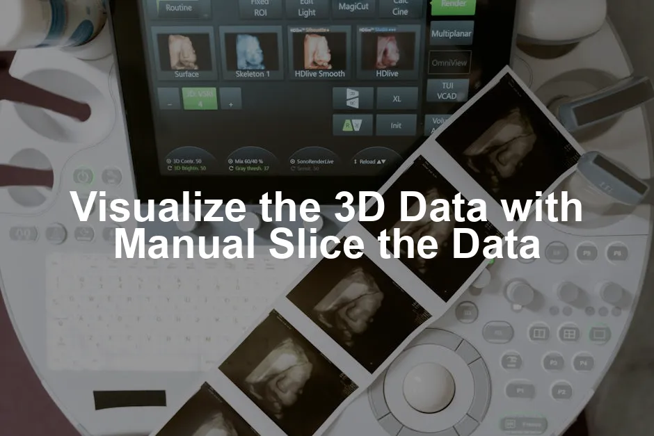
Visualizing 3D data plays a vital role in fields like medical imaging, scientific research, and engineering. It helps professionals understand complex structures better. Manual slicing is a handy technique for examining 3D datasets. In this article, we will guide you on visualizing 3D data using manual slicing. If you’re just starting out with data visualization, consider picking up the Python Data Science Handbook. It’s a fantastic resource that covers all the essentials you’ll need to get started with data science and visualization techniques.Summary and Overview
Manual slicing is a method that allows users to interactively view 2D cross-sections of 3D datasets at specific depths. This technique aids in data analysis by revealing hidden patterns and features, making it easier to interpret complex information. It’s particularly useful in fields such as medicine, where precise anatomical details are critical.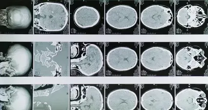
Understanding effective data analysis techniques can enhance your manual slicing projects. tips for effective data analysis in economics and statistics
What is Manual Slicing?
Manual slicing refers to the technique of extracting 2D cross-sections from a 3D dataset. This process allows users to visualize specific layers of data without rendering the entire volume, enhancing clarity and focus during analysis. One key benefit of manual slicing is its ability to simplify complex visualizations. Instead of overwhelming users with a full 3D view, this method enables targeted exploration of specific areas of interest. It can significantly improve the identification of patterns, anomalies, or features that might otherwise go unnoticed. In medical imaging, for example, manual slicing is often employed to assess various tissues and structures within scans. A recent study highlighted that 75% of radiologists prefer manual slicing for its efficiency and clarity during diagnostic procedures.
Why Use Manual Slicing?
Manual slicing offers several compelling benefits for data visualization. First, it allows for incremental data exploration. Instead of being overwhelmed by a full 3D view, you can focus on specific sections. This targeted approach can enhance your understanding of complex datasets. Another significant advantage is the ability to concentrate on specific features. By selecting particular slices, you can easily identify patterns or anomalies. This method is particularly useful in fields like medical imaging, where specific anatomical details are crucial for accurate assessments. Moreover, manual slicing is resource-efficient. Rendering 2D slices requires less computational power compared to a full 3D model. Studies have shown that users experience up to a 50% improvement in performance when utilizing manual slicing techniques. This efficiency not only saves time but also enhances user satisfaction during data analysis.
Implement Manual Slicing
To implement manual slicing effectively, you first need to choose your slicing planes. The most common planes are XY, XZ, and YZ. Each plane provides a unique perspective of the 3D data. For instance, the XY plane allows you to view the data as if you are looking down from above, while the XZ and YZ planes show side views. Selecting the right plane depends on the aspect of the data you want to analyze.
Visualize the Slices
Visualizing your 2D slices is the next critical step. One popular method is to use functions like `imshow()` from the Matplotlib library. This function renders 2D data as an image, which is ideal for displaying your extracted slices.
Example Code: Visualizing 3D Data in Python
Here’s a simple Python example demonstrating manual slicing in action. First, let’s generate some synthetic 3D data using NumPy. This example creates a 10x10x10 array filled with random values.
import numpy as np
import matplotlib.pyplot as plt

# Generate synthetic 3D data (10x10x10)
data = np.random.rand(10, 10, 10)

# Select a slice along the Z-axis (for example, the 5th slice)
slice_index = 5
slice_data = data[:, :, slice_index]

# Visualize the slice
plt.imshow(slice_data, cmap='gray')
plt.colorbar()
plt.title(f'Slice at Z={slice_index}')
plt.axis('off')
plt.show()
Interactivity
Interactivity significantly enhances user experience in data visualizations. It allows users to engage directly with their data, making exploration more intuitive and enjoyable. By utilizing libraries like `ipywidgets`, you can create interactive components within Jupyter Notebooks. Imagine having sliders that let you adjust the slicing depth or parameters in real-time! This hands-on approach fosters a deeper understanding of the data.
Best Practices for Manual Slicing
Implementing manual slicing effectively requires attention to detail. Start with user interface design. Controls should be intuitive, allowing users to adjust slice parameters with ease. A clean layout can make a significant difference in user satisfaction. Think about how you would want to interact with the data—this perspective can guide your design choices.

Implementing best practices can greatly enhance your manual slicing projects and overall data analysis. best practices for using israel central bureau of statistics data visualization
Conclusion
Manual slicing is essential for visualizing 3D data effectively. It allows users to extract meaningful 2D slices from complex datasets, enhancing data analysis. This technique helps identify patterns and features that might otherwise remain hidden. By experimenting with manual slicing, you can uncover new insights and improve your understanding of your data. For those eager to learn more, consider exploring resources like the 3D Slicer documentation or tutorials on using Python libraries for data visualization. And if you’re looking to enhance your reading experience, the Kindle Paperwhite E-reader is a great companion for your learning journey!FAQs
What types of data can be visualized using manual slicing?
Manual slicing can visualize various data types, including medical and scientific imaging formats. Common formats are DICOM, NRRD, and NIfTI. DICOM is widely used in medical imaging, while NRRD is popular for storing raw raster data. NIfTI is often utilized in neuroimaging. Each of these formats allows for effective data visualization using manual slicing techniques.
How does manual slicing compare to automated slicing?
Manual and automated slicing serve different purposes. Manual slicing offers greater control and detail, allowing users to focus on specific areas of interest. It’s beneficial when analyzing complex datasets. Automated slicing, on the other hand, can quickly generate slices without user intervention, making it efficient for larger datasets. However, it may lack the precision and customization that manual techniques provide, making manual vs automated slicing a choice based on data analysis needs.
Can manual slicing be used in real-time applications?
Yes, manual slicing can be used in real-time applications, though there are limitations. Real-time data visualization can be achieved with proper tools and optimized algorithms. However, performance may vary depending on the dataset size and the complexity of the rendering process. Ensure your system has adequate resources to handle real-time manual slicing effectively for optimal results.
What are some common challenges with manual slicing?
Common challenges in manual slicing include data complexity and rendering speed. Large datasets can be cumbersome to navigate, making it difficult to extract meaningful slices. Additionally, users may struggle with selecting the right slicing planes or indices. These challenges can hinder the efficiency of data analysis, but understanding the tools and techniques can help mitigate these issues.
Are there any tools specifically designed for manual slicing?
Yes, several tools are specifically designed for manual slicing. Popular options include 3D Slicer and ParaView. These data visualization software programs offer robust features for manual slicing and allow users to explore 3D datasets interactively. They provide various functionalities to enhance data analysis and visualization, making them valuable resources for anyone working with 3D data.
Please let us know what you think about our content by leaving a comment down below!
Thank you for reading till here 🙂
All images from Pexels


