
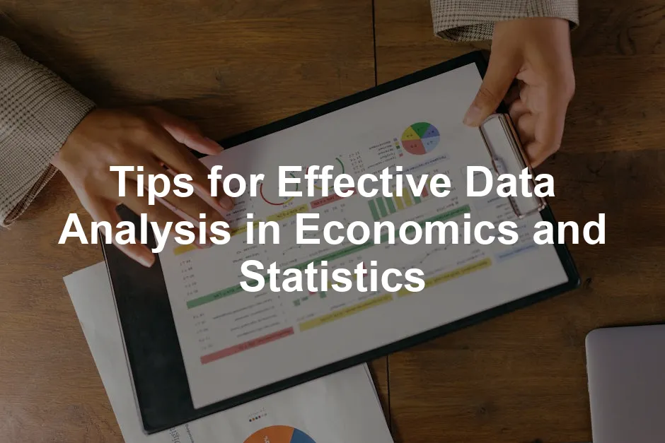
Introduction
Data analysis is the backbone of economics and statistics. It transforms raw numbers into meaningful insights. These insights guide policymakers, businesses, and researchers. In a world overflowing with data, the ability to analyze and interpret information is crucial.
Effective data analysis leads to informed decision-making. It allows for the assessment of economic conditions and trends. With accurate analysis, stakeholders can create policies that improve societal welfare. For instance, understanding unemployment rates can help formulate job creation strategies.
In this article, we will share key tips for enhancing your data analysis skills. From understanding your data to mastering analytical techniques, these insights will prepare you for effective analysis. So, grab your favorite analytical tool, and let’s get started!
1. Understanding Your Data
1.1 Define Your Objectives
Before anything else, establish clear objectives. What do you want to achieve with your analysis? Defining your goals will streamline your efforts. Start by formulating a research question or hypothesis. For example, “How does inflation affect consumer spending?” This question will guide your analysis, ensuring it stays focused.
1.2 Data Types and Sources
Understanding data types is essential. Data can be quantitative or qualitative. Quantitative data includes numerical values, while qualitative data encompasses descriptive information. Additionally, data can be structured, like spreadsheets, or unstructured, such as social media posts.
Utilizing reliable data sources is critical. Government databases, like the Bureau of Labor Statistics, offer valuable economic indicators. International organizations, such as the World Bank and IMF, provide data for comparative analyses. Academic journals also contain research findings that can enrich your understanding. For those looking to dive deeper into data handling, R Programming for Data Science is a fantastic resource to get you started with data analysis.

1.3 Data Cleaning and Preparation
Data integrity is vital for accurate analysis. Common data issues include missing values, duplicates, and inconsistencies. Cleaning your data means identifying and addressing these issues. Start by checking for missing values. Decide on methods to fill or exclude them.
Next, remove duplicates to ensure each entry is unique. Finally, standardize your data format. For example, ensure dates are in the same format across your dataset. By taking these steps, you will enhance the quality of your data and improve the reliability of your findings.
In summary, understanding your data is crucial for effective analysis. Define your objectives, recognize data types, and prioritize data cleaning. These foundational steps will position you for successful data analysis in economics and statistics. And if you’re looking for a comprehensive guide, check out Data Science from Scratch.

For further insights on how economics and statistics can complement each other, check out this article on is economics and statistics a good double major.
2. Choosing the Right Analytical Tools
2.1 Tool Selection Criteria
When choosing analytical tools, consider several key factors. First, think about the type of data you’ll be working with. Is it structured or unstructured? Quantitative or qualitative? Understanding your data type helps narrow down the tool options.
Next, assess the complexity of the analysis required. Are you performing simple descriptive statistics, or do you need to conduct advanced inferential tests? More complex analyses often require more powerful software. If you’re looking for a solid introduction to programming to help with these analyses, Python Crash Course is a great resource!
Lastly, reflect on user familiarity with the tools. Are you comfortable with programming languages or statistical software? If you’re not, a user-friendly interface may be more beneficial. Remember, the best tool is one that aligns with your data type, analysis complexity, and personal expertise.

2.2 Overview of Common Tools
Now, let’s explore some of the most commonly used analytical tools in economics and statistics.
Excel: This is the classic tool for basic statistical functions and data visualization. Excel offers a range of formulas, pivot tables, and charting options. It’s excellent for quick analyses and is widely accessible. However, it may fall short for more complex statistical tasks. If you want to take your Excel skills to the next level, consider Excel 2021 for Windows.

R and Python: These programming languages are the superheroes of data analysis. R is tailored for statistical computing, offering packages like ggplot2 for visualization and dplyr for data manipulation. On the other hand, Python shines with libraries such as Pandas for data manipulation and NumPy for numerical analysis. Both languages provide the flexibility to handle sophisticated statistical analyses and are highly recommended for serious data analysts.
If you’re looking to get started with Python for data analysis, consider reading this introduction to statistical learning with python book length.
Statistical Software: Specialized software like SPSS and Stata caters to more advanced statistical needs. SPSS is user-friendly for conducting complex analyses, while Stata is favored for its robust capabilities in econometrics. These tools come equipped with vast libraries of statistical tests, making them ideal for in-depth analyses. If you want to explore SPSS further, check out SPSS Statistics for Data Analysis.
In summary, when selecting analytical tools, consider your data type, the complexity of your analysis, and your familiarity with the software. Utilize Excel for simple tasks, R or Python for more advanced analytics, and specialized software when your analysis demands it. Choosing the right tool will pave the way for insightful data analysis in economics and statistics.

3. Employing Appropriate Analysis Techniques
3.3 Regression Analysis
Regression analysis is a powerful statistical method. It helps us understand relationships between variables. Think of it as a detective, revealing how one variable influences another. For instance, how does education level affect income? This insight is crucial for economists and policymakers.
There are several types of regression analysis. First, linear regression is the simplest. It shows the relationship between two variables using a straight line. This method is great for predicting outcomes when you have one independent variable.
Next up is logistic regression. This one is used when the dependent variable is categorical. For example, predicting whether a customer will buy a product (yes or no) based on various factors. It uses a logistic function to squeeze values into a range between 0 and 1, making it perfect for binary outcomes.
Finally, we have multiple regression. This technique takes it up a notch by examining multiple independent variables. It answers complex questions like: “How do education, age, and experience together influence salary?” This method provides a comprehensive view of relationships, helping to paint a fuller picture of economic data.

3.4 Time Series Analysis
Time series analysis is vital in economics. It allows analysts to study data points collected over time. This method is key for understanding trends and forecasting future economic conditions. Think of it as tracking your spending habits over months to predict future expenses.
One significant aspect of time series analysis is its ability to identify trends. For example, an upward trend in employment rates might indicate a growing economy. Analysts can assess data over various time frames—daily, monthly, or yearly—to spot these patterns. For those looking to master time series analysis, consider Introduction to Time Series Analysis.
Another essential feature is analyzing seasonal patterns. Many economic indicators fluctuate with seasons, like retail sales during holidays. Techniques like seasonal decomposition help isolate these seasonal effects, providing clearer insights. This helps businesses and policymakers make informed decisions based on anticipated changes.

3.5 Machine Learning Techniques
Machine learning is revolutionizing data analysis in economics. It involves using algorithms to learn from data and make predictions. Think of it as teaching a computer to identify patterns without explicit programming.
Predictive modeling is one of the key applications of machine learning. For instance, it can forecast economic downturns by analyzing historical data. This proactive approach enables businesses and governments to prepare for potential challenges. Interested in diving deeper into machine learning? Check out Machine Learning for Data Analysis.
Another application is classification tasks. Machine learning can help categorize data into predefined labels. For example, it might classify consumer behavior into categories like “likely to purchase” or “not interested.” This categorization aids targeted marketing strategies and improves customer engagement.
Machine learning techniques enhance data analysis by providing real-time insights. They offer adaptability, making them invaluable in the ever-changing landscape of economics and statistics. As these technologies evolve, their impact on data analysis will only grow, leading to more informed decision-making.

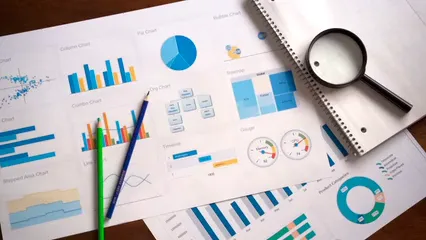
4. Tools for Data Visualization
When it comes to making sense of data, visualization is your best friend. It takes complex information and transforms it into clear, concise visuals. This process can turn a sea of numbers into a friendly chart that even your grandma could understand! Let’s look at some popular tools that can help you create engaging data visualizations: Tableau, Power BI, and Google Data Studio.
Tableau stands out for its ease of use and powerful capabilities. With drag-and-drop features, you can create stunning visualizations quickly. Want to build a dashboard that highlights your economic findings? Tableau makes it a breeze! It allows for real-time data analysis, making it perfect for those who need to make decisions on the fly. Plus, it’s equipped with robust sharing options, so your findings can reach your audience with just a few clicks. If you’re just starting with Tableau, check out Tableau for Dummies.

Power BI is another heavy hitter in the visualization arena. Developed by Microsoft, it integrates seamlessly with other Microsoft tools. If you’re already using Excel, this tool will feel like a walk in the park. Power BI enables users to create interactive reports and dashboards that can be shared across the organization. Its ability to handle large datasets while maintaining speed is impressive, making it a favorite among analysts.
Lastly, we have Google Data Studio. This tool is a gem for teams that love collaboration. Being cloud-based, it allows multiple users to work on the same report simultaneously. You can pull in data from various Google services, such as Google Analytics and Google Sheets, making it incredibly versatile. Plus, it’s free! So if you’re just starting and don’t want to break the bank, Google Data Studio is an excellent choice.
In summary, choosing the right visualization tool can significantly enhance your data analysis capabilities. Tableau offers depth and ease, Power BI integrates beautifully with Microsoft products, and Google Data Studio shines in collaboration and cost-effectiveness. Each of these tools has unique strengths, so pick the one that aligns with your needs and watch your data come to life! If you’re looking for a comprehensive guide on data visualization, check out Data Visualization: A Practical Introduction.

5. Critical Interpretation of Results
5.1 Contextualizing Findings
Understanding the economic context surrounding your data is crucial. Without it, your analysis might feel like a ship lost at sea. For instance, if you find unemployment rates decreasing, it’s essential to consider underlying factors—like government policies or economic growth—that may have influenced this change. Relating your findings to existing economic theories or literature can provide depth and perspective. This context helps to ensure that your conclusions are not only valid but also relevant.
Consider a scenario where you analyze consumer spending data. If you see an uptick, it’s essential to contextualize this finding. Is it due to a tax cut? Seasonal spending trends? Or perhaps a new marketing campaign? By connecting your results to established economic principles or recent studies, you enhance the credibility of your analysis. It shows you’re not just throwing numbers around; you’re making informed interpretations grounded in reality.

5.2 Identifying Limitations
Every data analysis comes with its limitations. Ignoring them is like pretending a hole in your boat doesn’t exist. Common pitfalls include overgeneralization and ignoring confounding variables. For instance, if your analysis suggests that a rise in education levels correlates with increased earnings, you must consider other factors at play. Is it also due to an improving job market or access to better opportunities?
Moreover, be cautious of the data quality. If your dataset is incomplete or biased, your conclusions may lead you astray. Recognizing these limitations not only strengthens your integrity as an analyst but also prepares you for potential questions about your findings. It demonstrates a critical understanding of the complexities involved in data interpretation.

5.3 Communicating Results
Communicating your findings effectively is just as important as the analysis itself. Different audiences require different approaches. When presenting to policymakers, focus on actionable insights. Use clear visuals and emphasize the implications of your findings. They want to know how your analysis can drive decisions and policies.
For stakeholders, a more detailed report might be necessary, highlighting methodologies, data sources, and potential limitations. This transparency builds trust and credibility. When addressing the public, aim for simplicity. Use relatable language and visuals that resonate with everyday experiences. The goal is to inform without overwhelming.
In all cases, clarity is key. Avoid jargon and keep your messages concise. Highlight the most significant insights up front, and provide context to support your conclusions. Effective communication ensures your hard work is recognized and understood. If you want to improve your communication skills in data analysis, consider reading Data Science for Business.

6. Continuous Learning and Skill Development
6.1 Staying Updated
The field of data analysis is ever-changing. To stay relevant, continuous learning is crucial. Attend workshops, webinars, and conferences to learn about new methodologies and tools. Online courses can offer in-depth training on specific topics, ensuring your skills remain sharp.

6.2 Resources for Learning
Utilize various resources for skill enhancement. Websites like Coursera or edX offer courses in data analysis, statistics, and programming. Joining forums or communities can connect you with fellow learners and industry professionals. Engaging with others will expose you to different perspectives and insights, enriching your understanding. If you’re interested in a structured approach to learning statistics, consider Practical Statistics for Data Scientists.
In conclusion, mastering data analysis in economics and statistics requires a blend of knowledge, practical skills, and continual learning. By leveraging the right tools and remaining curious, you can navigate this dynamic field with confidence.
FAQs
What are the most common data analysis techniques in economics?
Common techniques include descriptive statistics, regression analysis, and time series analysis. Each method serves specific purposes, from summarizing data to forecasting trends.
How can I ensure the quality of my data?
Quality assurance involves data cleaning, checking for missing values, and validating data sources. Regular audits can help maintain data integrity.
What tools should I learn for data analysis?
Familiarize yourself with tools like Excel, R, Python, and SQL. These tools are widely used for data manipulation, statistical analysis, and visualization.
Is programming necessary for data analysis?
Basic programming knowledge, especially in languages like Python or R, can significantly enhance your data analysis capabilities. However, advanced programming skills are not always necessary for entry-level positions.
How can I improve my data visualization skills?
Practice creating different types of visualizations using tools like Tableau or Power BI. Studying effective examples and seeking feedback can also help refine your skills.
Please let us know what you think about our content by leaving a comment down below!
Thank you for reading till here 🙂
All images from Pexels


