

- Minimum: The smallest data point, excluding outliers.
- Q1 (First Quartile): The median of the lower half of the data. This value separates the lowest 25% of the data from the rest.
- Median: The middle value of the dataset. It divides the data into two equal halves.
- Q3 (Third Quartile): The median of the upper half of the data. This separates the highest 25% from the rest.
- Maximum: The largest data point, excluding outliers.
This visual representation makes it easy to see the spread and skewness of the data, which is particularly helpful when comparing multiple datasets. For a visual aid, consider a Box Plot Poster to keep handy!
Now, let’s talk about outliers. Box plots are like detectives for spotting these pesky numbers that don’t quite fit in. An outlier is defined as a data point that lies significantly outside the overall pattern of distribution. In box plots, outliers are often indicated with dots or asterisks that sit outside the whiskers.
How do we spot them? The Interquartile Range (IQR) plays a significant role here. To identify outliers, we can use the formula:
- Outliers are any data points that fall below Q1 – 1.5 * IQR or above Q3 + 1.5 * IQR.
This means if a data point is too far from the box—either too low or too high—it’s flagged as an outlier. This feature of box plots allows statisticians to quickly identify unusual values that could skew analysis.
Using box plots effectively helps us understand the data’s overall distribution while keeping an eye on those outliers that might disrupt our statistical calculations. Whether you’re analyzing test scores, sales figures, or any dataset, box plots give you a clear snapshot of the landscape. So, the next time you see a box plot, remember: it’s not just a box; it’s your data’s story, told with style!

Outliers and Their Impact
Outliers are those pesky data points that stand out from the crowd. They’re like the kid in class who wears a bright neon shirt while everyone else is in subdued colors. Statistically, an outlier is a value significantly different from the rest of the dataset. Understanding outliers is crucial because they can distort your analysis and lead to misguided conclusions.
To identify outliers, we use the Interquartile Range (IQR) method. First, we find the first quartile (Q1) and the third quartile (Q3) of the dataset. The IQR is simply Q3 minus Q1. Any data point that lies below Q1 – 1.5 * IQR or above Q3 + 1.5 * IQR is considered an outlier. This method is favored because it focuses on the middle 50% of the data, making it robust against extreme values.
But what happens when we have outliers in our data? They can wreak havoc on summary statistics. For instance, the mean is highly sensitive to outliers. If you have a dataset of test scores, say 70, 75, 80, and 1000, the mean jumps to an astronomical 256.25! Meanwhile, the median remains unaffected, sitting comfortably at 80. This demonstrates that relying solely on the mean can lead to skewed interpretations of data.
Graphically, outliers can also influence representation. When plotting data, outliers can exaggerate the range, making it appear that there’s more variability than there actually is. This can mislead anyone trying to understand the data’s overall distribution. In box plots, outliers are often marked distinctly, allowing for quick visual identification.
In summary, understanding and identifying outliers is essential in statistical analysis. They can distort both summary statistics and graphical representations, leading to potentially erroneous conclusions. Keeping a keen eye on these outliers ensures that your analysis remains accurate and meaningful. For further insights into the world of statistics, consider picking up a copy of The Art of Statistics: Learning from Data.

Understanding the impact of outliers is crucial for accurate data analysis. Learn more about the topic in this article: inferential statistics vs descriptive statistics in data interpretation.
Please let us know what you think about our content by leaving a comment down below!
Thank you for reading till here 🙂
If you’re looking to dive deeper into data analysis, consider picking up Data Science for Business: What You Need to Know about Data Mining and Data-Analytic Thinking. It’s a great way to enhance your understanding and application of data science concepts!
All images from Pexels
Introduction
Welcome to AP Statistics Unit 1, where we embark on the exhilarating adventure of exploring one-variable data! This unit is the foundation of your statistical journey, and trust me, it’s more exciting than it sounds. Why? Because understanding one-variable data is like unlocking the secrets behind the numbers in our daily lives.
In this unit, you will learn to analyze and interpret data that encompasses a single variable. This means you’ll dive into the nitty-gritty of data characteristics while developing skills that are crucial in various fields, from business to healthcare. Imagine being able to make sense of trends and patterns in data that could influence major decisions. Sounds cool, right?
Throughout this unit, you will discover fundamental concepts such as measures of center and spread, which are vital for summarizing data. You’ll also learn how to visually represent data through various graphical methods. These skills are not just academic; they have real-world applications! Whether you’re evaluating survey results or analyzing sports statistics, mastering one-variable data is essential.
By the end of Unit 1, you’ll not only be equipped with the tools to interpret data but also lay a strong groundwork for more complex statistical topics. This unit enhances your data interpretation skills, preparing you for future statistical adventures. So, grab your TI-84 Plus CE Graphing Calculator and let’s get started on this thrilling journey into the world of statistics!

Understanding One-Variable Data
What is One-Variable Data?
One-variable data focuses on a single characteristic or feature. Picture it as a spotlight on one specific aspect of a dataset. This type of data is significant because it simplifies the analysis and interpretation process. By concentrating on one variable, we can draw clearer conclusions and identify patterns.
One-variable data can be classified into two main types: categorical and quantitative. Each type has its own unique characteristics and applications in statistics.
Types of Data
Categorical Data
Categorical data is all about groups and categories. It can be further divided into two types: nominal and ordinal.
Nominal data consists of categories without any specific order. Think of your favorite ice cream flavors—chocolate, vanilla, strawberry. There’s no hierarchy; they are simply different flavors.
Ordinal data, on the other hand, involves categories that have a natural order. For example, consider a customer satisfaction survey with responses such as “satisfied,” “neutral,” and “dissatisfied.” Here, the categories have a clear ranking.
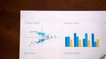
When it comes to representing categorical data graphically, bar graphs and pie charts are your best friends. Bar graphs allow you to compare different categories side by side, while pie charts provide a visual representation of the proportion of each category in relation to the whole. Both methods make interpreting categorical data easier and more engaging!
So, whether you’re comparing favorite movie genres or analyzing survey results, understanding categorical data is crucial for effective communication and interpretation. Get ready to dive deeper into the world of data!
Measures of Center
Mean
The mean is your classic average. To calculate it, just add all the numbers in your dataset and divide by how many numbers you have. For example, if your data points are 2, 4, and 6, the mean would be (2 + 4 + 6) / 3 = 4. Simple, right?
But hold your horses! The mean can be a bit of a drama queen. If you have an outlier—a value that’s way higher or lower than the others—this can skew your mean. Imagine your dataset is 2, 4, 100. The mean here is (2 + 4 + 100) / 3 = 35.33. Ouch! That doesn’t really represent your data well.
Outliers can make the mean less reliable. So, while it’s a useful measure, always check for those pesky outliers before drawing conclusions.
Median
Next up, we have the median. This one’s the middle child of the statistics family. To find the median, arrange your data points in order and pick the middle value. If you have an even number of data points, take the two middle values and average them out.
Consider this dataset: 3, 1, 4, 2. Arranging it gives us 1, 2, 3, 4. The median is (2 + 3) / 2 = 2.5. Now, let’s say you have an odd number: 3, 1, 4. Here, the median is 2 because it’s the middle value.
The beauty of the median is its resilience against outliers. For example, if we add an outlier like 100 to our previous dataset, the median of 1, 2, 3, 4, 100 is still 3. So, if your data is skewed or has extreme values, the median is often a better indicator of center than the mean.
Mode
Now, let’s talk about the mode. This is the value that appears most frequently in your dataset. If your data is all about categories, the mode is your go-to statistic.
For example, in the dataset of shoe sizes: 7, 8, 7, 9, 8, 7, the mode is 7, as it appears most often.
Modes can come in handy in various scenarios, especially in marketing. Suppose a survey shows that most people prefer pizza toppings of pepperoni over others. The mode here would be pepperoni, guiding businesses in stocking their inventory.
Sometimes, you might have more than one mode. This is called a multimodal distribution. Say your dataset is 2, 3, 3, 4, 4, 5. Here, both 3 and 4 are modes.
Understanding the mode helps you see popular trends in data, making it super relevant in fields like marketing, where knowing what’s trending can shape your strategy.
In summary, the mean, median, and mode each offer unique insights into your data. While the mean gives a general average, the median provides stability against outliers, and the mode highlights frequency. By using these measures together, you can get a clearer picture of your dataset’s story. So, next time you’re crunching numbers, remember to consider all three!

Measures of Spread
Range
The range is the simplest measure of spread in statistics. It calculates the difference between the maximum and minimum values in a dataset. For instance, if your data points are 3, 7, and 10, the range is 10 – 3 = 7. Easy peasy, right?
However, the range has its quirks. It’s highly sensitive to outliers. A single extreme value can throw off the range entirely. Imagine a dataset of test scores: 55, 60, 62, and 100. The range would be 100 – 55 = 45. But those scores tell a different story when most scores are clustered around 60. Thus, while the range provides a quick glimpse of variability, don’t rely on it alone for a full analysis.
Interquartile Range (IQR)
Now, let’s chat about the Interquartile Range, or IQR for short. This measure focuses on the middle 50% of your data. To find the IQR, first identify the first quartile (Q1) and third quartile (Q3). The IQR is calculated as Q3 – Q1.
For example, in the dataset 2, 3, 5, 7, 9, the first quartile (Q1) is 3, and the third quartile (Q3) is 7. Thus, IQR = 7 – 3 = 4.
Why is the IQR your new best friend? It’s robust against outliers. Unlike the range, which can be easily skewed by extreme values, the IQR focuses on the heart of the data. This makes it a better indicator of spread when your dataset isn’t nice and tidy. You can learn more about it in Statistics for Dummies.

Standard Deviation
Next up is the standard deviation, the superhero of variability measures. It tells you how spread out the values are from the mean. In simple terms, a low standard deviation means data points are close to the mean, while a high standard deviation indicates they’re spread out over a wider range.
To calculate the standard deviation, follow these steps: First, find the mean of your dataset. Then, subtract the mean from each data point and square the result. Next, average those squared differences. Finally, take the square root of that average. Voila! You’ve got your standard deviation.
Interpreting standard deviation is straightforward: a small value indicates consistency, while a large value shows diversity in your data. For example, if the standard deviation of test scores is 2, most students scored close to the average. If it’s 10, scores are all over the map. If you want to dive deeper into this, check out How to Lie with Statistics.
In summary, the range, interquartile range, and standard deviation each tell a part of the story about your data’s spread. Use them wisely to get a clearer picture of what’s happening behind the numbers!

Graphical Representations of Data
Box Plots
Box plots are nifty little tools used in statistics to visually summarize data. They show the distribution of a dataset based on five key summary statistics: the minimum, first quartile (Q1), median, third quartile (Q3), and maximum. Think of a box plot as a visual sandwich, where the box represents the middle 50% of your data, and the whiskers extend to the range of the remaining data.
Let’s break down the components of a box plot:
- Minimum: The smallest data point, excluding outliers.
- Q1 (First Quartile): The median of the lower half of the data. This value separates the lowest 25% of the data from the rest.
- Median: The middle value of the dataset. It divides the data into two equal halves.
- Q3 (Third Quartile): The median of the upper half of the data. This separates the highest 25% from the rest.
- Maximum: The largest data point, excluding outliers.
This visual representation makes it easy to see the spread and skewness of the data, which is particularly helpful when comparing multiple datasets. For a visual aid, consider a Box Plot Poster to keep handy!
Now, let’s talk about outliers. Box plots are like detectives for spotting these pesky numbers that don’t quite fit in. An outlier is defined as a data point that lies significantly outside the overall pattern of distribution. In box plots, outliers are often indicated with dots or asterisks that sit outside the whiskers.
How do we spot them? The Interquartile Range (IQR) plays a significant role here. To identify outliers, we can use the formula:
- Outliers are any data points that fall below Q1 – 1.5 * IQR or above Q3 + 1.5 * IQR.
This means if a data point is too far from the box—either too low or too high—it’s flagged as an outlier. This feature of box plots allows statisticians to quickly identify unusual values that could skew analysis.
Using box plots effectively helps us understand the data’s overall distribution while keeping an eye on those outliers that might disrupt our statistical calculations. Whether you’re analyzing test scores, sales figures, or any dataset, box plots give you a clear snapshot of the landscape. So, the next time you see a box plot, remember: it’s not just a box; it’s your data’s story, told with style!
Outliers and Their Impact
Outliers are those pesky data points that stand out from the crowd. They’re like the kid in class who wears a bright neon shirt while everyone else is in subdued colors. Statistically, an outlier is a value significantly different from the rest of the dataset. Understanding outliers is crucial because they can distort your analysis and lead to misguided conclusions.
To identify outliers, we use the Interquartile Range (IQR) method. First, we find the first quartile (Q1) and the third quartile (Q3) of the dataset. The IQR is simply Q3 minus Q1. Any data point that lies below Q1 – 1.5 * IQR or above Q3 + 1.5 * IQR is considered an outlier. This method is favored because it focuses on the middle 50% of the data, making it robust against extreme values.
But what happens when we have outliers in our data? They can wreak havoc on summary statistics. For instance, the mean is highly sensitive to outliers. If you have a dataset of test scores, say 70, 75, 80, and 1000, the mean jumps to an astronomical 256.25! Meanwhile, the median remains unaffected, sitting comfortably at 80. This demonstrates that relying solely on the mean can lead to skewed interpretations of data.
Graphically, outliers can also influence representation. When plotting data, outliers can exaggerate the range, making it appear that there’s more variability than there actually is. This can mislead anyone trying to understand the data’s overall distribution. In box plots, outliers are often marked distinctly, allowing for quick visual identification.
In summary, understanding and identifying outliers is essential in statistical analysis. They can distort both summary statistics and graphical representations, leading to potentially erroneous conclusions. Keeping a keen eye on these outliers ensures that your analysis remains accurate and meaningful. For further insights into the world of statistics, consider picking up a copy of The Art of Statistics: Learning from Data.
Understanding the impact of outliers is crucial for accurate data analysis. Learn more about the topic in this article: inferential statistics vs descriptive statistics in data interpretation.
Please let us know what you think about our content by leaving a comment down below!
Thank you for reading till here 🙂
If you’re looking to dive deeper into data analysis, consider picking up Data Science for Business: What You Need to Know about Data Mining and Data-Analytic Thinking. It’s a great way to enhance your understanding and application of data science concepts!
All images from Pexels


