Introduction
In a world overflowing with data, transforming numbers into compelling visuals is not just an art; it’s a necessity. Singapore’s Department of Statistics (DOS) offers a treasure trove of tools and resources designed to help you make sense of complex datasets. Whether you are a seasoned analyst or a curious beginner, understanding how to effectively visualize data can elevate your storytelling and decision-making capabilities. Imagine sifting through mountains of numbers, seeking insights that seem hidden at first glance. This is where data visualization comes in, acting as a flashlight, illuminating patterns and trends that raw data simply can’t reveal. The DOS provides an array of resources that empowers you to create engaging visuals that resonate with your audience, making complex information accessible and easy to understand. What tools does the DOS offer, you ask? Buckle up! From interactive dashboards that bring real-time data to life, to infographics that tell stories at a glance, and videographics that simplify intricate concepts—there’s something for everyone. Utilization of these tools can transform your data into captivating narratives, enhancing your ability to communicate findings effectively. But why is data visualization so crucial? In today’s data-driven landscape, the ability to interpret and present data visually is more than just a skill; it’s a necessity. Engaging visuals not only capture attention but also facilitate discussions, drive strategic decisions, and foster a deeper understanding of the context behind the numbers. So, ready to unlock the secrets of effective data visualization? Let’s dive into the vibrant universe of data visualization and discover how to harness these resources to turn raw data into actionable insights! By the end of this guide, you’ll be equipped with the knowledge and tools needed to transform data into compelling stories that demand attention and inspire action. While you’re on this journey, consider enhancing your skills with Data Visualization: A Guide to Visual Storytelling. This book is like the Swiss Army knife for data enthusiasts; it equips you with the tools to craft visual narratives that can turn even the driest datasets into engaging tales!
Summary of Key Points
In this post, we’ll explore:- The importance of data visualization in today’s data-driven landscape.
- The various tools offered by the Department of Statistics Singapore, including interactive dashboards, infographics, and videos.
- Best practices for selecting the right visualization techniques based on your data type and audience.
- Real-world examples of effective data visualization and the impact they have.
- A step-by-step guide to using DOS tools for effective data storytelling.
- Tips on enhancing your visualizations for maximum impact.

The Importance of Data Visualization
Understanding Data Visualization
Data visualization is the graphical representation of information. It transforms numbers into visuals, making data easier to understand. Instead of staring at endless rows of numbers, we see colorful charts and graphs that tell a story. This visual approach allows analysts to interpret data quickly and efficiently. Why is this significant? Well, raw data can be a maze. It often hides trends and patterns that are crucial for decision-making. For instance, imagine looking at sales data for the past year. A table filled with numbers may not reveal much. However, a line graph can show a clear upward or downward trend, making it obvious when sales peak or dip. Effective visualizations help in identifying anomalies, trends, and correlations that raw data fails to convey. They act as the eyes of data analysis, revealing insights and enabling users to act based on visual evidence rather than guesswork. This is particularly important in sectors like finance, healthcare, and marketing, where data-driven decisions can lead to significant outcomes. If you’re looking for a comprehensive guide to mastering data visualization, check out The Visual Display of Quantitative Information by Edward R. Tufte. This book is a classic in the field and will help you understand the principles of effective visual communication, turning your graphs from bland to grand!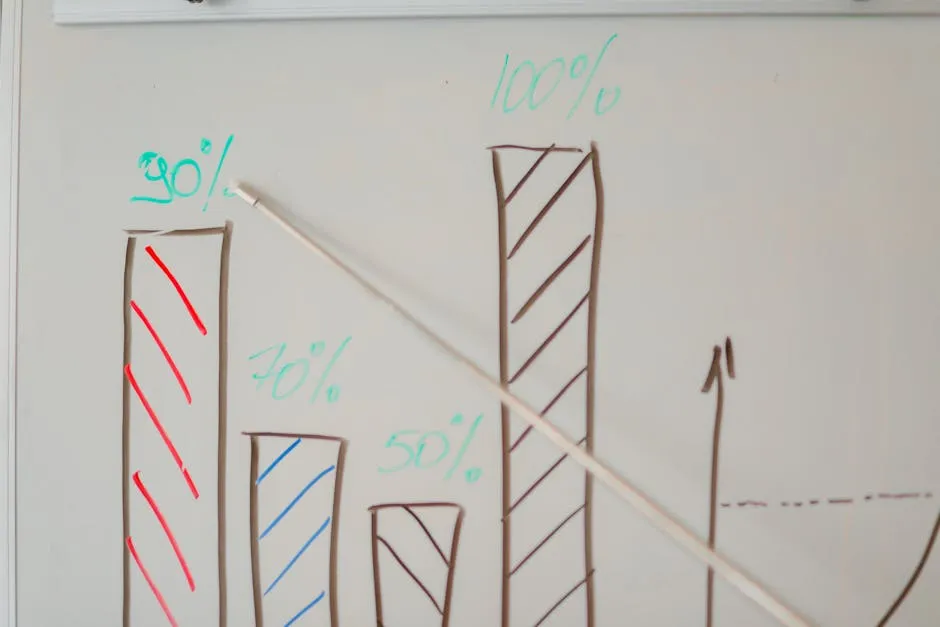
Benefits of Effective Data Visualization
Enhances comprehension: Visually represented data is easier to digest. Charts, graphs, and infographics simplify complex information. Imagine trying to understand a company’s quarterly performance through numbers alone! A bar chart makes it a breeze to see which quarters were the best or worst. It’s like swapping a dense textbook for a comic book—much more engaging! Supports decision-making: Visualizations aid in strategic planning. They provide actionable insights that inform decisions. For example, managers can assess performance metrics through visual dashboards. They can quickly spot issues and make timely adjustments, ensuring that the company stays on the right track. Engages audiences: Well-designed visuals capture attention. Whether during a presentation or in a report, engaging visuals make people sit up and take notice. Think about it: which would you prefer? A lengthy report filled with numbers or a punchy infographic that summarizes the key points? Engaging visuals create discussions, spark curiosity, and encourage deeper dives into the data. In a nutshell, effective data visualization not only makes your data look good but also enhances understanding, supports crucial decisions, and engages your audience. These benefits are essential for anyone looking to communicate insights clearly and effectively in today’s data-driven world. So, let’s embrace the power of visuals—they’re not just pretty pictures; they’re the key to unlocking the full potential of your data!
Tools from the Department of Statistics Singapore
Infographics
Infographics are a fantastic way to visualize data, making it engaging and understandable. The Department of Statistics Singapore offers various types, including Population Trends, E-Commerce, and more. For instance, the “Singapore Population” infographic provides a lively snapshot of essential demographic insights. This animated piece illustrates life expectancy, births and deaths, marriages and divorces, educational attainment, households, and housing statistics. It’s like the ultimate cheat sheet for understanding the dynamics of Singapore’s population. With vibrant visuals and concise data, it helps you grasp the ever-evolving face of Singapore in just a few seconds!
Interactive Dashboards
Interactive dashboards are the superheroes of real-time data exploration. They allow users to dive into specific metrics, offering personalized insights tailored to various industries. A prime example is the “Know My Industry – Retail Trade” dashboard. This interactive tool provides users with insights into industry trends, business outlook, rental costs, and labor market conditions within the retail sector. Imagine having the power to filter data by time periods or specific criteria, all at your fingertips! It’s an invaluable resource for businesses aiming to make informed decisions based on current industry dynamics.
Videographics
Videographics play a crucial role in simplifying complex data concepts. The Department of Statistics Singapore has embraced video as a medium to educate and inform. A standout example is the “Guide to the SingStat Table Builder” video. In this engaging presentation, viewers learn how to access over 2,300 customizable datasets from 70 public sector agencies. The video breaks down the process step-by-step, making it accessible even for those who may feel overwhelmed by the data. It’s like having a friendly guide lead you through the maze of statistics!
How to Access and Use These Tools
Accessing the resources from the Department of Statistics Singapore is straightforward. Begin by navigating to the DOS website, where you can find various visual tools. Look for tabs labeled “Visualising Data” or “Explore Data” to access infographics, dashboards, and videos. Once you’re there, selecting the right tool becomes an adventure! Consider your specific data visualization needs. Do you need real-time updates? Opt for interactive dashboards. Prefer visual storytelling? Choose infographics or videographics.

Best Practices for Data Visualization
Choosing the Right Visualization Type
Selecting the right visualization type can make or break your data presentation. Different types of visualizations serve distinct purposes. Let’s break down some common options. Bar Charts: These are perfect for comparing quantities across categories. For example, if you want to showcase sales figures for different products, a bar chart provides a clear visual comparison. It’s straightforward, making it easy for viewers to grasp key differences at a glance. Line Graphs: Ideal for displaying trends over time, line graphs show how data points connect chronologically. If you want to illustrate the growth of Singapore’s GDP over the past decade, a line graph will clearly depict the upward or downward trends.

Designing Effective Visualizations
Effective design principles enhance data visualization, ensuring clarity and engagement. Here are some crucial aspects to consider: Clarity: Your visuals should communicate the message clearly. Avoid cluttered designs. Use labels and legends judiciously, ensuring they enhance understanding rather than confuse it. Simplicity: Less is often more. Stick to the essentials. For instance, if a line graph has too many lines, it can overwhelm viewers. Instead, focus on the most significant data points to maintain attention. Relevance: Ensure your visuals directly support your narrative. Each element should contribute to the story you’re telling. If a certain data point doesn’t add value, consider omitting it. Color: Color can convey meaning, but it should be used thoughtfully. Different colors can represent different categories, but ensure there’s enough contrast for visibility. Use color palettes that are accessible to all, including those with color blindness. Typography: Fonts matter! Choose legible fonts that align with your overall design. Avoid overly decorative fonts that might distract from your message. Consistency in font usage across your visuals also enhances professionalism. Layout: A well-structured layout guides the viewer’s eye. Group related information together, and use whitespace effectively to prevent a cramped appearance.
Crafting a Story with Your Data
Data storytelling breathes life into your visuals. Here’s how to weave a compelling narrative through your data: Structure: Start with a strong introduction that outlines the key findings. Follow this with supporting visuals that build on your main points. Conclude with a summary that ties everything together, reinforcing your narrative arc. Context: Provide context for your visuals. Explain why the data matters. For example, if you show a spike in unemployment rates, accompany it with information about economic conditions during that period. This helps viewers understand the implications behind the numbers. Narrative: Use storytelling techniques to engage your audience. Incorporate anecdotes or real-life examples that relate to the data. This can humanize the statistics, making them more relatable. Engagement: Encourage interaction when possible. For instance, if using interactive dashboards, prompt users to explore different variables. This not only makes the experience more engaging but also empowers them to draw their own conclusions.
Case Studies
Singapore has made remarkable strides in data visualization, providing real-world examples that highlight its effectiveness. A notable case is the “Singapore Population” infographic. This animated visual not only showcases demographic changes over the years but also illustrates trends like life expectancy and marriage rates. By making intricate data accessible, it helps citizens understand the dynamics of their society. This infographic sparked conversations about community planning, influencing policies on housing and healthcare.
Lessons Learned
From these successful projects, several key takeaways emerge. First, clarity is king. Visuals must present information in a straightforward manner. Overly complex visuals can confuse rather than inform. Keeping designs simple and focused allows audiences to grasp essential messages quickly. Second, interactivity enhances user engagement. Tools like interactive dashboards encourage exploration, allowing users to delve deeper into data that matters to them. This two-way interaction increases retention and understanding of the data presented.
For more insights into the tools used in data visualization, check out our article on top michigan state basketball statistics tools for data visualization.
All images from Pexels
