
Introduction
In the age of big data, the ability to visualize information can make all the difference. Enter the realm of data visualization tools—your trusty sidekicks in transforming complex datasets into digestible insights. But with so many options out there, how do you choose the right one? Fear not! The Department of Statistics Singapore has curated a list of top-notch data visualization tools that can elevate your data game. Let’s embark on a journey through the vibrant world of data visualization, where numbers dance and graphs tell stories!
Summary
Data visualization tools are essential for translating complex data into formats that are easier to understand and act upon. The Department of Statistics Singapore emphasizes the importance of using effective visualization tools to enhance comprehension and decision-making. This article will explore the top data visualization tools recognized by the Department, including their unique features, use cases, and advantages.
We will dive into categories like interactive dashboards, infographics, and videographics, highlighting tools like Tableau Software, Microsoft Power BI, and Google Data Studio. Whether you’re a data analyst, business executive, or academic, you’ll find insights into how these tools can facilitate better data storytelling and drive informed decisions. By the end, you’ll be equipped with the knowledge to select the right data visualization tool tailored to your needs.

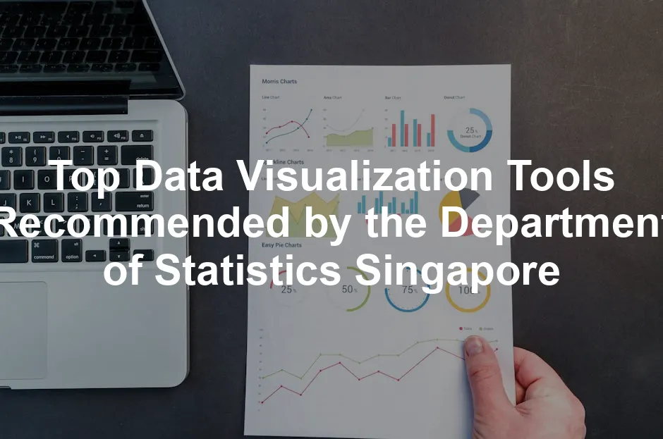
Top Data Visualization Tools Recommended by the Department of Statistics Singapore
Infographics Tools
Infographics are essential for visually communicating data. They condense complex information into engaging visuals. Tools like Datawrapper and Canva shine in creating eye-catching graphics. Datawrapper allows easy creation of interactive charts and maps without coding. Meanwhile, Canva provides an extensive library of templates, perfect for quick designs.
For example, the Department of Statistics Singapore frequently uses infographics to present key statistics on topics like population trends and the economy. These visuals make information digestible and appealing to a broad audience. Plus, if you’re in need of tools to enhance your graphic design skills, consider investing in Graphic Design Software. It’s a great way to elevate your design game!

Interactive Dashboards
Interactive dashboards are game-changers for real-time data analysis. They allow users to explore data dynamically, making insights more accessible. Tableau and Microsoft Power BI are standout tools in this category. Tableau offers robust features for creating intuitive dashboards from various data sources. It’s known for its user-friendly interface and extensive customization options.
Power BI, on the other hand, integrates seamlessly with other Microsoft products. It provides real-time updates and AI-driven insights, allowing businesses to track performance efficiently. Both tools empower users to visualize complex data simply and effectively. Need a boost in your productivity? Check out a High-Performance Laptop to run these powerful tools smoothly!

Videographics
Videographics are an engaging way to present data through animation and storytelling. These tools make information lively, capturing viewers’ attention. Flourish and Google Data Studio are excellent choices for creating videographics. Flourish allows users to build stunning visual stories that can be shared easily. It’s particularly favored by journalists and content creators for its interactive capabilities.
Google Data Studio, while primarily known for dashboards, can also create video-like presentations. It connects to various data sources, enabling users to craft compelling narratives around their data. These videographics can significantly enhance audience understanding and retention of information. And if you’re looking to create stunning presentations, consider a Laser Projector to wow your audience!

In conclusion, the world of data visualization is vast and varied. The Department of Statistics Singapore recommends tools that cater to different needs, from infographics to interactive dashboards and videographics. By using these tools, you can transform data into stories that resonate and inform your audience effectively.
For a deeper understanding of how the Department of Statistics Singapore compares its statistical models with global standards, check out this article on comparing statistical models from the Department of Statistics Singapore vs global standards.
Future Trends in Data Visualization
Emerging Technologies
Data visualization is evolving like a butterfly emerging from its chrysalis. And boy, it’s about to take flight! Emerging technologies are set to revolutionize how we visualize data. Think artificial intelligence (AI) and machine learning (ML). These powerful tools can automate data analysis, providing insights at lightning speed. Imagine algorithms generating visualizations based on user queries in real-time. It’s like having a personal data assistant!
Moreover, augmented reality (AR) and virtual reality (VR) are making waves. These technologies allow users to interact with data in immersive environments. Picture walking through a 3D model of a city, engaging with population statistics as if they were tangible objects. This hands-on approach enhances understanding and retention, making the data experience unforgettable. If you’re looking to dive into this immersive world, consider an Augmented Reality Headset or Virtual Reality Headset!

Another exciting trend is the rise of cloud-based visualization tools. These platforms enable collaboration across teams, regardless of location. No more emailing spreadsheets back and forth! Everyone can access the same dashboard, making teamwork smoother and more efficient.
Predictions for the Next 5 Years
So, what can we expect in the next five years? First, data storytelling will take center stage. Companies will focus on not just presenting data but crafting narratives around it. Visualizations will become more intuitive, guiding users through insights seamlessly. This trend will empower stakeholders to make informed decisions faster.
Next, expect a surge in customization options. Users will demand more personalized visualizations tailored to their specific needs. Tools will evolve to offer more flexible features, allowing users to design dashboards that reflect their unique data stories. And for those creative souls, the Digital Drawing Pad can be a game changer!

Lastly, the integration of data ethics into visualization practices will become crucial. As data privacy concerns grow, organizations will prioritize transparent and ethical data representation. Visualizations will need to not only inform but also uphold trust and integrity.
In summary, the future of data visualization is bright and full of potential. With emerging technologies paving the way, we can anticipate a world where data is not just seen but experienced. Get ready for a revolution in how we visualize our world!
Conclusion
In the ever-evolving landscape of data, visualization tools play a crucial role in transforming raw numbers into compelling insights. The Department of Statistics Singapore highlights the importance of selecting the right tools to enhance understanding and facilitate decision-making. With numerous options available, each tailored to specific needs, the right choice can significantly impact the quality of data storytelling.
From infographics that simplify complex data to interactive dashboards that allow dynamic exploration, the recommended tools are designed to meet diverse requirements. Tools like Tableau and Microsoft Power BI excel in providing real-time analytics and user-friendly interfaces, making them favorites among professionals. Meanwhile, Datawrapper and Canva shine when it comes to creating engaging infographics that communicate key statistics effectively.

As we look to the future, the integration of emerging technologies will further enhance our visualization capabilities. Expect AI-driven insights, immersive experiences through AR and VR, and tailor-made visualizations that truly resonate with audiences. The emphasis on data ethics will ensure that our visual representations are not just informative but also trustworthy. And if you’re gearing up for those long data sessions, don’t forget to grab a pair of Blue Light Blocking Glasses to protect your eyes!

In conclusion, investing time in understanding and utilizing these tools is invaluable. By harnessing the power of data visualization, organizations can drive informed decisions, foster collaboration, and ultimately improve outcomes. So, roll up your sleeves, dive into these tools, and let your data tell its story!
FAQs
Please let us know what you think about our content by leaving a comment down below!
Thank you for reading till here 🙂
All images from Pexels


