

Introduction
In a world driven by data, the strip chart stands out as a simple yet powerful tool for visualizing information over time. Whether you’re an engineer plotting temperature fluctuations or a scientist tracking a chemical reaction, strip charts have been there, ink on paper, capturing the nuances of change. But how much do you really know about this fascinating graphical representation? Historically, strip charts began as a way to record continuous data. Picture this: engineers and scientists hunched over their instruments, meticulously capturing data points on long rolls of paper. It might not sound glamorous, but these charts paved the way for modern data visualization. Today, strip charts are essential in various fields like engineering, healthcare, and environmental science. They’re not just for the data geeks anymore; anyone can appreciate the clarity they bring to complex datasets. Want to see a trend? Strip charts have your back. Need to monitor a process? They do that too. In this extensive guide, we’ll unravel the mysteries of strip charts and explore their applications, advantages, and evolution. From the classic analog versions to sleek digital formats, we’ll cover it all. So buckle up—your journey into the world of strip charts is about to begin! Imagine walking into a lab where the walls are adorned with colorful strip charts. Each line tells a story, revealing trends, anomalies, and patterns. It’s like reading a book, but instead of words, you’re deciphering data. And the best part? Strip charts make it easy to understand what’s happening at a glance. As we dive deeper into this guide, we’ll shed light on the different types of strip charts available. We’ll discuss how to create and interpret them effectively, and even touch on their historical significance. Curiosity piqued? Let’s embark on this enlightening adventure and uncover the intricate world of strip charts!
Summary of Key Points
Strip charts, also known as strip chart recorders, are invaluable in various fields such as engineering, science, and healthcare. This article will cover:- The definition and history of strip charts.
- Different types of strip charts and their uses in various industries.
- The advantages of using strip charts over other data visualization tools.
- How to create and interpret strip charts effectively.
- The transition from traditional strip charts to digital alternatives.
- Practical applications of strip charts in real-world scenarios.
- A comparison of strip charts with other forms of data representation.
Applications of Strip Charts
Engineering Applications
Strip charts are indispensable in engineering. They monitor processes, keeping an eye on temperature and pressure changes. Picture an assembly line: machines whirring, products moving, and data flowing. Engineers rely on strip charts to visualize this data in real-time, transforming chaos into clarity. Take a case study from the manufacturing industry. A factory producing auto parts uses strip charts to monitor temperature during welding. By plotting the temperature over time, engineers can quickly spot anomalies. If the temperature strays from the ideal range, they can take corrective action immediately. This proactive approach not only ensures product quality but also minimizes waste and enhances safety. With strip charts, engineers can prevent costly mistakes before they happen. If you’re diving into data visualization, consider investing in a reliable Strip Chart Recorder. This tool is essential for anyone serious about monitoring continuous data, ensuring that you have the insights you need to make informed decisions.Scientific Research
In the realm of scientific research, strip charts play a pivotal role in laboratory experiments and data collection. They’re more than just pretty lines; they’re essential for tracking changes over time. Imagine a chemist observing a reaction. With a strip chart, they can record data points as the reaction unfolds, providing a visual timeline of events. For instance, consider a lab studying the effects of temperature on a chemical reaction. As the scientist heats the mixture, they use a strip chart to track changes in pressure. This real-time visualization reveals how the reaction behaves under different conditions. The ability to see these shifts helps researchers develop a deeper understanding of the underlying processes. For your scientific endeavors, don’t forget to equip yourself with a good Digital Thermometer. Accurate temperature readings are crucial for successful experiments, and this gadget will ensure you get it right every time.Healthcare Monitoring
Strip charts have found a home in healthcare, especially in patient monitoring systems. They track vital signs like heart rate and temperature. Imagine a hospital room where a patient’s heart rate is displayed on a strip chart. This visual representation allows doctors and nurses to monitor fluctuations, ensuring timely interventions. A real-life case study illustrates this perfectly. In a clinical setting, nurses use strip charts to monitor patients recovering from surgery. Each line on the chart corresponds to a patient’s heart rate over time. If the chart shows an increase in heart rate, medical staff can investigate further. This quick response can be crucial, potentially saving lives. Strip charts make it easy to visualize changes and act accordingly.Environmental Studies
Environmental studies also benefit from strip charts. They track changes in climate data, providing insights into our planet’s health. As researchers collect data on temperature, precipitation, and other factors, strip charts offer a visual tool for analysis. Accuracy is paramount in environmental research. Strip charts help scientists identify trends and anomalies in data. For example, when tracking annual temperature changes, a strip chart can reveal patterns over decades. This information is vital for understanding climate change’s impact. By presenting data clearly, strip charts contribute to informed decision-making in environmental policy and conservation efforts.
Advantages of Using Strip Charts
Simplicity and Clarity
One of the standout advantages of strip charts is their simplicity. They can simplify complex datasets, turning confusion into clarity. Stakeholders appreciate this visual appeal, as it helps them grasp essential information quickly. With just a glance, they can see trends, fluctuations, and anomalies.Real-Time Monitoring
Real-time monitoring is another significant benefit of strip charts. They allow for immediate data visualization, which is crucial in industrial applications. Imagine a power plant: operators need to monitor energy output continuously. Strip charts provide that instant feedback, allowing for quick adjustments and better overall performance.Historical Record Keeping
Strip charts also serve as historical records. They play a vital role in maintaining historical data, especially in regulated industries. For example, environmental regulators may require companies to keep track of emissions over time. Strip charts make it easy to document this data, ensuring compliance with regulations. They offer a clear, concise way to present historical information, making audits and reviews a breeze. In summary, strip charts are powerful tools across various applications. Whether in engineering, scientific research, healthcare, or environmental studies, their advantages are clear. They simplify data, provide real-time insights, and maintain historical records, making them invaluable in today’s data-driven world.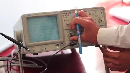
Creating and Interpreting Strip Charts
Step-by-Step Guide to Creating a Strip Chart
Creating a strip chart is easier than you might think! First, let’s gather the necessary tools and software. For digital strip charts, software like Excel for Beginners Book, Google Sheets, or specialized programs such as MATLAB for Engineers Book can work wonders. These platforms offer user-friendly interfaces and robust functionalities to help you bring your data to life. Now, onto the plotting process! Here’s a simplified step-by-step guide:- Collect Your Data: Ensure you have the data you wish to visualize. Data can come from experiments, surveys, or any real-time monitoring system.
- Open Your Software: Launch your chosen software and create a new spreadsheet or workspace.
- Input Data: Enter your data into the software. Typically, time or category goes on the X-axis, while the variable being measured is on the Y-axis.
- Select Chart Type: Choose the strip chart option. If it’s not available, a line chart often does the trick.
- Customize Your Chart: Add labels, adjust colors, and tweak styles to enhance clarity. Remember, a well-labeled chart speaks volumes!
- Analyze Your Chart: Once plotted, take a moment to examine the visualization. Look for trends, patterns, and anomalies that catch your eye.

Best Practices for Interpretation
Interpreting strip charts requires a keen eye and a bit of practice. Here are some tips to help you read and analyze strip charts accurately:- Understand the Axes: Familiarize yourself with what each axis represents. The X-axis usually represents time or categories, while the Y-axis shows the measured variable.
- Look for Trends: Are there upward or downward trends? Trends can indicate patterns or changes over time, which are crucial for decision-making.
- Spot Anomalies: Keep an eye out for outliers or unexpected spikes. Anomalies can reveal critical insights or errors in data collection.
- Context is Key: Always consider the context. Understanding the background of the data helps in interpreting the chart accurately.
- Ignoring Scale: Always check the scale on both axes. Misinterpretation can occur if the scale is not uniform.
- Rushing to Conclusions: Take your time. A hasty analysis might lead to misinterpretation of the data trends.
- Neglecting Data Limitations: Remember, every dataset has its limitations. Knowing these will help you contextualize your findings correctly.
Understanding best practices for interpretation can greatly enhance your skills in data visualization. tips for effective data analysis
The Evolution from Analog to Digital
Transitioning to Digital Strip Charts
The transition from analog to digital strip charts marks a significant evolution in data visualization. Traditionally, analog strip charts relied on physical paper and ink, which, let’s face it, could be messy and cumbersome. In contrast, digital strip charts offer a sleek, efficient alternative. The shift began with the rise of electronic data recording methods. Engineers and scientists quickly realized that digital strip charts could capture data more accurately and efficiently. No more waiting for ink to dry! With the click of a button, data points could be recorded in real-time, making the process faster and more reliable. Digital strip charts offer several advantages over their analog counterparts. For starters, they provide enhanced accuracy. Data can be plotted with precision, minimizing human error. Additionally, digital formats allow for easier data manipulation. Want to zoom in on a specific timeframe? No problem! Digital tools make it a breeze.Current Technologies and Tools
Today, several software tools dominate the digital strip chart landscape. Among the most popular are Microsoft Excel and Google Sheets, which allow users to create basic strip charts with ease. For more advanced features, MATLAB for Engineers Book and OriginLab provide specialized functionalities for engineers and researchers. When comparing these tools, consider features like user interface, data handling capabilities, and integration with other software. For example, MATLAB excels in handling complex datasets, while Excel is user-friendly for quick visualizations. In summary, the evolution from analog to digital strip charts has transformed how we visualize data. With technological advancements, creating and interpreting strip charts has never been easier, making them essential tools in various fields.
Conclusion
In summary, strip charts are more than just lines on paper; they symbolize the evolution of data visualization. From their humble beginnings in engineering labs to their vital role in healthcare and environmental science, the significance of strip charts cannot be overstated. Each line tells a story, revealing trends and anomalies that would otherwise remain hidden. They are a bridge between complex datasets and clear understanding. As we transition further into the digital age, strip charts maintain their reliability. They are effective tools for anyone seeking to uncover the narratives within data. Unlike other fancy graphs that might confuse the viewer, strip charts offer a straightforward approach to data representation. They show you what you need to see without the fluff. Consider the world of continuous data. It’s like a river flowing with information, and strip charts are your trusty kayak, guiding you through the currents. They are particularly useful for real-time monitoring, allowing quick responses to changes. Whether in an engineering setting, a laboratory, or a medical facility, strip charts help professionals keep their pulse on vital processes. Moreover, their historical significance is noteworthy. Many industries rely on them for regulatory compliance. They provide a clear, concise record of past data, essential for audits and reviews. This ability to maintain historical records makes them invaluable in our data-driven world. As you embark on your journey of data visualization, consider incorporating strip charts into your toolkit. They are timeless and versatile, proving that sometimes, simple solutions are the best. Your window into understanding continuous data awaits, and it’s lined with the reliability and clarity that only strip charts can provide.
FAQs
What is a strip chart recorder?
A strip chart recorder is an instrument that creates a continuous visual representation of data over time. It uses a pen to draw on a moving strip of paper, allowing users to track variables like temperature, pressure, or speed. Applications include process control in manufacturing, environmental monitoring, and laboratory experiments.
How do you read a strip chart?
Reading a strip chart is straightforward. Start by checking the axes: the X-axis usually represents time, while the Y-axis shows the measured variable. Look for trends—are the lines going up or down? Spot any anomalies or outliers that deviate from the expected pattern. Context is crucial; understanding the background of the data will help you interpret it accurately.
Are strip charts still relevant today?
Absolutely! Strip charts remain relevant in modern data visualization practices. While digital technologies have emerged, the simplicity and effectiveness of strip charts make them a go-to option for many professionals. They’re still used in industries like healthcare, engineering, and environmental science for data tracking and monitoring.
What are common mistakes when using strip charts?
Common mistakes include not checking the scale of the axes, which can lead to misinterpretation. Rushing to conclusions without fully analyzing the data can also skew understanding. Additionally, neglecting the limitations of the data can lead to inaccurate interpretations, so always consider the context when using strip charts.
Can strip charts be created online?
Yes, several online tools allow users to create strip charts. Platforms like Google Sheets, Microsoft Excel, and specialized software like Plotly or Tableau offer user-friendly interfaces for constructing strip charts. With these tools, you can easily input your data and visualize it without needing extensive programming knowledge.
The Basics of Strip Charts
What is a Strip Chart?
A strip chart is a graphical representation of data plotted over time. It features a horizontal axis, typically displaying time, and a vertical axis showcasing the variable being measured. Think of it as a timeline where each data point tells a story. Strip charts can be simple, yet they reveal complex trends when viewed as a whole. Historically, strip charts emerged as a solution for continuous data recording. Picture engineers of yesteryears, with ink pens in hand, carefully documenting measurements on long rolls of paper. These early instruments, known as strip chart recorders, laid the groundwork for today’s advanced data visualization techniques.Types of Strip Charts
- Analog Strip Charts: These traditional charts use physical paper and ink. They’re often found in settings where continuous monitoring is essential, like manufacturing. The pen moves in real-time, creating a visual record of processes. While they have their charm, they can be messy and less accurate.
- Digital Strip Charts: These modern counterparts have taken the world by storm. Utilizing software, digital strip charts can record data with remarkable precision. They offer features like zooming in on specific data points, which can be a game changer for detailed analysis. The transition to digital has revolutionized data visualization, making it more accessible and efficient.
Key Components of Strip Charts
Key components of strip charts include the axes, legends, and data lines. The X-axis usually represents time, while the Y-axis indicates the variable being monitored. Understanding scale and units of measurement is crucial. If you’re plotting temperature, for example, ensure your Y-axis reflects appropriate temperature units like Celsius or Fahrenheit. Legends provide context for the data lines. If multiple variables are plotted, legends help distinguish between them. Data lines visually connect the dots, showing trends and fluctuations. By grasping these components, you can effectively interpret what the strip chart is conveying. Now that you know the basics, you’re well on your way to becoming a strip chart aficionado! With a solid understanding of what strip charts are and their components, you’re ready to explore their fascinating applications in various fields. Stay tuned for more insights! Please let us know what you think about our content by leaving a comment down below! Thank you for reading till here 🙂All images from Pexels


