

Introduction
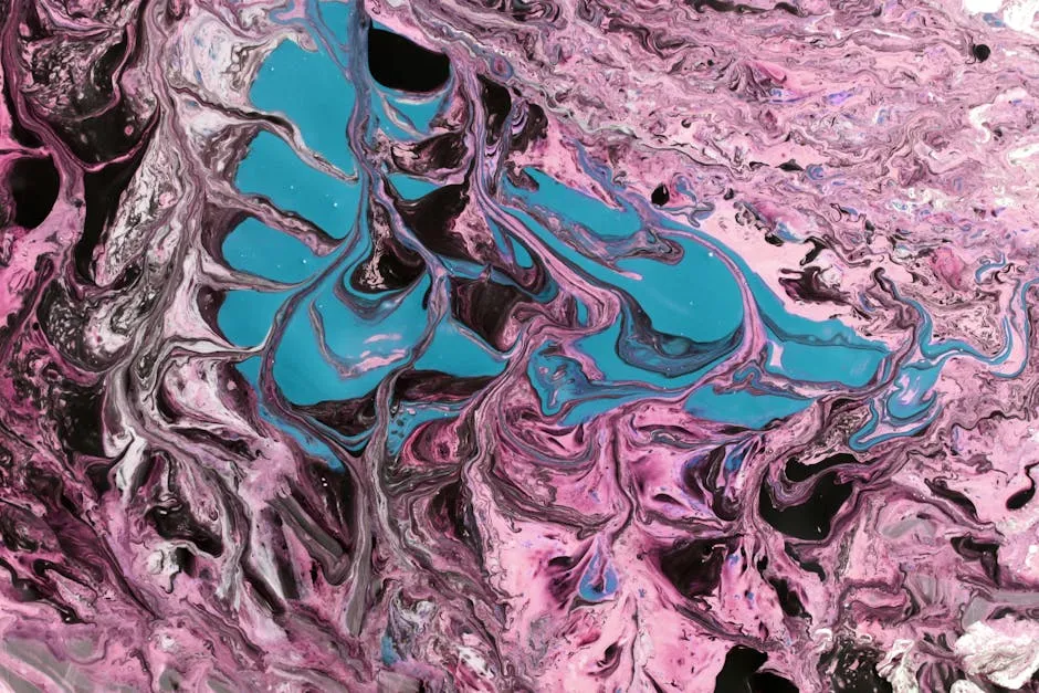
In a world where colors speak louder than words, understanding the intricacies of color charts can be your secret weapon. Whether you’re a web designer trying to create a stunning interface or an artist seeking the perfect palette, a color chart is your go-to resource. But what exactly is a color chart, and why does it matter? A color chart is a visual representation of colors, showcasing various shades, tones, and formats that help you make informed design decisions.
Color charts come in handy across various domains, from graphic design to fashion and even interior decorating. They allow for quick comparisons, enabling you to pick the right colors for your projects. For designers, using a color chart can mean the difference between a captivating design and a lackluster one. Plus, color is a powerful tool in evoking emotions and creating memorable experiences.
This post dives into the vibrant universe of color charts, exploring their types, uses, and how to create your own. We’ll cover everything from flat design to web-safe colors, ensuring you have all the knowledge you need at your fingertips. So, grab your RGB values and get ready to color your world with knowledge! Get excited as we uncover the colorful secrets that can elevate your work and bring your creative visions to life.

Understanding Color Charts
What is a Color Chart?
A color chart is a visual tool that displays various colors in an organized manner. It helps users identify, compare, and choose colors effectively. Think of it as a color buffet—where you can sample a bit of everything before making a decision.
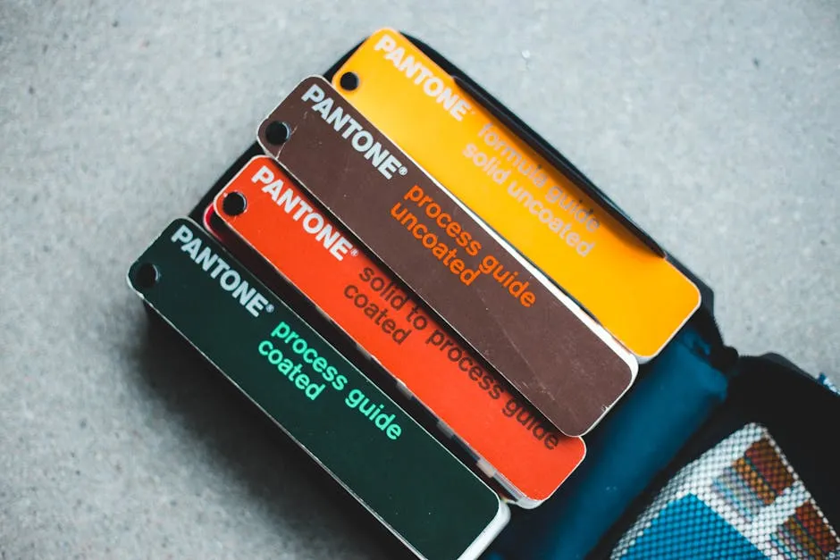
Color charts serve multiple purposes across various industries. In design, they guide artists and graphic designers in selecting harmonious color combinations. For manufacturers, these charts ensure consistency in product colors, which is vital for branding. In the fashion industry, color charts help designers predict trends and create appealing collections. If you’re looking for a handy tool to keep your colors organized, consider a Color Swatch Book. It’s a designer’s best friend!
Moreover, color plays a crucial role in communication. Different colors evoke different emotions. For example, blue often conveys trust and calmness, while red can signify passion or urgency. Thus, understanding color charts can empower professionals to make informed choices that resonate with their audience.
In essence, a color chart isn’t just a pretty palette; it’s a strategic tool that enhances creativity and decision-making across numerous fields. With the right color chart, anyone can confidently navigate the colorful world of design, art, and manufacturing.

Types of Color Charts
Flat Design Color Chart
Flat design has taken the web by storm! By using bold, eye-catching colors and simple shapes, this design style creates clean and user-friendly interfaces. Flat design color palettes often feature bright, vibrant colors, making them perfect for modern web design.
Want to see some examples? Look at popular websites; they often utilize flat design to enhance user experience. You can find numerous flat design color palettes online. Many resources offer download options in various formats, including CSS, SCSS, PNG, and SVG. This flexibility allows designers to incorporate these palettes directly into their projects, saving time and effort. For those looking to mix colors like a pro, a Color Mixing Guide for Artists can be invaluable!

Material Design Color Chart
Material Design is a visual language created by Google, emphasizing usability and aesthetic appeal. This design philosophy incorporates depth and shadows, giving a sense of realism while maintaining simplicity. Material Design color palettes are curated to provide balance and harmony.
These palettes feature primary, secondary, and accent colors to create engaging visual experiences. Material Design color charts are available in downloadable formats like PNG and SVG. Such resources enable designers to implement these palettes easily in their projects, ensuring a consistent look and feel. If you’re diving into graphic design, a Graphic Design Sketchbook is a must-have!
Web Safe Color Chart
Web-safe colors emerged during the early internet days when browsers had limited color capabilities. These 216 colors were standardized to display consistently across all major browsers, making them essential for early web design.
Even today, web-safe colors have their place, especially in retro designs or projects that aim for a vintage aesthetic. Examples of web-safe colors include bright hues like red, blue, and green, all easily recognizable. Much like the others, web-safe color charts can be downloaded in formats like PNG and SVG, ensuring accessibility for all designers. And while you’re at it, why not get your hands on a Color Theory Book to deepen your understanding?

RAL Color Chart
RAL color standards originated in Europe and are widely recognized in various industries. This color matching system allows for clear communication about colors, particularly in manufacturing and construction. RAL colors provide a comprehensive range of shades, each associated with a unique code.
Using RAL codes ensures consistency across products and projects. For instance, if a designer specifies RAL 5010 (Gentian Blue), everyone involved knows exactly what shade to use. However, it’s essential to note that RAL colors are protected by copyright, necessitating a user agreement for commercial use. This licensing safeguards the integrity of the color standards while allowing industries to maintain color consistency in their offerings.
Understanding Color Codes
Hex Color Codes
Hex color codes are a popular way to represent colors in web design. The code consists of six digits, each pair representing the intensity of red, green, and blue (RGB). The first two digits show red, the next two green, and the last two blue. For instance, the code #FFFFFF represents white, while #000000 indicates black.
To better grasp how these codes work, you can think of each pair as a number between 00 and FF in hexadecimal format. The value 00 means no intensity, while FF signifies full intensity. So, if you mix red at full intensity and no green or blue, you get #FF0000 for red.
You might wonder how to convert these hex codes into RGB values. It’s simple! Each pair in the hex code is converted to decimal. For example, #FF5733 translates to RGB as follows:
- Red: FF = 255
- Green: 57 = 87
- Blue: 33 = 51

Popular hex codes include:
- #FFFFFF for white
- #000000 for black
- #FF5733 for a vibrant coral shade
- #3498DB for a lovely blue
- #2ECC71 for a refreshing green
RGB Color Codes
The RGB color model is foundational in digital media. It combines red, green, and blue light in various intensities to produce other colors. Each color component is measured on a scale from 0 to 255.
In this model, RGB values are structured as three numbers in parentheses. For example, RGB(255, 0, 0) represents bright red. The absence of any color results in black, shown as RGB(0, 0, 0).
Calculating RGB values can be an intriguing process. You can use the formula: RGB = (R * 65536) + (G * 256) + B
To illustrate, let’s calculate RGB for white:
- R = 255, G = 255, B = 255
- Calculation yields: \( (255 * 65536) + (255 * 256) + 255 = 16777215

Here are some examples of common RGB codes:
- White: RGB(255, 255, 255)
- Black: RGB(0, 0, 0)
- Red: RGB(255, 0, 0)
- Green: RGB(0, 255, 0)
- Blue: RGB(0, 0, 255)

In the digital realm, understanding RGB codes empowers you to create captivating and vibrant designs. Whether you’re designing a website or creating an artwork, mastering these color codes is a game changer! And for those who enjoy the tactile experience of painting, a quality Acrylic Paint Set can bring your visions to life!

Creating Your Own Color Chart
Creating a custom color chart can elevate your design projects significantly. You’ll want the right tools to make this process smooth and efficient. Software like Adobe Color, Canva, or ColorHexa can help you design a stunning color chart. These tools allow you to experiment with different shades and visualize your selections.
Once you have your software ready, follow these steps to create your color chart:
- Define Your Project Needs: Determine the purpose of your color chart. Are you designing for a website, branding, or an artistic project?
- Select a Base Color: Start with a primary color that resonates with your project’s theme.
- Create Variations: Use your chosen software to generate different shades and tints of your base color. This will provide a range of options for your design.
- Organize Your Palette: Group similar colors together. This makes it easier to find the perfect hue later on.
- Export Your Chart: Save your color chart in a format that suits your needs, like PNG or PDF.
Accessibility is another crucial aspect of color selection. Always check your color combinations for contrast. Tools like the WebAIM Contrast Checker can help ensure your design is inclusive and user-friendly.

In summary, creating your color chart is a fun yet strategic endeavor. With the right tools, thoughtful planning, and a little creativity, you can craft a chart that enhances your projects and delights your audience.

Accessibility and Color Choices
When designing, color contrast is crucial for accessibility. High contrast ensures that text is readable against its background. This is especially important for visually impaired users. Imagine trying to read white text on a light yellow background. Yikes!
The Web Content Accessibility Guidelines (WCAG) recommend a contrast ratio of at least 4.5:1 for normal text. For large text, a 3:1 ratio is acceptable. This means that colors need to stand out against one another. Using color charts helps you visualize these ratios.
Creating inclusive designs requires thoughtful color choices. Start by understanding your target audience. Consider color blindness: about 8% of men and 0.5% of women have some form of color vision deficiency. Avoid problematic color combinations, like red and green. Instead, opt for colors with different brightness levels to ensure everyone can see your content.
Use tools like Adobe Color or ColorHexa to generate color palettes. These tools allow you to see how colors interact and help you select combinations that are both appealing and accessible. Remember, the goal is to create a design that everyone can enjoy. And speaking of enjoyment, how about a Colorful Coffee Mug to sip your favorite drink while you work?
For checking color contrast ratios, several resources are available online. The WebAIM Contrast Checker is a popular tool. Just input your foreground and background colors, and it calculates the ratio. Another excellent option is the Contrast Checker by the Accessible Colors project. These tools are user-friendly and provide immediate feedback.
By prioritizing accessibility in your color choices, you create a welcoming environment for all users. This not only boosts user satisfaction but also enhances your brand’s reputation. So, remember to choose wisely and keep your designs inclusive!
FAQs
What is the difference between Hex and RGB color codes?
Hex and RGB are two popular formats for color representation. Hex codes are six-character strings, starting with a hashtag. They represent colors in a hexadecimal format. For example, #FF5733 indicates a vibrant coral. Each pair of characters represents the intensity of red, green, and blue. On the other hand, RGB codes consist of three numbers in parentheses. Each number ranges from 0 to 255. For instance, RGB(255, 87, 51) translates to the same coral color. While Hex codes are often favored for web design, RGB codes are useful for digital displays. Both formats allow designers to communicate colors effectively.
How can I ensure my color chart is accessible?
Creating an accessible color chart is crucial for inclusivity. Start by checking contrast ratios. Use tools like the WebAIM Contrast Checker to ensure text is readable against its background. Aim for a contrast ratio of at least 4.5:1 for normal text. Additionally, consider color blindness. Avoid problematic combinations like red and green. Instead, opt for colors that differ in brightness. Tools such as ColorBrewer can help you choose color palettes that are friendly to all viewers. Lastly, always test your designs with real users to gather feedback on accessibility.
Can I use color charts for print design?
Absolutely! Color charts are not just for digital designs. They play a vital role in print design, too. However, you must consider color profiles. Unlike screens, printers use CMYK (Cyan, Magenta, Yellow, Black) to produce colors. Color charts designed for print often include CMYK values alongside RGB or Hex codes. This ensures accurate color representation in printed materials. Always test print samples before finalizing designs. This practice helps ensure the colors appear as intended on physical media.
Where can I find free color charts online?
Finding free color charts online is as easy as pie. Websites like HTML Color Codes offer various color charts, including flat design, Material design, and web-safe colors. They provide downloadable options in formats like PNG and SVG, perfect for designers. Another great resource is Adobe Color, which lets you create and explore color palettes. You can save your favorites and access them anytime. Additionally, many design blogs and forums share color charts and palettes, making it easy to discover fresh hues.
How do I choose a color palette for my project?
Selecting a color palette can be daunting, but it’s also exciting! Start by defining the project’s theme. Is it playful, serious, or elegant? This sets the tone. Then, consider your target audience. Different demographics resonate with different colors. Use color theory as your guide. For instance, complementary colors (opposite on the color wheel) create contrast, while analogous colors (next to each other) offer harmony. Tools like Canva’s Color Palette Generator can inspire you. Finally, test your palette with real users, making adjustments based on their feedback. Happy coloring!
Please let us know what you think about our content by leaving a comment down below!
Thank you for reading till here 🙂 And if you’re looking to add a splash of color to your life, check out a Colorful Throw Pillow for your couch!
All images from Pexels


