Introduction
Graphs are vital for data visualization and analysis. They simplify complex data, making it easier to understand. This article aims to highlight various types of graphs and their uses in different contexts. For a deeper understanding of statistical learning, check out this introduction to statistical learning with Python.
To keep your thoughts organized while brainstorming data ideas, consider using a Graph Paper Notebook. It’s perfect for sketching out your graphs before committing them to a presentation!
Summary and Overview
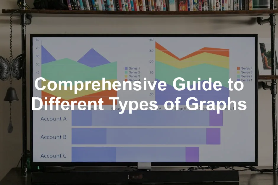
Graphs visually represent data, allowing us to identify trends, patterns, and relationships. They play a crucial role in effectively communicating information, especially in business and research. Choosing the right graph type enhances clarity and understanding. In this article, we will cover several graph types, including line graphs, bar charts, pie charts, and more. Each type serves a unique purpose and can significantly impact how data is perceived.
For those looking to dive deeper into the realm of data analysis, consider picking up a copy of Statistical Analysis Book. It’s like having a personal tutor for all things data!

Types of Graphs
1. Line Graphs
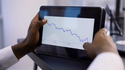
Line graphs display data points connected by straight lines. They are excellent for showing trends over time or continuous data. Use them when you want to illustrate changes, such as stock prices or temperature fluctuations. To create effective line graphs, label axes clearly and ensure the scale is consistent. Use different colors or styles for multiple lines to enhance readability. For example, a line graph showing monthly sales can effectively highlight growth trends over several years. They are particularly useful in time series analysis, allowing viewers to quickly grasp significant patterns.
To make your data pop, why not use a Colorful Markers Set? These vibrant markers can help you distinguish between different data series on your graphs, making your presentations more engaging!
2. Bar Charts
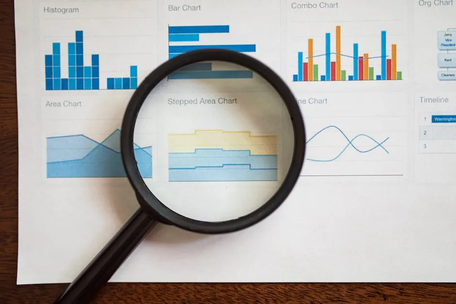
Bar charts are powerful tools for comparing different categories. They use rectangular bars to represent values, making it easy to visualize differences. In business, bar charts help track sales performance and customer preferences. In education, they can showcase student scores across subjects.
Variations of bar charts include stacked and grouped bar charts. Stacked bar charts display multiple data series in a single bar, showing the total and its components. Grouped bar charts present data side by side, facilitating easy comparison across categories.
To ensure clarity, label each axis clearly and use contrasting colors. Avoid clutter by limiting the number of categories. A well-designed bar chart can convey important insights effectively, making it a preferred choice for many data presentations. Consider using bar charts for your categorical comparisons to enhance understanding and engagement.

3. Pie Charts
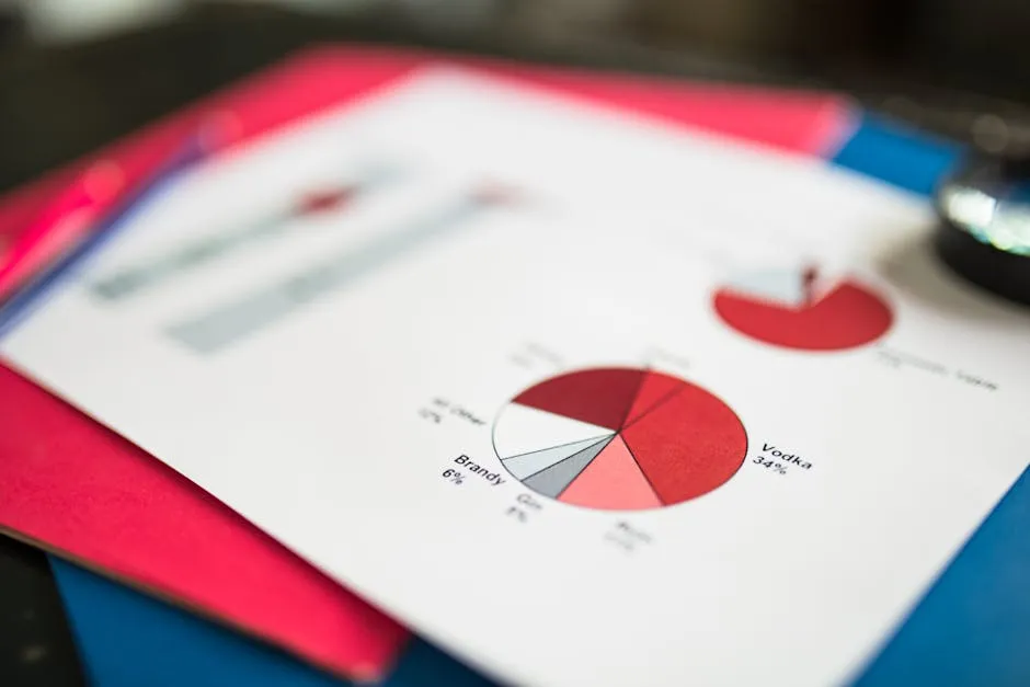
Pie charts represent part-to-whole relationships effectively. They consist of slices that show the proportion of each category within a whole. These charts are ideal for illustrating data with a limited number of categories, typically less than six or seven.
For instance, consider a pie chart displaying the market share of smartphone brands. Each slice represents a brand’s share of the total market, providing a quick visual understanding of dominance among competitors.
Despite their usefulness, pie charts have limitations. They can be misleading if there are too many slices, making it hard to distinguish between them. It’s best to avoid pie charts when the differences between values are minimal or when precise comparisons are necessary.
To create effective pie charts, ensure each slice is clearly labeled and use contrasting colors. Limiting the number of categories enhances clarity. Remember to use pie charts sparingly for clarity and impact.
4. Scatter Plots
Scatter plots display the relationship between two variables. Each point represents an observation in a two-dimensional space. This graph type helps identify trends, correlations, and outliers effectively. Scatter plots are particularly useful for visualizing regression analysis.
To interpret scatter plots, look for patterns. A positive correlation appears as points slope upwards, while a negative correlation slopes downwards. No clear pattern may indicate no relationship. For example, in a study on advertising spend and sales revenue, a correlation coefficient of 0.85 suggests a strong positive relationship.
For best practices, label axes clearly and choose appropriate scales. Avoid overcrowding by limiting data points. Use colors or shapes to differentiate groups, enhancing clarity. Remember, scatter plots are powerful for visualizing regression analysis.

5. Histograms
Histograms are graphical representations of frequency distributions. They show how numerical data is spread across different ranges. This type of graph is essential for visualizing the shape and spread of data.
Use histograms when you want to represent continuous data. They are ideal for large datasets. In contrast, bar charts are better for categorical data. For example, if you have exam scores for a class of students, a histogram can display how many students scored within specific score intervals.
When creating histograms, pay attention to data binning. Choose the right bin size to avoid misleading results. Too few bins can oversimplify your data, while too many can obscure patterns. For clearer insights, use histograms to analyze large datasets. They effectively highlight the frequency distribution of your data points, revealing trends and patterns easily.
For a bit of creative flair in your presentations, consider using a Sticky Notes for Brainstorming. They are perfect for jotting down ideas during your data analysis sessions!
For more tips on effective data analysis, refer to this article on tips for effective data analysis in economics and statistics.
To make your workspace more organized while diving into data, invest in a Desk Organizer for Office Supplies. A tidy desk can do wonders for your productivity!
Please let us know what you think about our content by leaving a comment down below!
Thank you for reading till here 🙂
All images from Pexels
