Introduction
One variable statistics is the backbone of data analysis. It helps us make sense of the endless streams of numbers we encounter daily. Imagine trying to make decisions based on a mountain of data without knowing where to start. Sounds overwhelming, right? This is why mastering one variable statistics is essential. In this article, we’ll guide you through the ins and outs of one variable statistics. You’ll learn key terminology that will empower you to communicate your findings effectively. We’ll also cover visualization techniques that can turn rows of numbers into eye-catching graphs. You’ll discover measures of central tendency, which help summarize data points into a single representative value. Moreover, we will dive into measures of variability, enabling you to understand the spread and consistency of your data. Finally, we’ll explore practical applications of one variable statistics in various fields. Ever wondered how to summarize the vast amount of data you collect on a single subject? By the end of this article, you’ll not only know how to do that but also appreciate the role one variable statistics plays in shaping our understanding of the world around us. So, let’s get started!
Understanding One Variable Statistics
Definition and Importance
One variable statistics, often referred to as univariate statistics, focuses on analyzing a single characteristic or attribute. This field plays a crucial role in research and data analysis. By simplifying complex datasets, it allows researchers to summarize and interpret data effectively without getting lost in the noise. The significance of one variable statistics extends across various fields. In psychology, for example, it aids researchers in understanding behaviors by analyzing responses to surveys. In business, it can track sales trends and customer preferences. Meanwhile, healthcare professionals can use it to monitor patient vitals and assess the effectiveness of treatments. One variable statistics is not just about crunching numbers; it’s about drawing meaningful conclusions from data. Without this foundational knowledge, advanced analyses involving multiple variables can become daunting and confusing. Therefore, mastering one variable statistics is essential for anyone looking to make data-driven decisions. If you’re looking to deepen your understanding of this topic, consider picking up a copy of R Programming for Data Science by Hadley Wickham. This book is a fantastic resource for those who want to master data analysis with R and gain insights into effective statistical practices.
Applications
The applications of one variable statistics are vast and varied. In education, teachers can analyze student performance based on test scores. By understanding the distribution of scores, educators can identify which areas require more attention. Meanwhile, in the realm of marketing, businesses can evaluate customer satisfaction through surveys, enabling them to refine their products and services based on direct feedback. Moreover, healthcare professionals rely heavily on one variable statistics. Tracking patient outcomes, such as recovery times or the effectiveness of medications, helps in improving treatment plans. In environmental studies, researchers can analyze pollution levels in different regions, allowing for better policy-making to protect our planet. Overall, one variable statistics is essential for clear, concise decision-making in various fields. By honing your skills in this area, you position yourself to interpret data more effectively and contribute to informed decision-making processes. So, whether you’re in business, healthcare, or education, knowing how to analyze a single variable can lead to significant insights. To further enhance your skills, check out The Data Warehouse Toolkit: The Definitive Guide to Dimensional Modeling by Ralph Kimball. This book offers a comprehensive look at data warehousing and its significance in statistical analysis.
Key Terminology
Individuals and Population In statistics, clarity is key. Individuals represent the specific objects or items being studied. These can be people, animals, or even abstract entities. For instance, if you’re examining the test scores of students, each student is an individual. The population, on the other hand, encompasses all individuals that meet a set criteria. So, if you’re studying the same test scores of all students in a school, that entire group is your population. Understanding this distinction helps ensure accurate data analysis and reporting. Variable Types Variables are the heart of any statistical analysis, and they come in two main flavors: categorical and quantitative. Categorical variables are like the colorful candies in a jar—they can be divided into distinct categories. For instance, think of variables such as favorite ice cream flavors or types of pets. You might have categories like chocolate, vanilla, or strawberry for ice cream, while pet categories could include dogs, cats, and fish. On the flip side, we have quantitative variables, which are numerical and can be measured. These can be further divided into discrete and continuous variables. Discrete variables are countable, like the number of students in a classroom or the number of cars in a parking lot. Continuous variables, however, can take on any value within a range, such as height, weight, or temperature. Understanding these variable types is crucial for choosing the right analysis techniques and visualizations, ensuring you communicate your data effectively. In summary, grasping the concepts of individuals versus population and the distinction between categorical and quantitative variables lays a strong foundation for your adventure into one variable statistics. These terms will pop up often, guiding your understanding and interpretation of the data at hand.
Best Practices for Data Visualization
Visual representation of data is crucial. It transforms numbers into insights. Here are some tips to ensure your visuals hit the mark: 1. Label Your Axes: Don’t leave your audience guessing! Clearly label both axes on your graphs. This provides context and ensures clarity. 2. Choose Appropriate Scales: Ensure your scales reflect the data accurately. Avoid misleading representations. For instance, a y-axis that starts from 0 provides a true picture of changes. 3. Use Colors Wisely: Colors can enhance understanding. But too many colors can confuse. Stick to a palette that is easy on the eyes and provides clear differentiation. 4. Keep It Simple: Clutter can distract from the message. Aim for simplicity. Remove unnecessary elements that don’t add value to the visualization. 5. Highlight Key Insights: Use annotations or callouts to draw attention to important data points. This guides your audience to the most critical information. 6. Consider Your Audience: Tailor your visuals to your audience’s understanding level. A technical audience might appreciate detailed graphs, while a general audience may prefer simpler representations. 7. Test Your Visuals: Before finalizing, show your graphs to a few people. Get feedback on clarity and effectiveness. Sometimes, fresh eyes catch what you might miss.
Effective data visualization is crucial for clear communication of insights. Learn more about effective data analysis techniques.
Summary Statistics
Measures of Central Tendency
In statistics, measures of central tendency summarize a dataset with a single representative value. These include the mean, median, and mode. Each offers unique insights into the data. Mean: The mean is the average of all data points. To calculate it, add all values and divide by the number of observations. For example, if you have the ages of five people: 20, 30, 25, 35, and 40, the mean age is (20 + 30 + 25 + 35 + 40) / 5 = 30. However, the mean can be skewed by outliers, such as if one person is 100 years old. You can learn more about what mean identically distributed means in statistics here.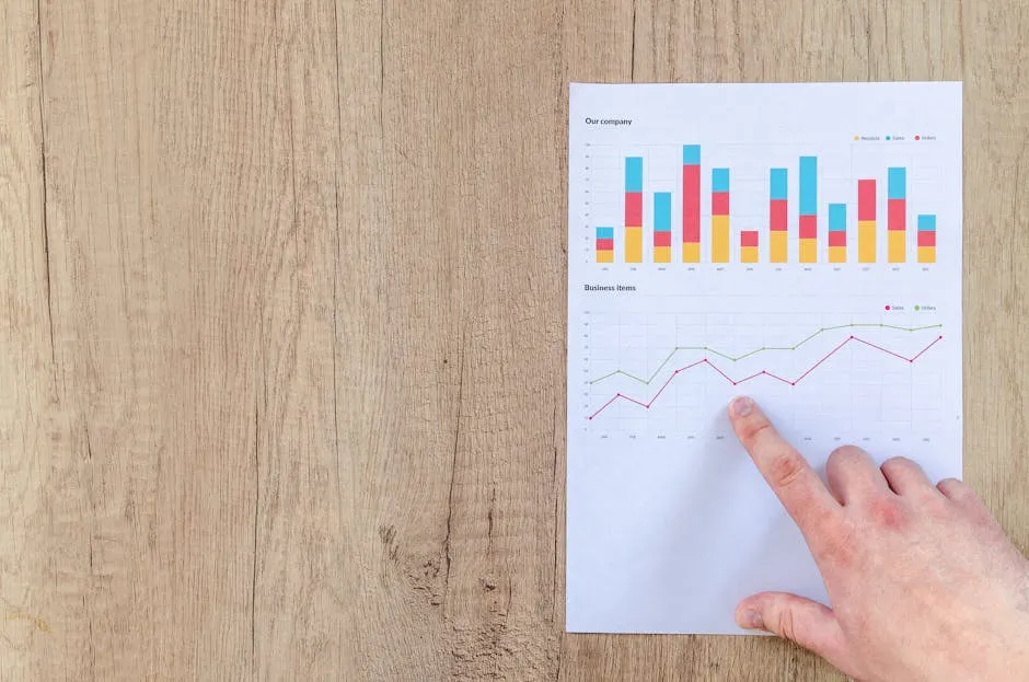
Median: The median is the middle value when data is sorted. It’s less affected by outliers. For the ages mentioned earlier, when sorted (20, 25, 30, 35, 40), the median is 30. If we add an outlier age of 100, the new median becomes 35, demonstrating its robustness. You can find insights about median salary trends in Poland for 2024 here.Understanding the mean is essential for accurate data analysis. Learn more about mean identically distributed in statistics.

Mode: The mode represents the most frequently occurring value. In a dataset of ages: 20, 20, 25, 30, 35, the mode is 20, as it appears most often. Mode is especially useful for categorical data, where it identifies the most common category. You can learn more about statsmodels residuals statistics here.The median is a crucial measure of central tendency. Discover more about median salary trends in Poland for 2024.

Each measure has strengths and weaknesses. The mean provides an overall average but can mislead with outliers. The median offers a true middle point, while the mode highlights common values. Choosing the right measure depends on the dataset and the specific insights sought.The mode is important for understanding categorical data. Learn more about statsmodels residuals statistics.
Measures of Variability
Measures of variability describe the spread or dispersion within a dataset. Understanding variability helps interpret data consistency and reliability. Key measures include range, variance, and standard deviation. Range: The range is the difference between the highest and lowest values in a dataset. For instance, in the ages 20, 25, 30, 35, and 40, the range is 40 – 20 = 20. A larger range indicates more spread, while a smaller range suggests clustering around the center. You can explore the crime statistics in Orange County, CA for a comprehensive overview here.
Variance: Variance quantifies how far data points are from the mean. To calculate, find the mean, subtract it from each data point, square the results, then average those squared differences. For example, with ages 20, 25, 30, 35, and 40, the variance shows how much the ages differ from the mean age of 30. Standard Deviation: The standard deviation is the square root of variance. It provides a measure of variability in the same units as the data. A low standard deviation indicates that data points are close to the mean, while a high standard deviation suggests greater spread. Using the previous example, if the standard deviation is 5, this means most ages fall within 5 years of the mean. Together, these measures of variability provide a full picture of the dataset’s distribution. By analyzing both central tendency and variability, you get a better understanding of the data’s behavior and reliability, leading to more informed conclusions.Understanding the range is vital in data analysis. Learn more about crime statistics in Orange County, CA.

Practical Applications
Using One Variable Statistics in Research
One variable statistics shines in research settings, where clear analysis is vital. Let’s look at two case studies that highlight its effectiveness.Case Study 1: Customer Satisfaction in Retail
A renowned retail chain conducted a survey to gauge customer satisfaction. They focused on a single variable: overall satisfaction score, rated from 1 to 10. By analyzing this one variable, they discovered that 75% of customers rated their experience at 8 or higher. This insight enabled management to identify trends and areas needing improvement. Consequently, they enhanced staff training, resulting in a 20% increase in satisfaction ratings over the next quarter.
Case Study 2: Health Outcomes in a Clinical Trial
In a clinical trial for a new medication, researchers monitored a single variable: the reduction in symptoms reported by patients. By assessing the average symptom score before and after treatment, they found a significant decrease. The average score dropped from 8.0 to 3.5, indicating the medication’s effectiveness. This analysis helped the team obtain FDA approval, illustrating how one variable statistics can drive impactful decisions in healthcare.
Tools and Software
For anyone venturing into one-variable statistical analysis, several tools stand out. R is a powerhouse for statistical computing, offering a wealth of packages for one-variable analysis. Excel is user-friendly and widely accessible, making it a great choice for beginners. Both platforms can handle basic calculations, create visualizations, and generate summary statistics efficiently. For those who prefer a more interactive experience, statistical applets online can help visualize datasets and calculate various statistics easily. You can find a comprehensive guide on descriptive statistics in Excel here.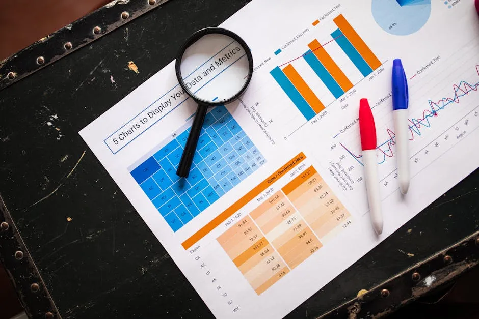
Exercises and Practice Problems
Ready to flex your statistical muscles? Here are a few exercises to practice calculating and interpreting statistics from sample datasets: 1. Exercise 1: Mean Calculation Given the following dataset representing the ages of participants in a study: 22, 25, 29, 33, 28, 30 Calculate the mean age. 2. Exercise 2: Median Calculation From the dataset: 12, 15, 9, 20, 18 Determine the median age. 3. Exercise 3: Mode Identification In the dataset below, identify the mode: 5, 7, 5, 8, 9, 5, 10, 7 4. Exercise 4: Range Calculation Calculate the range for the following dataset: 14, 22, 10, 18, 30 5. Exercise 5: Standard Deviation Use the dataset: 60, 70, 80, 90, 100 Find the standard deviation of this dataset. Practice these exercises, and you’ll be well on your way to mastering one-variable statistics! And if you’re eyeing a great way to keep your notes organized and thoughts clear, grab a Notebook for Data Analysis to jot down your insights and calculations!
Conclusion
One variable statistics is an indispensable tool in data analysis. It allows researchers, businesses, and healthcare professionals to make informed decisions based on clear insights from their data. By focusing on a single variable, one can simplify complex datasets and draw meaningful conclusions. We explored the applications of one variable statistics in real-world scenarios, such as customer satisfaction and health outcomes. These examples showcased how analyzing a single variable can lead to significant improvements and understanding. Moreover, we highlighted essential tools like R and Excel, which facilitate straightforward statistical analysis. Whether you’re a student, researcher, or professional, mastering these tools can enhance your data analysis capabilities. Also, consider checking out Excel 2021 for Dummies by Greg Harvey for a user-friendly approach to mastering Excel. In summary, one variable statistics is more than just a technique; it’s a stepping stone to deeper insights and data-driven decisions. Now, go forth and apply these concepts in your own projects. Your data awaits!
Frequently Asked Questions
What is the difference between one variable statistics and multivariable statistics?
One variable statistics examines a single characteristic. This approach lays the groundwork for more complex analyses. It simplifies data interpretation, allowing researchers to focus on one aspect at a time. In contrast, multivariable statistics evaluates relationships between multiple variables. While one variable statistics helps summarize data, multivariable statistics dives into interactions and dependencies. By mastering one variable first, you build a solid foundation for tackling more intricate statistical challenges later.
How do outliers affect one variable statistics?
Outliers can significantly skew measures of central tendency, like the mean. For example, in a dataset of ages, a single 100-year-old can raise the average age dramatically. This can misrepresent the actual data. Additionally, outliers increase variability measures such as standard deviation. To handle outliers, consider using median instead of mean for central tendency. Graphical methods, like box plots, can help identify outliers visually. Always assess their impact before finalizing your analysis.
Can one variable statistics predict outcomes?
While one variable statistics provides valuable insights, it’s limited in predictive power. It focuses on single-variable behavior without considering others. For instance, a student’s test score may not predict their overall academic success. To make robust predictions, multivariable analyses are necessary. These methods evaluate relationships between several variables, offering a more comprehensive view. If you’re aiming for accuracy in predictions, don’t forget to incorporate multiple variables in your analysis.
What are some common mistakes to avoid in one variable statistics?
Mistakes can lead to misleading conclusions. A common pitfall is over-relying on the mean in skewed datasets. This can misrepresent the data’s true center. Instead, consider using the median for a clearer picture. Another mistake is neglecting outlier analysis. Ignoring them can distort your findings. Lastly, using inappropriate visualizations can confuse your audience. Always choose the right graphical representation for your data type. By avoiding these traps, your analyses will be much more reliable!
All images from Pexels
