
Introduction
In statistics, class boundaries are the unsung heroes of data analysis. They define the intervals that help to sort and visualize data effectively. Imagine trying to create a beautiful histogram without knowing where the boundaries lie—yikes! Whether you’re an experienced statistician or a newcomer eager to learn, grasping class boundaries is crucial for effective data visualization.
As we leap into the data-driven world of 2024, the ability to calculate class boundaries becomes even more vital. With the explosion of data, clear intervals make analysis easier and insights clearer. This guide breaks down the complexities of class boundaries, turning convoluted datasets into easily digestible visual representations.
First, let’s clarify what class boundaries really are. They are the values that separate different classes in a frequency distribution. Unlike class limits, which represent the smallest and largest values in a class, class boundaries create a smooth transition between classes. This distinction is essential for accurate statistical representation.
Now, what’s the big deal about class boundaries? Well, they play a pivotal role in frequency distributions, helping to visualize data in an organized manner. Without them, our beautiful graphs would look like a jumbled mess! Think of class boundaries as the glue that holds your data visualizations together.
By mastering class boundaries, you’ll enhance your analytical skills and make your findings more accessible. This guide will walk you through the step-by-step process of calculating class boundaries, including practical examples that solidify your understanding. So, are you ready to transform your data into visual masterpieces? Let’s dive into the fascinating world of class boundaries and make your statistical analyses shine!

Summary
This comprehensive guide covers everything you need to know about calculating class boundaries in statistics for effective data visualization in 2024. You’ll learn about the importance of class boundaries, the step-by-step calculation process, and practical examples to solidify your understanding.
Key points include the difference between class limits and boundaries, methods for handling uneven class widths, and the significance of continuous data in statistical analysis. By the end of this guide, you’ll have the tools to create more accurate visual representations of your data, enhancing your analytical skills and making your findings more accessible. Curious about how precise calculations can lead to clearer insights? Read on to discover how to master class boundaries in your statistical analyses!
The Importance of Class Boundaries
What Are Class Boundaries?
Class boundaries are essential in statistics. They define the values that separate different classes in a frequency distribution. Think of class boundaries as the invisible lines that help us organize our data. Without them, we’d have a chaotic mess instead of structured insights.
Now, let’s clarify the difference between class limits and class boundaries. Class limits consist of actual values that define each class interval, such as 10-20 or 21-30. In contrast, class boundaries smooth out these intervals. They address the gaps that may exist between classes, ensuring that data points are accurately represented. For instance, if the upper class limit is 20 and the lower class limit of the next class is 21, the class boundary would be 20.5. This distinction is vital for precise data analysis.
To enhance your understanding of data visualization, consider picking up Statistics for Data Science: A Complete Guide to Statistical Analysis. This book is perfect for anyone looking to dive deeper into the statistical methods that underpin effective data visualization.

Why Class Boundaries Matter
Understanding class boundaries can significantly improve your frequency distributions. They allow for a more accurate representation of data, leading to clearer visualizations. When we group data into classes, we want to ensure that each observation fits neatly into its designated category. Class boundaries help achieve this by eliminating ambiguity.
Imagine you’re plotting a histogram without class boundaries. You might end up with overlapping intervals, creating confusion. Instead of a clear picture, you get a chaotic interpretation of your data. Class boundaries provide clarity by defining where one class ends and another begins. They create a smooth transition, which is especially important for continuous data.
Moreover, class boundaries enhance our ability to analyze data trends. By accurately categorizing data, we can visualize frequency distributions that reveal valuable insights. For example, in a survey on customer satisfaction, class boundaries help us see how many respondents rated their experience in specific ranges. This clarity enables businesses to make informed decisions based on customer feedback.
For those looking to visualize data effectively, a great resource is The Art of Data Visualization: A Guide to Creating Compelling Graphs. This book will help you create visuals that not only look good but also communicate effectively.
In summary, class boundaries are crucial for effective data analysis. They define clear intervals for grouping data, ensuring that our visualizations are precise and informative. By understanding and applying class boundaries, you can elevate your statistical analysis and create compelling visual representations of your data. So, let’s get down to business and discover how to calculate these boundaries for your datasets!
Steps to Calculate Class Boundaries
Step 1: Identify Class Limits
To calculate class boundaries, the first step is to identify the class limits. This involves determining the upper and lower limits of each class. The lower class limit is the smallest value in a class, while the upper class limit is the largest.
For example, consider the class intervals: 10-20, 21-30, and 31-40. Here, the lower class limits are 10, 21, and 31, while the upper limits are 20, 30, and 40. These limits form the basis for calculating class boundaries.
To assist in your calculations, you might want to use a Histogram Chart Maker Tool. This handy tool can help you visualize your data distributions effortlessly!

Step 2: Calculate the Gap Between Classes
Once you have the class limits, it’s time to calculate the gap between the classes. This gap is essential for determining the class boundaries accurately. To find this gap, you will subtract the upper class limit of the first class from the lower class limit of the next class.
Using our previous example, for the classes 20-21, the gap is calculated as follows: 21 (lower limit of the second class) – 20 (upper limit of the first class) = 1. This gap plays a crucial role in ensuring that our class boundaries are correctly positioned.
Next, divide this gap by two. This division helps us find the adjustment needed for each class limit. In this case, 1 divided by 2 equals 0.5.
Now, it’s time to adjust the class limits to create the class boundaries. For the first class, subtract 0.5 from the lower class limit and add 0.5 to the upper class limit. Therefore, the first class boundary will be 9.5 to 20.5.
Repeat this process for each class. For the second class, the boundaries would be adjusted similarly. By following these steps, you can easily calculate the class boundaries for any dataset. For more tips, check out tips for effective data analysis.
With a solid understanding of class boundaries and their importance, you’re ready to dive deeper into the practical steps for calculating them. Get ready to take your data analysis skills to the next level!

Step 3: Adjust the Class Limits
Now that you’ve identified your class limits, it’s time to adjust them for accuracy. This step ensures continuity between classes by applying the midpoint formula. The midpoint serves as the connecting point between the upper limit of one class and the lower limit of the next. This adjustment smooths out any gaps, making your data representation cleaner.
To apply the midpoint formula, follow these steps:
- Calculate the Gap: Subtract the upper limit of the current class from the lower limit of the next class.
- Divide by Two: Take that gap and divide it by two. This will give you the adjustment needed for each class.
- Adjust Class Limits: Subtract the result from the lower limit and add it to the upper limit of each class.
For example, if you have class limits of 20 and 21, the gap is 1. Dividing by two gives you 0.5. Thus, the adjusted limits become 19.5 for the lower and 20.5 for the upper class.
This technique helps maintain a continuous flow of data, which is essential for accurate visualizations. If you’re looking for a tool that can help with this, consider checking out a Box Plot Generator. It’ll make your visualizations even more effective!
Example Calculations
Now, let’s solidify our understanding by walking through a few examples of adjusting class limits.
Example 1: Basic Calculation with Whole Numbers
– Class limits: 10-20, 20-30
– Gap Calculation: 20 – 20 = 0
– Adjustment: 0 / 2 = 0
– Adjusted Limits:
– First class: 10 – 20
– Second class: 20 – 30
The class boundaries will be 9.5 – 20.5 and 19.5 – 30.5.
Example 2: Uneven Class Widths
– Class limits: 10-25, 25-35
– Gap Calculation: 25 – 25 = 0
– Adjustment: 0 / 2 = 0
– Adjusted Limits:
– First class: 10 – 25
– Second class: 25 – 35
The boundaries are 9.5 – 25.5 and 24.5 – 35.5.
Example 3: Non-integer Class Limits
– Class limits: 12.5-23.5, 23.5-34.5
– Gap Calculation: 23.5 – 23.5 = 0
– Adjustment: 0 / 2 = 0
– Adjusted Limits:
– First class: 12.5 – 23.5
– Second class: 23.5 – 34.5
The adjusted boundaries become 12 – 23.5 and 23.5 – 34.5.
By following these examples, you can confidently adjust class limits to ensure accurate representation in your data visualizations. If you’re interested in learning more about the broader context of data science, consider grabbing a copy of Data Science for Business: What You Need to Know About Data Mining and Data-Analytic Thinking. This book provides a solid foundation for understanding data analysis in a business context.

Handling Challenges in Class Boundary Calculation
Uneven Class Widths
Uneven class widths can be a tricky challenge in statistics. When dealing with continuous data, it’s crucial to ensure that class boundaries are clearly defined and that they accurately represent the data. Here are a few strategies to tackle this issue effectively:
- Consistent Class Widths: Whenever possible, maintain uniform class widths. This way, each class is treated equally, making it easier to visualize and interpret data.
- Adjust Class Boundaries: When facing uneven classes, use the midpoint method to adjust boundaries. This ensures that the transition from one class to another is smooth and logical.
- Consider Data Distribution: Be mindful of the data distribution. If the data is skewed or has outliers, adjust your classes accordingly. This may mean having wider classes for areas with less data and narrower ones for dense data regions.
- Visual Representation: Use graphical tools to visualize your data distribution. Histograms can help pinpoint where adjustments are needed, allowing you to fine-tune class boundaries for better clarity.
By employing these strategies, you can effectively manage uneven class widths and create class boundaries that truly reflect your data’s narrative. This will enhance your data visualization and make your analyses more insightful. For a comprehensive overview of visualization techniques, consider Data Visualization Essentials: A Practical Guide. This resource will help you tackle various visualization challenges!

Visualizing Class Boundaries
Creating Histograms
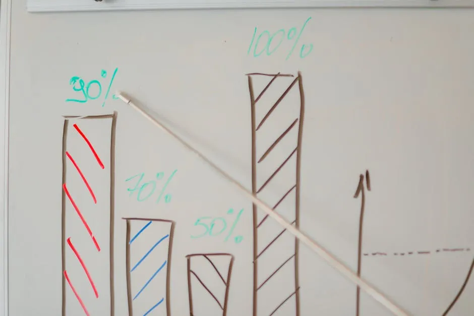
Histograms are your go-to tool for visualizing frequency distributions. They transform numerical data into a clear graphical representation. But wait! To make a histogram work its magic, you need to understand class boundaries. These boundaries help accurately define where one class ends and another begins.
So, how do class boundaries fit into histograms? Each bar in your histogram represents a class interval, and the height of each bar shows the frequency of data points within that interval. Think of it as a way to organize your data neatly. If your class boundaries are set correctly, your histogram will look as smooth as a jazz saxophonist on a Saturday night.
Here’s a tip for effective histogram visualization: ensure your class intervals are consistent. This consistency helps avoid visual clutter and allows for easier interpretation. If your classes are uneven, you might find yourself in a mess of overlapping bars, confusing your audience and ruining the vibe.
Another pro tip? Label your axes clearly! The x-axis should showcase your class boundaries, while the y-axis indicates frequencies. Clear labels guide your audience, turning your histogram into a delightful visual experience rather than a puzzle.
Finally, consider using color to enhance your histogram. Bright, engaging colors can draw attention and highlight specific trends in your data. Just remember, too many colors can distract. Stick to a simple palette that complements your data story.

Other Visualization Techniques
Histograms are fantastic, but they aren’t the only game in town. Class boundaries also play a crucial role in other graphical representations. Let’s explore a couple of these techniques.
Box Plots: Box plots provide a visual summary of data distribution. They display the median, quartiles, and any potential outliers. Class boundaries come into play when determining where to draw the lines of your box. This helps you visualize the spread and skewness of your data effectively.
Frequency Polygons: A frequency polygon is like a line graph version of a histogram. It connects the midpoints of each class interval with a line. You still need class boundaries to define these intervals accurately. This technique allows for a fluid understanding of trends over time and is especially useful for displaying changes in data distribution.
Remember, different visualization techniques can tell different stories. By choosing the right method, you enhance clarity and engagement for your audience. Use class boundaries wisely, and you’ll craft visuals that not only convey information but also captivate your audience’s attention. If you’re interested in enhancing your skills even further, check out Data Visualization Toolkit: Tools and Techniques for Creating Data Visualizations. This toolkit provides invaluable resources for any aspiring data visualizer!

Conclusion
In conclusion, understanding how to calculate class boundaries is integral to effective statistical analysis and data visualization. When you master the steps outlined in this guide, you become equipped to handle complex datasets with grace, ensuring clarity and accuracy in your visual representations. Imagine presenting data without clear class boundaries—it’s like trying to read a book with the pages mixed up!
As you implement these techniques in your analysis, remember that precision in calculating class boundaries can open the door to profound insights and impactful data stories. These boundaries allow you to create cleaner, more interpretable visualizations, making your statistical findings accessible to a broader audience.
Moreover, with the rise of data-centric decision-making in 2024, honing your skills in class boundary calculations will not only make you a better analyst but also a valuable asset in any data-driven environment. So, whether you’re whipping up histograms or crafting compelling presentations of your findings, clear class boundaries will serve as your trusty guide.
As you venture forth into the world of statistics, remember: the clearer your class boundaries, the clearer your story! Now, go forth and visualize with confidence, knowing that your understanding of class boundaries will lead to clearer insights and more impactful data narratives. Happy analyzing!

FAQs
What are class boundaries in statistics?
Class boundaries are the values that separate classes in a frequency distribution. They define clear intervals for data analysis, ensuring that data points fit neatly into their respective categories. In simpler terms, they help eliminate any ambiguity about where one class ends and the next begins.
How do you calculate class boundaries?
To calculate class boundaries, follow these steps: First, identify the upper class limit of the first class and the lower class limit of the subsequent class. Next, subtract the upper class limit from the lower class limit to find the gap. Divide this gap by two to get the adjustment needed. Finally, subtract this adjustment from the lower limit and add it to the upper limit of each class to establish the class boundaries.
Why are class boundaries important in data visualization?
Clear class boundaries are crucial because they eliminate confusion in interpreting data. They ensure that visualizations, like histograms, accurately represent the distribution of data without overlapping intervals. This clarity leads to better insights and more informed decision-making.
Can class limits be decimal numbers?
Yes, class limits can indeed be decimal numbers. This flexibility allows for precise representation of data, particularly when dealing with continuous data that requires finer distinctions. So, whether your data points are whole numbers or decimals, class boundaries can adapt accordingly!
What tools can help with calculating class boundaries?
Several tools can assist in calculating class boundaries, including software like Excel, statistical software such as R or Python, and online calculators. Additionally, educational platforms may offer resources and templates to simplify this process, making it easier for you to focus on analysis rather than computation.
Please let us know what you think about our content by leaving a comment down below!
Thank you for reading till here 🙂
All images from Pexels


