Introduction
Descriptive statistics is like a crystal ball for your data. It summarizes key features and characteristics, giving you a snapshot of what’s happening. Whether you’re a student, a researcher, or just someone who loves crunching numbers, understanding descriptive statistics is essential for making sense of your data. Think of situations where you might need descriptive statistics: summarizing survey results, analyzing academic scores, or even assessing customer feedback. In these cases, descriptive statistics helps to condense vast amounts of information into digestible numbers. You get insights like averages, medians, and ranges, allowing you to identify trends and patterns quickly. Now, let’s talk about Excel. Why is it the go-to tool for many? First, it’s widely accessible. Most people have it at their fingertips, whether for school or work. Second, Excel’s user-friendly interface means you don’t need a PhD in statistics to make sense of your data. With just a few clicks, you can perform complex analyses without feeling overwhelmed. Excel provides a handy feature called the Analysis ToolPak. This add-in packs a punch, allowing you to perform descriptive statistics effortlessly. This tool lets you generate a variety of statistics, from means and medians to standard deviations and ranges, all with minimal fuss. If you’re looking to dive deeper into Excel’s capabilities, consider checking out Excel Data Analysis For Dummies by Stephen L. Nelson. It’s a great resource for mastering Excel data analysis! In this guide, we’ll walk you through the process of running descriptive statistics in Excel. So, grab your data and let’s get ready to crunch some numbers!
What Are Descriptive Statistics?
Descriptive statistics are essential for summarizing data. They provide a way to describe and understand your dataset without making predictions or generalizations. Unlike inferential statistics, which aim to draw conclusions about a population based on a sample, descriptive statistics stick to summarizing the data at hand. Key measures in descriptive statistics include:Central Tendency
1. Mean: This is the average of your dataset. To find it, add up all the values and divide by the number of values. It gives you a sense of the “center” of your data. For more insights, check out our article on what does mean identically distributed in statistics.2. Median: The median is the middle value when your data is ordered. If you have an odd number of observations, it’s the middle one. For an even number, it’s the average of the two middle values. It’s particularly useful in skewed distributions. For a deeper understanding, refer to our article on statistics poland median salary 2024.Understanding the mean is crucial for data interpretation. what does mean identically distributed in statistics
3. Mode: This is the most frequently occurring value in your dataset. It can be particularly helpful in categorical data analysis. If you want to enhance your understanding of modes, consider checking out Excel Formulas and Functions for Dummies.The median provides a valuable perspective, especially in skewed datasets. statistics poland median salary 2024

Dispersion
1. Range: The range tells you the difference between the maximum and minimum values. It’s a straightforward way to assess variability. 2. Variance: This measure indicates how much the values in your dataset differ from the mean. A high variance means your data points are spread out, while a low variance indicates they are closer together. For a deeper dive into variance, check out Data Analysis with Excel: A Practical Guide for Beginners. 3. Standard Deviation: This is the square root of the variance. It provides a more intuitive sense of dispersion, showing how much individual data points typically differ from the mean.Shape of Distribution
1. Skewness: This measures the asymmetry of your data distribution. A positive skew indicates a tail on the right, while a negative skew indicates a tail on the left. 2. Kurtosis: Kurtosis describes the “tailedness” of your data distribution. High kurtosis means more data in the tails, while low kurtosis indicates a flatter distribution. To illustrate these measures, consider a dataset of student exam scores: 55, 60, 75, 80, 85. – Mean: (55 + 60 + 75 + 80 + 85) / 5 = 71 – Median: The middle score is 75. – Mode: If another student scored 75, that would be the mode. – Range: 85 – 55 = 30 – Variance: Calculate how each score differs from the mean, square those differences, and average them. – Standard Deviation: The square root of the variance. – Skewness: Examine whether scores are more concentrated on one side. – Kurtosis: Determine if more students scored extremely low or high. These measures empower you to understand the nuances of your data better. With each statistic, you can tell a story about your dataset and make informed decisions based on the insights gathered.
Steps to Calculate Descriptive Statistics in Excel
Running descriptive statistics in Excel can make your data analysis journey much smoother. Let’s get right into the nitty-gritty of how to do it in a few simple steps. Just follow along with your spreadsheet, and you’ll be a stats wizard in no time!1. Organize Your Data in Columns
Before you start, make sure your data is well-organized. Place your data in single columns, each representing a different variable. For example, if you’re analyzing test scores, have one column for names and another for scores. Avoid mixing data types in a single column; clarity is key! And for those who want a deeper understanding of organizing data, check out Excel 2021: The Complete Beginners Guide to Microsoft Excel.
2. Navigate to the Data Tab and Click on Data Analysis
Once your data is organized, head over to the Data tab in the Excel ribbon at the top of the screen. Look for the Data Analysis button. If you don’t see it, you might need to enable the Analysis ToolPak first. This add-in packs all the statistical goodies you need.
3. Choose Descriptive Statistics and Input Your Data Range
After clicking on Data Analysis, a dialog box will pop up. Scroll through the list and select Descriptive Statistics. Click OK to proceed. Now, you’ll need to specify your input range. This is where you tell Excel which data to analyze. Just highlight the cells containing your data. If your data has headers, remember to check the box for “Labels in First Row.”
4. Configure Output Options
Next up, it’s time to configure how you want Excel to present the results. You can choose where to place the output. It can be on the same worksheet or a new one altogether. Just select the appropriate option. Make sure to check Summary Statistics. This will generate essential metrics like mean, median, standard deviation, and more.
5. Interpret Results
Once you hit OK, Excel will generate a table with your descriptive statistics. This table will include measures of central tendency (like the mean and median), variability (like standard deviation), and other important metrics. Now, what do these numbers mean? – Mean: The average score. – Median: The middle value, useful if your data has outliers. – Standard Deviation: Indicates how spread out your data points are. A low value means your data points are close to the mean, while a high value indicates more spread. – Range: The difference between your maximum and minimum values. ### Visual Aids To make the process clearer, screenshots or diagrams can be added, showing the steps above. For instance, a screenshot of the Data Analysis button or the dialog box where you select Descriptive Statistics would provide a visual guide to help users follow along. If you’re interested in advanced visualizations, you might want to explore Data Visualization Made Simple: Insights Using Power BI and Tableau. By following these steps, you can efficiently run descriptive statistics in Excel, gaining insights into your dataset that can help inform your decisions. Whether you’re summarizing data for a report or just exploring your findings, Excel makes it easy to turn raw numbers into meaningful information. Now, go crunch those numbers and impress your colleagues with your newfound statistical prowess!
Visualizing Descriptive Statistics
When it comes to understanding data, visual aids are the unsung heroes. They transform numbers into stories, making it easier to grasp trends and patterns. Imagine trying to decipher a complex data set with just rows and columns—yikes! Visualizations bring clarity, revealing insights that might otherwise hide in plain sight. Let’s take a closer look at three popular types of visualizations: histograms, box plots, and scatter plots.Types of Visualizations
Histograms
A histogram is like a bar chart’s cooler cousin. It displays the frequency of data points within specific intervals, known as bins. This gives you a snapshot of how your data is distributed. Are most scores clustered around a certain value? Are there outliers? Histograms answer these questions and more. They’re particularly useful for visualizing continuous data, such as test scores or age distributions.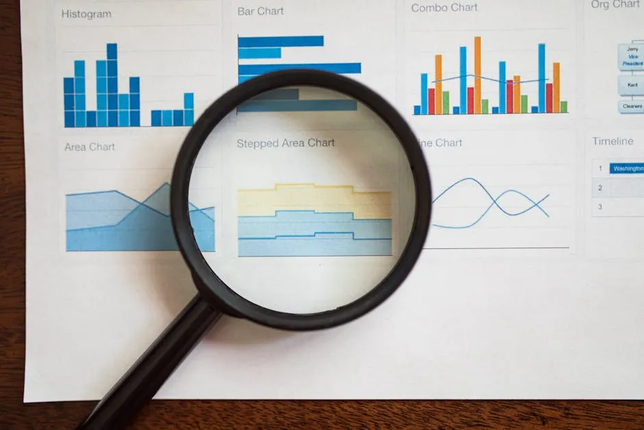
Box Plots
Box plots, also known as whisker plots, are fantastic for visualizing data variability. They show the median, quartiles, and potential outliers in your data. The box represents the interquartile range (IQR), where the middle 50% of your data lies. Whiskers extend to the smallest and largest values within 1.5 times the IQR. Any point beyond that? Well, it gets the outlier label. Box plots are great for comparing distributions between groups, making them a favorite among analysts.
Scatter Plots
Scatter plots are the go-to for exploring relationships between two variables. By plotting points on a Cartesian plane, you can see if there’s a correlation. Are they positively related? Negatively? Or is there no relationship at all? Scatter plots are particularly useful in regression analysis, where you can identify trends and make predictions. To get started with regression analysis, you might want to check out The Art of Data Science by Roger D. Peng and Elizabeth Matsui.
Creating Visuals in Excel
Now that we understand the importance of visualizations, let’s put them into action! Here’s a step-by-step guide on creating histograms, box plots, and scatter plots in Excel using your descriptive statistics data.Creating a Histogram
1. **Select Your Data**: Highlight the range of data you want to visualize.2. **Insert Histogram**: Go to the **Insert** tab, click on **Insert Statistic Chart**, and then select **Histogram**.
3. **Adjust Bins**: Right-click on the horizontal axis to adjust the bin width or number of bins, tailoring it to your needs.
4. **Format Your Chart**: Add chart titles, axis labels, and any other formatting tweaks to make it visually appealing.
Creating a Box Plot
1. **Prepare Your Data**: Ensure your data is organized in columns.2. **Insert Box Plot**: Click on the **Insert** tab, select **Insert Statistic Chart**, and choose **Box and Whisker**.
3. **Customize Your Plot**: Like with the histogram, add titles and labels for clarity. You can also adjust the style to enhance readability.

Creating a Scatter Plot
1. **Select Your Data**: Choose the two columns you want to compare.2. **Insert Scatter Plot**: Go to the **Insert** tab and select **Insert Scatter (X, Y) or Bubble Chart**. Choose the basic scatter plot option.
3. **Add Trendline**: If you want to analyze the trend, right-click on any data point and select **Add Trendline**. Choose the type of trendline that fits your data best.
4. **Format Your Chart**: Add titles, labels, and modify colors as needed. With these steps, you’ll create stunning visuals that elevate your data analysis. Remember, visualizations not only enhance your understanding but also make your findings much more shareable. So go ahead—turn those numbers into eye-catching graphics and make your data sing! If you’re looking for an insightful read on data visualization techniques, don’t miss out on The Visual Display of Quantitative Information by Edward R. Tufte.

Common Mistakes and Best Practices
Running descriptive statistics in Excel is straightforward, but common pitfalls can trip you up. Let’s highlight those and share best practices to keep your analysis smooth and error-free.Common Mistakes
1. **Ignoring Data Cleaning**: Failing to clean your data can lead to misleading results. Always check for missing values, duplicates, and outliers before analysis.2. **Misinterpreting Outputs**: It’s easy to misinterpret statistics like standard deviation or skewness. Be sure you understand what each measure indicates before drawing conclusions.
3. **Using Incorrect Measures**: Selecting the wrong statistical measures based on your data type can skew your results. For example, using mean in a skewed distribution can mislead—consider median instead.

Best Practices
1. **Proper Data Cleaning and Preparation**: Ensure your dataset is clean and organized. This includes handling missing values and ensuring consistent data types. A clean dataset is the foundation of accurate statistics.2. **Correctly Interpreting Outputs**: Familiarize yourself with statistical outputs. Understanding what the mean, median, mode, and standard deviation represent will help you draw accurate conclusions.
3. **Choose the Right Statistical Measures**: Match your statistical methods to your data type. For categorical data, use mode; for continuous data, consider mean and median. This ensures your analysis is relevant and meaningful. If you’re interested in a comprehensive overview of statistical methods, check out Statistical Methods for the Social Sciences. By avoiding common mistakes and adhering to these best practices, you’ll enhance your proficiency in running descriptive statistics in Excel. Remember, the goal is to turn data into insights, and a solid foundation is key to achieving that. Happy analyzing!

Conclusion
In summary, understanding how to run descriptive statistics in Excel is essential for anyone looking to analyze data effectively. This guide has walked you through the importance of descriptive statistics and how they provide a clear snapshot of your data. By summarizing key characteristics, these statistics help reveal patterns and trends that can guide decision-making. Descriptive statistics include measures such as mean, median, mode, standard deviation, and more. These metrics give you a comprehensive view of your data, allowing you to assess central tendencies and variability. With the Analysis ToolPak in Excel, you can easily generate these statistics and gain insights from your datasets. Excel is not just a spreadsheet tool; it’s a powerful ally in your data analysis journey. Its accessibility and user-friendly interface make it an ideal choice for both beginners and seasoned analysts. You don’t need to be a statistics wizard to run descriptive statistics—Excel simplifies the process, making it approachable for everyone. If you’re looking for a thorough understanding of data science concepts, consider Data Science for Dummies. Now that you’ve learned how to leverage Excel for descriptive statistics, it’s time to roll up your sleeves and dive into your own datasets. Practice what you’ve learned here, and you’ll soon be converting numbers into insights like a pro. So, grab that spreadsheet and start analyzing—your data is waiting!FAQs
What if my data contains missing values?
If your dataset has missing values, don’t fret! Excel can handle them, but it’s best to decide how to treat those gaps. You can either remove the entries with missing values or use techniques like imputation to fill them in. Just ensure your approach aligns with your analysis goals. If you choose to exclude them, Excel will automatically adjust the calculations to only include the available data, but be cautious; removing too many values can lead to skewed results.
Can I use Excel for advanced statistical analyses?
While Excel excels at descriptive statistics, it can also perform certain advanced analyses. You can run regression analysis, t-tests, and ANOVA using the Analysis ToolPak. However, for more complex statistical modeling, dedicated software like R or SPSS may be more suitable. Excel is fantastic for quick analyses and visualization, but it might not handle every advanced statistical need.
How do I interpret skewness and kurtosis in my results?
Skewness measures the asymmetry of your data distribution. A skewness close to zero indicates a symmetrical distribution, while positive skewness shows a tail on the right side, and negative skewness indicates a tail on the left. Kurtosis, on the other hand, describes the ‘tailedness’ of the distribution. High kurtosis means more data is in the tails, suggesting potential outliers, while low kurtosis indicates a flatter distribution. Assessing both metrics together can provide a deeper understanding of your data’s shape.
Why are my results different from those in another software?
Differences in results between Excel and other statistical software can arise from several factors. These include variations in how missing values are handled, the methods used for calculations, or even rounding differences. It’s crucial to check the settings in both programs and ensure you’re using the same datasets and parameters. If discrepancies persist, consider cross-referencing with a reliable statistical textbook or guide for clarity.
Additional Resources
If you’re eager to level up your skills in descriptive statistics and Excel, you’re in luck! There’s a treasure trove of resources out there, just waiting for you to dive in. Whether you’re looking for online courses, insightful books, or handy Excel templates, we’ve got you covered. Let’s explore some fantastic options that can help you become a data analysis maestro!Online Courses
1. **Coursera – Data Analysis with Excel**: This course offers a comprehensive introduction to using Excel for data analysis, including descriptive statistics. With video lectures and practical exercises, you’ll gain hands-on experience with real datasets. Plus, you’ll earn a certificate to show off your new skills
2. **Udemy – Excel Data Analysis: Pivot Tables, Descriptive Statistics & More**: If you’re keen on mastering data analysis tools in Excel, this course is for you. It covers everything from basic descriptive stats to advanced analytical techniques, all while keeping things engaging and interactive.
[Check it out on Udemy.](https://www.udemy.com/course/excel-data-analysis-pivot-tables/)
3. **LinkedIn Learning – Excel: Statistical Analysis**: This course focuses specifically on statistical analysis in Excel. It’s perfect for anyone who wants to understand descriptive statistics and how to apply them in real-world scenarios, all while learning from industry experts.
[Start learning today!](https://www.linkedin.com/learning/excel-statistical-analysis)
Books
1. **“Excel Data Analysis For Dummies” by Stephen L. Nelson**: This book is a gem for beginners and experienced users alike. It walks you through essential data analysis concepts and Excel functions, including descriptive statistics. With easy-to-follow examples, you’ll be crunching numbers in no time
2. **“Statistics for Data Science: Leveraging the Power of Excel” by James D. Miller**: This book offers a deep dive into data analysis, focusing on statistical techniques. It’s packed with practical examples using Excel, making it a great resource for anyone looking to understand descriptive statistics in the context of data science.
[Find it on Amazon.](https://www.amazon.com/Statistics-Data-Science-Leveraging-Excel/dp/1630197929)
3. **“Practical Statistics for Data Scientists” by Peter Bruce and Andrew Bruce**: While not solely focused on Excel, this book provides a solid foundation in statistics, including descriptive statistics. It’s perfect for those who want to bridge the gap between statistical theory and practical application in Excel.
[Check this one out!](https://www.oreilly.com/library/view/practical-statistics-for/9781492075657/)
Excel Templates
1. **Excel Easy – Descriptive Statistics Template**: This free resource provides an Excel template that simplifies the process of calculating descriptive statistics. It includes built-in formulas and examples that can help you get started quickly.[Download the template here.](https://www.excel-easy.com/examples/descriptive-statistics.html)
2. **Vertex42 – Statistics Templates**: Vertex42 offers a range of free Excel templates for statistical analysis. Their descriptive statistics template allows you to input your data and instantly calculate key metrics like mean, median, and standard deviation.
[Explore these templates.](https://www.vertex42.com/ExcelTemplates/statistics-templates.html)
3. **Spreadsheet123 – Data Analysis Templates**: This site offers various templates for data analysis, including descriptive statistics. These user-friendly templates can help you conduct analyses without the hassle of setting up formulas from scratch.
[Visit Spreadsheet123 for templates.](https://www.spreadsheet123.com/) Please let us know what you think about our content by leaving a comment down below! Thank you for reading till here 🙂
All images from Pexels
