
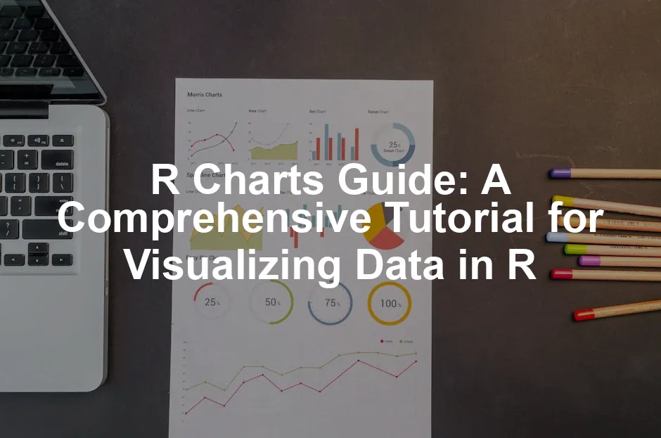
Introduction
Data visualization plays a pivotal role in data analysis. It helps us make sense of complex datasets. With clear visuals, insights become much easier to grasp. R is a powerful tool for creating diverse charts. Whether you’re looking to create simple plots or intricate graphics, R has you covered.
This guide aims to provide a structured overview of R charts. You will learn how to create various types of charts and understand their applications.

Summary and Overview
In this guide, you can expect a blend of theory and practical examples. We will discuss numerous chart types suitable for different data scenarios. For instance, scatter plots, histograms, and bar charts will be covered.
Key R packages like base R graphics and ggplot2 will be highlighted. Each package has unique strengths that cater to various visualization needs. We will also stress the importance of reproducible code. This ensures your visualizations are consistent and sharable.
If you want to dive deeper into R’s rich ecosystem, consider picking up R Programming for Data Science by Hadley Wickham. It’s a fantastic resource for both beginners and seasoned pros!

Getting Started with R Charts
Understanding R and Data Visualization
R is a statistical programming language. It’s widely used for data analysis. One of R’s key strengths lies in data visualization. Visualizing data helps reveal patterns and insights. Charts and graphs make complex information easier to understand. This clarity aids in decision-making and storytelling with data. With R, you can create a variety of charts, from simple to complex.

Installing Necessary Packages
To get started, you need essential R packages. The most popular ones are ggplot2, dplyr, and tidyr. Here’s how to install them:
1. Open your R console or RStudio.
2. Use the following command to install the packages:
install.packages(c("ggplot2", "dplyr", "tidyr"))
3. After installation, load the packages with:
library(ggplot2)

   library(dplyr)

   library(tidyr)
These packages will enhance your data manipulation and visualization experience in R. If you’re looking for a comprehensive guide on R graphics, check out R Graphics Cookbook by Winston Chang. It’s a delightful read!

Types of R Charts
Scatter Plots
Creating Basic Scatter Plots
Scatter plots are a fundamental way to visualize relationships between two variables. The basic syntax for creating a scatter plot is:
plot(x, y)
Here, x and y are your data vectors. Scatter plots help identify correlations. They can show trends, clusters, and outliers in your data.
Customizing Scatter Plots
You can customize your scatter plots using colors, shapes, and sizes. For example, you can add color to points based on a categorical variable:
ggplot(data, aes(x = variable1, y = variable2, color = category)) + geom_point()
Furthermore, you can add a trend line with the geom_smooth() function:
ggplot(data, aes(x = variable1, y = variable2)) + geom_point() + geom_smooth(method = "lm")
Customizing your plots makes them more informative and visually appealing. If you want to learn more about data visualization, Data Visualization: A Practical Introduction by Kieran Healy is a fantastic resource!

Bar Charts
Creating Bar Charts
Creating bar charts in R is straightforward. You can use the barplot() function in base R or geom_bar() in ggplot2. For a basic bar chart, the syntax is:
barplot(height, names.arg = labels)
Here, height represents the values for each bar, and labels are the names for those bars. Grouped bar charts can provide more insight by comparing categories. To create a grouped bar chart using ggplot2, use:
ggplot(data, aes(x = category, fill = subcategory)) + geom_bar(position = "dodge")
Bar charts shine when displaying categorical data. They’re perfect for showing counts or sums across categories, like sales by region. Use them to visualize survey results, demographics, or any grouped data effectively. To dive deeper into data analytics, consider Data Science for Business by Foster Provost and Tom Fawcett. It’s a must-read!

Customizing Bar Charts
Enhancing your bar charts makes them more informative. You can add labels, legends, and colors. To add labels, modify your plot like this:
ggplot(data, aes(x = category, y = values)) + geom_bar(stat = "identity") + geom_text(aes(label = values), vjust = -0.5)
Colors can be customized to represent categories better. You might choose a palette that fits your brand or enhances readability. Additionally, stacked bar charts visually represent parts of a whole by stacking bars on top of each other. For a stacked chart, use:
ggplot(data, aes(x = category, y = values, fill = subcategory)) + geom_bar(stat = "identity")
This approach allows for quick comparisons between categories and subcategories. If you’re interested in advanced data visualization techniques, check out Data Visualization Made Simple by Daniel J. Murray.

Histograms
Creating Histograms
Histograms are essential for visualizing frequency distributions of continuous data. In base R, you can create a histogram with the hist() function:
hist(data)
In ggplot2, use:
ggplot(data, aes(x = variable)) + geom_histogram(binwidth = 1)
Histograms effectively show the distribution of data, helping you identify patterns, skewness, or outliers. For those looking to deepen their understanding of data science, check out The Elements of Statistical Learning by Trevor Hastie, Robert Tibshirani, and Jerome Friedman.

Customizing Histograms
To enhance your histograms, adjust bin sizes and colors. Changing the bin size can provide clearer insights into data distribution. For example:
ggplot(data, aes(x = variable)) + geom_histogram(binwidth = 0.5, fill = "blue", color = "black")
Adding a density curve can also help interpret data more effectively. Use:
ggplot(data, aes(x = variable)) + geom_histogram(aes(y = ..density..), binwidth = 0.5, fill = "blue", color = "black") + geom_density(alpha = 0.2, fill = "red")
This combination gives a clear picture of data trends alongside the frequency distribution, making it easier to analyze. If you’re curious about how to use R for data mining, consider reading R and Data Mining: Examples and Case Studies.

Box Plots
Creating Box Plots
To create a box plot in R, use the following syntax:
boxplot(data$variable ~ data$grouping_variable)
In this code, replace data$variable with your numeric variable and data$grouping_variable with the categorical variable that divides your data. Box plots are fantastic for visualizing data distribution. They show the median, quartiles, and potential outliers in a dataset. This representation helps you quickly understand the spread and skewness of the data.
Box plots are particularly useful when comparing distributions across different categories. For example, if you want to compare test scores among different classes, a box plot clearly illustrates how each class’s scores vary. It allows you to spot trends and identify which groups perform better or worse. If you’re eager to learn more about statistical learning, check out An Introduction to Statistical Learning by Gareth James, Daniela Witten, Trevor Hastie, and Robert Tibshirani.

Customizing Box Plots
Customizing your box plots can enhance their readability and appeal. You can add notches, which indicate confidence intervals around the median, making it easier to compare medians. Use the notch argument:
boxplot(data$variable ~ data$grouping_variable, notch = TRUE)
Colors can also improve visualization. Change the color of your box plots like this:
boxplot(data$variable ~ data$grouping_variable, col = "lightblue")
Lastly, interpreting outliers is crucial. Outliers appear as individual points beyond the whiskers of the box plot. Investigate these data points further, as they may indicate significant variations or errors in your dataset. If you’re looking for a comprehensive reference, consider The R Book by Michael J. Crawley.

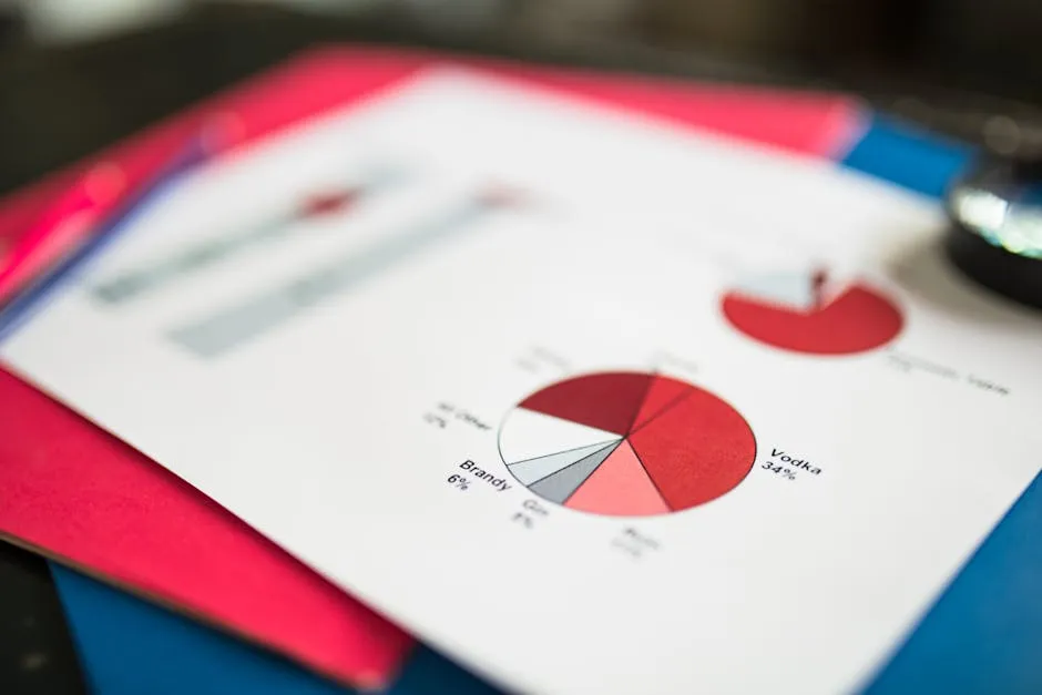
Pie Charts
Creating Pie Charts
Creating a pie chart in R is simple. Use the pie() function, which requires your data to be in a vector format. Here’s the basic syntax:
pie(x, labels = names(x), main = "Your Title")
Here, x is your numeric vector, and labels are the names for each slice. Pie charts effectively show proportions of a whole, making them suitable for visualizing categorical data. Use them for surveys, sales data, or any set of proportions that adds up to a total.
However, remember that pie charts can be misleading with too many categories. They work best with a small number of slices. If you’re interested in enhancing your data visualization skills, Storytelling with Data: A Data Visualization Guide for Business Professionals by Cole Nussbaumer Knaflic is a fantastic read!
Customizing Pie Charts
You can customize pie charts by adding colors and labels. For instance, to set custom colors, use:
pie(x, labels = names(x), col = c("red", "blue", "green"), main = "Your Title")
Also, consider adding percentages to your labels for better clarity. Calculate the percentage for each slice and include it in your labels:
labels <- paste(names(x), "(", round(100 * x / sum(x), 1), "%)", sep = "")

pie(x, labels = labels, main = "Your Title")
For those seeking a more dynamic look, consider 3D pie charts. Use the plotrix package for this:
library(plotrix)

pie3D(x, labels = names(x), explode = 0.1, main = "Your Title")
3D pie charts add depth but should be used sparingly to avoid clutter.

Advanced Visualization Techniques
Using ggplot2 for Enhanced Graphics
R’s ggplot2 package offers advanced capabilities for creating visually appealing graphics. This section will explore how to leverage ggplot2 to enhance your data visualizations. With ggplot2, you can create layered graphics using a consistent syntax that emphasizes clarity and flexibility.
The basic structure of a ggplot2 command includes the data, aesthetics, and geometric objects. Here’s a simple example:
ggplot(data, aes(x = variable1, y = variable2)) + geom_point()
This code creates a scatter plot. By specifying the aes() function, you define how your data maps to the plot’s axes. Afterward, you add geometric objects like points, lines, or bars to visualize your data effectively.
One of the powerful features of ggplot2 is its ability to layer components. For instance, you can combine scatter plots with trend lines using geom_smooth():
ggplot(data, aes(x = variable1, y = variable2)) + geom_point() + geom_smooth(method = "lm")
This approach allows for a richer analysis of relationships within your data. You can also customize themes, colors, and labels to improve readability and aesthetics. Use the theme() function to modify plot elements:
ggplot(data, aes(x = variable1, y = variable2)) + geom_point() + theme_minimal()
Utilizing ggplot2 effectively can significantly enhance your data visualization skills, making your graphics more informative and visually appealing. If you’re interested in mastering this package, consider the ggplot2: Elegant Graphics for Data Analysis by Hadley Wickham.

To learn more about effective data analysis techniques, check out tips for effective data analysis in economics and statistics.
Understanding the Grammar of Graphics
ggplot2 uses a layered approach to create plots. This method allows you to build your visualizations step by step. Each layer adds more detail and complexity.
The main components of this system are:
- Data: This is the dataset you are visualizing. It can be any data frame in R.
- Aesthetics: This refers to how your data maps to visual properties. For example, you can map variables to x and y axes, colors, shapes, and sizes.
- Geoms: These are the geometric objects that represent your data. Common geoms include points, lines, and bars.
- Stats: Statistical transformations summarize your data. These can include things like counts or means.
- Scales: Scales control how data values map to visual properties. They define the axes and legends.
- Themes: Themes adjust the overall look of your plot, including background and font styles.
Understanding these components helps you create effective visualizations. Each element works together to enhance the clarity of your data representation. If you’re looking for a deeper dive into visualization, consider Visualization Analysis and Design by Tamara Munzner.
Creating Complex Plots with ggplot2
Creating multi-layered plots can significantly enhance your visual storytelling. For example, combining scatter and line plots can illustrate relationships and trends effectively.
You might start with a scatter plot to show individual data points. Then, you can add a line to represent the trend. Here’s how you do it:
ggplot(data, aes(x = variable1, y = variable2)) + geom_point() + geom_smooth(method = "lm")
In this example, geom_point() adds the scatter points, while geom_smooth() adds the trend line. This layering allows for deeper analysis in a single visualization.
Customizing themes and styles is also essential. You can make your graphics publication-ready by adjusting elements like colors, fonts, and backgrounds. Use the theme() function to tweak these features:
ggplot(data, aes(x = variable1, y = variable2)) + geom_point() + theme_minimal()
Using a minimal theme can make your plots cleaner and easier to interpret. By mastering these techniques, you can create visually appealing and informative graphics. If you want to explore interactive visualizations, consider Interactive Data Visualization for the Web by Scott Murray.

Interactive Visualizations with Plotly
Creating interactive charts in R is a game changer for data exploration. Using Plotly, you can convert your ggplot2 charts into interactive visualizations easily.
To do this, first, create your ggplot2 chart. Then, wrap it with the ggplotly() function from the plotly package:
library(plotly)

p <- ggplot(data, aes(x = variable1, y = variable2)) + geom_point()

ggplotly(p)
Interactive charts allow users to hover over data points for more information. They can zoom in and out, making it easier to explore large datasets. This feature is particularly useful for presentations or sharing insights with others.
Overall, interactive visualizations enhance user engagement and understanding of the data. They are a powerful tool for any data analyst or researcher. If you want to learn more about JavaScript visualization libraries, check out D3.js in Action by Elijah Meeks.
Conclusion
In summary, mastering the grammar of graphics in R is essential for effective data visualization. By understanding key components, you can create complex plots that convey meaningful insights.
Don’t hesitate to practice creating your own charts using various datasets. The more you experiment, the better your visualizations will become. For further learning, explore additional resources and tutorials available online. You can also check out The Big Book of Dashboards: Visualizing Your Data Using Real-World Business Scenarios to further enhance your skills.
FAQs
Please let us know what you think about our content by leaving a comment down below!
Thank you for reading till here 🙂
All images from Pexels


