Introduction
Statistical communication is more than just crunching numbers. It’s about making data speak clearly and effectively. In today’s data-driven world, this skill is vital across many fields, from healthcare to business and beyond. Whether you’re a scientist, a journalist, or a marketer, the ability to interpret and convey statistical information is essential.
Imagine receiving a report filled with graphs and charts, but you’re left scratching your head. Frustrating, right? Effective statistical communication can bridge that gap. It helps ensure that decision-makers understand the implications of data, allowing them to make informed choices. When data is presented well, it can clarify complex issues, influence public policy, and shape societal norms.
But how often do we truly grasp what the statistics are saying? Have you ever struggled to understand a statistical report? Many face this challenge. The key is not just the numbers but how those numbers are conveyed. Let’s unpack the importance of statistical communication and discover how it can enhance understanding and decision-making.

Understanding Statistical Communication
What is Statistical Communication?
Statistical communication is the practice of presenting statistical data in a manner that is clear, understandable, and engaging. It goes beyond mere data presentation; it uses narrative elements, context, and visual aids to make information accessible. In data-driven environments, effective statistical communication is crucial. It ensures that insights derived from data can be easily understood and acted upon.
The significance of this communication style is monumental. With the right approach, statistics can become a powerful tool for storytelling. It transforms numbers into narratives that resonate with audiences, making the information relatable and actionable.

Importance of Context in Statistical Communication
Context is the backbone of statistical communication. It shapes how data is interpreted and understood. Without context, statistics can be misleading. For instance, imagine reading an economic report that states unemployment has dropped by 2%. Sounds great, right? But without knowing the larger context—such as demographic shifts or regional variances—this number could paint a misleading picture.
Misinterpretation often stems from a lack of context. A classic example is the infamous COVID-19 statistics. Without proper context, such as population density or healthcare infrastructure, those numbers can lead to panic or complacency.
In summary, effectively communicating statistics requires more than just presenting numbers. It demands a deep understanding of context, ensuring that audiences grasp the full picture. By providing context, statistical communication fosters trust and enhances comprehension, allowing audiences to make informed decisions based on the data presented.

Best Practices for Effective Statistical Communication
Know Your Audience
Understanding your audience is the cornerstone of effective statistical communication. Tailoring your message ensures that the information resonates and is comprehensible. Different audiences have varying levels of familiarity with statistics, which significantly influences how you should present your data.
When communicating with experts, you can use technical jargon and delve into complex methodologies. Experts often appreciate detailed analyses, rigorous statistical models, and nuanced interpretations. For instance, if you’re presenting to a group of data scientists, feel free to include confidence intervals, regression outputs, and advanced statistical terms. They’ll likely relish the challenge of unpacking those complex ideas.
On the other hand, when addressing non-experts, simplicity is key. Avoid statistical jargon that might leave them puzzled. Use relatable analogies to explain complex concepts. For example, if discussing a statistical increase in health outcomes, you could compare it to something universally understood, like the change in weather. “Just as we notice the temperature rising in spring, we see a positive trend in health metrics too!”
Consider the audience’s background. Are they business executives looking for quick insights to make informed decisions? Or are they community members seeking to understand a new health initiative? Adjust your tone, language, and the complexity of the data accordingly. A well-structured summary can be a lifesaver for busy executives. Use bullet points or visual aids to highlight key takeaways. This lets them grasp the essentials without wading through dense text.

Speaking of visuals, consider utilizing an Infographic Maker Tool. These tools can help you create eye-catching visuals that make complex data easier to understand and more appealing to your audience.
Another vital aspect is to engage your audience. Ask questions to pique their interest and encourage participation. For instance, “What do you think this rise in statistics means for our community?” This not only fosters dialogue but also helps you gauge their understanding.
In conclusion, knowing your audience is not just about adjusting the content but also about engaging them meaningfully. By tailoring your communication style to match their expertise and interests, you empower them to understand and act on the statistical information presented.

Use of Visualizations
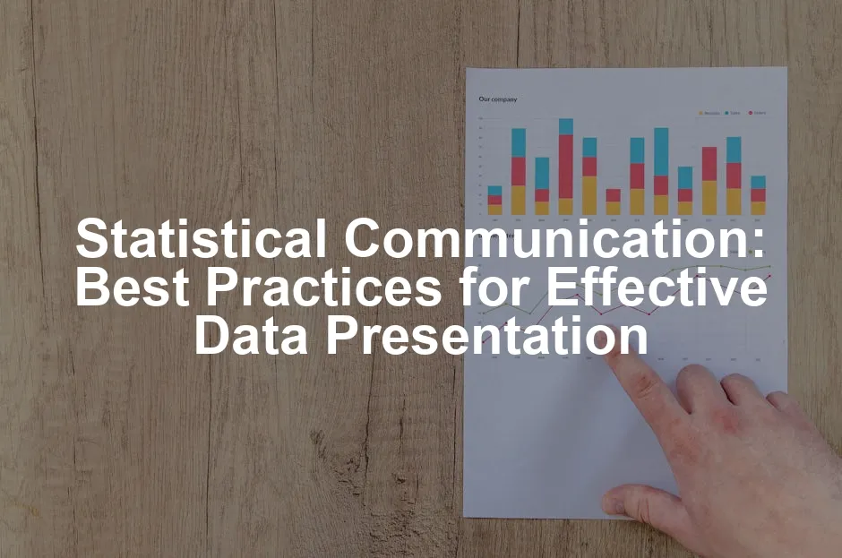
Visual aids are powerful tools in statistical communication. They help convey complex data in a clear and engaging way. The right visualization can transform a sea of numbers into easily digestible insights.
There are several effective types of visuals to consider. Charts, graphs, and infographics are commonly used. Each type serves a unique purpose. Bar charts are excellent for comparing quantities across categories. Line graphs effectively show trends over time. Infographics combine images and data to tell a compelling story. Choosing the right type of visual depends on the data you’re presenting and the message you want to convey.
When designing visuals, follow key design principles. Start with simplicity. Overly complex visuals can confuse viewers. Use clear labels and legends to ensure everyone understands what they’re looking at. Choose colors wisely; contrasting colors can highlight critical points, while too many colors can be overwhelming. For example, a pie chart with too many segments can become a dizzying spectacle.

Limit the amount of information displayed at once. A good rule of thumb is to focus on one main idea per visual. This approach keeps the viewer’s attention and ensures they grasp the key message without feeling inundated.
Case studies can illustrate the power of effective data visualization. Consider the example of a public health campaign that successfully used infographics to communicate vaccination rates. By presenting data visually, they increased public engagement and understanding. Instead of presenting raw numbers, they showed trends over time, highlighting the positive impact of vaccinations on community health. This clear, visual representation helped drive home the message that vaccines save lives, encouraging more people to get vaccinated.
If you’re looking for inspiration for your visualizations, check out Data Visualization Poster Templates. These can help you create professional-quality visuals in no time!
Another successful example involves a business that utilized a dashboard to display real-time sales data. This not only kept the team informed but also fostered a culture of data-driven decision-making. The visual format allowed team members to quickly identify trends and adjust strategies accordingly.
Ultimately, effective visualizations enhance comprehension and retention of information. By using the right visuals and adhering to design principles, you can significantly boost your statistical communication efforts, making them impactful and memorable.

Clear and Concise Writing
Writing about statistics can feel like scaling a mountain—intimidating and complex. But fear not! The key to effective statistical communication lies in clarity and simplicity. Jargon is the enemy here. When you use complex terminology, you risk alienating your audience. Instead, opt for plain language. This helps ensure that everyone, regardless of their statistical expertise, can grasp the information.
Imagine explaining a statistical concept to your grandmother. Would you use terms like “multivariate regression”? Probably not! You’d say something like, “We’re looking at how different factors affect each other.” This approach is not just friendly; it’s effective.
Now, let’s talk about structure. Organizing your reports and presentations effectively is crucial. Use headings and subheadings to break down your content. This allows readers to skim and easily find what they need. A well-structured report often includes an executive summary. This summary gives a quick overview of the key points, making it easier for busy decision-makers to grasp the essentials without diving deep into the details.

Bullet points are your best friend. They can distill complex information into digestible chunks. For instance, instead of writing a dense paragraph about findings, create a bullet list. Each point should highlight a significant takeaway, making it easier for the audience to remember.
Visual aids are also part of clear writing. When you complement your text with graphs or charts, you enhance understanding. A well-placed visual can clarify trends and relationships that words alone might obscure. Remember, your visuals should be labeled clearly and provide context. A graph without an explanation is like a joke without a punchline—confusing!
To further enhance your writing, consider checking out Statistics for Dummies. This book breaks down complex statistical concepts into easy-to-understand language, making it a great resource for anyone looking to improve their statistical communication skills.
In summary, clear and concise writing is about making your statistical message accessible. Avoid jargon, organize your content thoughtfully, and use visuals effectively. When you communicate with clarity, you empower your audience to understand and act on the statistics presented.

Communicating Uncertainty
In the world of statistics, uncertainty is a constant companion. It’s essential to address this aspect head-on, especially when presenting data. There are two main types of uncertainty: estimation uncertainty and fundamental uncertainty.
Estimation uncertainty arises from unknown model parameters. Picture this: You’re trying to predict the weather, but your data is limited. The more data you collect, the clearer your predictions become. This uncertainty diminishes as sample sizes grow. On the other hand, fundamental uncertainty is a different beast. It’s the inherent variability present in any model. No matter how much data you gather, some level of uncertainty will always remain.
So how do we effectively communicate this uncertainty? Enter confidence intervals. These intervals provide a range where we believe the true value lies. For example, instead of saying, “The average height of trees is 15 feet,” you can say, “The average height of trees is between 14 and 16 feet, 95% of the time.” This approach gives your audience a clearer picture of the data’s reliability.
Another best practice involves contextualizing uncertainty. When presenting findings, explain what the uncertainty means for decision-making. For instance, if a drug trial shows a 70% success rate with a wide confidence interval, it’s vital to emphasize that while there’s promise, variability exists. This helps decision-makers weigh risks appropriately.

Furthermore, using visuals to represent uncertainty can be beneficial. Graphs depicting confidence intervals alongside point estimates can illustrate the range of uncertainty effectively. This not only enhances comprehension but also keeps your audience engaged.
In summary, communicating uncertainty is crucial for accurate statistical representation. By recognizing the types of uncertainty, using confidence intervals, and providing context, you help your audience understand the reliability of your data. Remember, it’s not just about the numbers; it’s about making those numbers meaningful.

Examples of Statistical Communication in Practice
Case Study: Statistical Communication in Public Health
Public health campaigns often rely on robust statistical communication to relay crucial information. Consider the campaign to increase vaccination rates during a flu outbreak. The Centers for Disease Control and Prevention (CDC) launched a campaign that prominently featured vaccination statistics.
They used clear visuals, such as infographics showing vaccination rates over the years, emphasizing the correlation between increased vaccination and reduced flu cases. The campaign included easy-to-understand charts that depicted how many lives vaccines save annually. By presenting these statistics in a visually appealing way, the campaign not only informed the public but also built trust in the healthcare system.
The messaging was designed to resonate with different demographics. For instance, they tailored the content for parents, highlighting how vaccinations protect children and the community. By humanizing the data, they transformed numbers into stories of families safeguarded from illness. This strategic statistical communication played a pivotal role in achieving a significant uptick in vaccination rates during the campaign period, showcasing the power of effective data presentation in public health.

Example: Business Decision-Making
In the realm of business, statistical communication is vital for informed decision-making. Companies routinely utilize data from market research to shape their strategies. For example, imagine a retail chain analyzing customer purchase patterns.
The chain may employ statistical analysis to identify which products are flying off the shelves and which are gathering dust. By communicating these findings to their marketing team through clear visualizations like bar charts and heat maps, they can make data-driven decisions. These visuals illustrate trends, such as seasonal spikes in certain product categories, allowing the team to strategize promotions effectively.
Furthermore, businesses often share statistical insights in quarterly reports. When presented effectively, these reports can reveal not just where profits are coming from but also where improvements are needed. For instance, if a product line shows declining sales, a well-structured report can help identify the issues—be it pricing, marketing, or competition. By making complex data understandable, businesses empower teams to act swiftly and strategically.

Lessons Learned from Failed Communications
Not all statistical communication hits the mark. A notable example is the early communication around COVID-19 statistics. Some health officials presented figures without appropriate context, leading to widespread confusion.
For instance, reports indicating a sharp increase in cases were often presented without mentioning population size or testing rates. This omission led to public panic and distrust in health authorities. People could not grasp what the numbers truly represented. Was the increase due to more testing? Or was the virus spreading unchecked? The lack of clarity exacerbated anxiety and misinformation.
This situation serves as a powerful reminder: context is king in statistical communication. Misleading presentations can lead to significant backlash, undermining public trust. The key takeaway? When communicating statistics, always provide context and a narrative that helps the audience understand the implications of the data. By doing so, communicators can avoid misunderstandings and foster a more informed public.

Tools and Resources for Enhancing Statistical Communication
Software
When it comes to data visualization, several software options can help you present statistics in engaging ways. For more information on the best data visualization tools, check out our article on the best data visualization tools for complex systems statistics.
Tableau is a leading data visualization tool that transforms raw data into interactive dashboards. Its drag-and-drop interface allows users to create stunning visualizations without a coding background. Tableau is widely used in business settings for its ability to connect with various data sources and provide real-time insights. If you’re interested in exploring Tableau, you can find it here.
R is another powerful tool for statisticians. This programming language has libraries like ggplot2, which specializes in creating beautiful and customizable graphics. R is perfect for those who enjoy coding and require advanced statistical analyses along with visualizations. If you’re interested in diving into R, check it out here.
Excel, while often seen as a basic tool, is surprisingly versatile. It offers a range of chart options and is widely accessible. Many professionals already use Excel for data handling, making it a practical choice for creating visuals that convey statistical information effectively. Need a refresher on Excel? Check out Microsoft Excel to get started!

Courses and Training
To improve your statistical communication skills, consider enrolling in workshops or online courses. Institutions like the Oxford Management Centre offer intensive training focused on statistical communication. Their courses cover essential topics, such as data gathering techniques, effective visual communication, and social media strategies for disseminating statistics.
Online platforms like Coursera and edX also provide various courses on statistics and data visualization. These courses are designed for beginners and advanced learners alike, allowing you to progress at your own pace. They often include practical exercises to help reinforce the concepts learned.
Further Reading
A wealth of literature exists on statistical communication. For a deep dive, consider reading “Making the Most of Statistical Analyses: Improving Interpretation and Presentation” by King, Tomz, and Wittenberg. This book emphasizes the importance of conveying statistical results effectively to non-experts. You can find it here.
Another recommended read is David Middleton’s “An Introduction to Statistical Communication Theory.” This classic text offers foundational insights into the applications of statistical theories across various domains, making it a valuable resource for practitioners seeking to enhance their communication skills. You can find this book here.
Lastly, you might find articles from academic journals and online platforms beneficial. Look for pieces that discuss best practices for statistical communication, offering pragmatic advice supported by real-world examples.
By harnessing these tools, engaging in training opportunities, and exploring insightful literature, you can significantly enhance your statistical communication abilities. Whether you’re presenting to colleagues or the public, these resources will help you convey your data in a compelling and clear manner.
Conclusion
In this blog post, we examined the art of statistical communication. We explored its definition and significance, alongside the crucial role context plays in interpreting data. Understanding your audience, utilizing visualizations, and writing clearly emerged as best practices for effective communication.
Statistical communication serves as a bridge between complex data and informed decision-making. When done right, it allows stakeholders to grasp essential information quickly, fostering trust and enhancing comprehension.
As we conclude, it’s clear that mastering this skill is not just beneficial; it’s essential. In a world overflowing with data, effective communication can lead to better understanding and more informed choices.
Now, let’s take action! Assess your current statistical communication practices. Are you tailoring your messages for your audience? Are you using visuals effectively? Reflect on these questions and seek improvement. Investing time in enhancing your skills can lead to significant gains in clarity and impact.
Remember, effective statistical communication is a journey. With the right tools and resources, you can become a more compelling communicator, transforming data into stories that resonate with your audience.
FAQs
What is the difference between statistics and statistical communication?
Statistics refers to the collection, analysis, interpretation, presentation, and organization of data. It encompasses mathematical techniques and methodologies used to process raw data. Statistical communication, on the other hand, is the practice of conveying statistical information clearly and understandably to an audience. While statistics focuses on data manipulation, statistical communication emphasizes the importance of presenting that data in a way that informs and engages the audience.
How can I improve my statistical communication skills?
Improving your statistical communication skills involves several actionable steps: 1. Understand Your Audience: Know their background and level of expertise. 2. Practice Clarity: Use simple language and avoid jargon. 3. Utilize Visuals: Incorporate charts, graphs, and infographics to make data engaging. 4. Seek Feedback: Share your work with peers for input on clarity and effectiveness. 5. Continuous Learning: Attend workshops, online courses, and read relevant literature to stay updated.
Why is visual representation important in statistical communication?
Visual representation is crucial because it enhances comprehension and retention. Humans process visuals far more quickly than text. A well-designed chart or graph can illustrate trends, comparisons, and relationships more effectively than a paragraph of text. This psychological impact helps audiences grasp complex data quickly, making it easier to draw conclusions and take action based on the information presented.
What are common pitfalls in statistical communication?
Common pitfalls include: Overloading with Data: Presenting too much information can confuse the audience. Using Complex Jargon: Technical terms can alienate non-expert audiences. Lack of Context: Failing to provide background information can lead to misinterpretation. Neglecting Visuals: Relying solely on text can make data presentation tedious and less engaging.
Are there certifications for statistical communication?
Yes, several organizations offer certifications in statistical communication and data presentation. For instance, courses from institutions like the Oxford Management Centre often provide certificates upon completion. Additionally, various online platforms, such as Coursera and edX, offer courses that can enhance your skills, some of which may include certificates as well. Check for specific programs that align with your career goals and interests.
Please let us know what you think about our content by leaving a comment down below!
Thank you for reading till here 🙂
All images from Pexels
