To transform this into a stacked bar chart, you can adjust it slightly:
bars1 = ax.bar(x, group1, width, label='Group 1')
bars2 = ax.bar(x, group2, width, bottom=group1, label='Group 2')
With this tweak, the bars for Group 2 will stack on top of Group 1, giving you a clear view of the total.
Adding Labels and Annotations
Labels and annotations make charts more informative. Use the ax.bar_label method to add data labels on top of the bars:
ax.bar_label(bars1)
ax.bar_label(bars2)
Now your audience won’t have to guess the values!
Real-World Applications of Bar Charts
Bar charts aren’t just for fancy presentations; they’re vital in various real-world settings. Let’s take a look at how they find their place in business analytics, academic research, and marketing.
Business Analytics and Reporting
In the corporate world, making decisions based on data is crucial. Bar charts simplify complex datasets, making trends and comparisons clear. Businesses often use them to track key performance indicators (KPIs) like sales, expenses, and customer satisfaction. For example, imagine a company analyzing quarterly sales across different products. A bar chart showcasing each product’s performance allows stakeholders to quickly identify top sellers and underperformers.
Moreover, bar charts are essential for financial reporting. When presenting earnings reports to investors, a clear visual representation can make all the difference. Decision-makers can spot trends over time, helping them make informed choices about resource allocation.
For a deeper dive into data visualization in business, check out Data Visualization: A Practical Introduction. This book offers insights that can help you leverage visuals in a business context.

Academic Research
In academia, bar charts serve as indispensable tools for presenting research findings. Researchers often rely on them to compare data across different groups or conditions. For instance, a study examining student performance across various teaching methods might use a bar chart to illustrate how each method impacts test scores.
Bar charts also enhance the clarity of research presentations. A well-structured bar chart can help simplify complex data, making it easier for audiences to grasp essential points. Whether presenting at a conference or publishing in a journal, researchers leverage bar charts to communicate their findings effectively.

Marketing and Sales Presentations
Marketers adore bar charts for their ability to showcase campaign performance. Picture a marketing team evaluating the success of multiple advertising channels. A bar chart could display metrics like click-through rates and conversions, allowing the team to see which channels are delivering results. This visual clarity aids in optimizing marketing strategies and reallocating budgets effectively.
Sales teams also benefit from bar charts. When analyzing customer demographics or regional sales data, a bar chart can highlight which segments are thriving. This information is crucial for crafting targeted sales strategies. By identifying high-potential markets, sales teams can direct their efforts where they’ll yield the best returns.
In summary, bar charts are versatile tools that play vital roles in business analytics, academic research, and marketing. Their ability to distill complex data into easily digestible visuals makes them indispensable in today’s data-driven landscape.
Case Studies
Now that we’ve covered how bar charts are applied in various fields, let’s look at some real-life examples that illustrate their effectiveness.
Analyzing a Dataset with a Bar Chart
Imagine a nonprofit organization focused on environmental conservation. They conduct a survey to understand community engagement in recycling programs. The survey results reveal participation rates across different neighborhoods, but the data is a jumble of numbers. To make sense of it, they create a bar chart.
The chart displays each neighborhood on the x-axis and participation rates on the y-axis. Instantly, the organization sees which areas are thriving and which are lagging. With this visual insight, they can tailor their outreach efforts to boost participation in underperforming neighborhoods.

Success Stories Using Bar Charts in Business
Let’s consider a tech company that launched a new software product. To gauge customer satisfaction, they conducted a survey and gathered feedback across various features. Using a bar chart to display the results, they showcased ratings for each feature on a single page.
The chart revealed a striking contrast: while users loved the ease of use, they were less thrilled about certain advanced features. Armed with this information, the product team focused on improving those features in their next update. As a result, customer satisfaction scores soared, and user retention improved significantly.
In both these cases, bar charts transformed raw data into actionable insights. By presenting information visually, these organizations could make informed decisions that directly impacted their success. Bar charts are more than just visuals; they are powerful allies in the quest for clarity and understanding in data analysis.
FAQs
What is the difference between a bar chart and a histogram?
Bar charts and histograms look similar, but they serve different purposes. A bar chart compares discrete categories, like sales figures by product. Each bar stands independently, making it easy to distinguish between categories. Histograms, on the other hand, visualize continuous data distributions, grouping data into ranges. Think of a histogram as a party for data where everyone is crammed into age groups, while a bar chart is a series of individual guests, each with their own unique flair.
When should I use a horizontal bar chart instead of a vertical one?
Choosing between horizontal and vertical bar charts depends on your data. If your category labels are long, a horizontal bar chart makes them more readable. It’s like giving your text room to breathe! Horizontal charts also work better when you have many categories to compare, as they prevent overcrowding. On the flip side, vertical bar charts are ideal for fewer categories, particularly when you want to emphasize the differences in values prominently.
Can bar charts represent negative values?
Absolutely! Bar charts can handle negative values like a pro. When you plot negative values, the bars extend downwards, visually indicating the loss or decrease. This feature is especially useful when comparing profits and losses or any scenario where values can dip below zero. Just remember to label your axes clearly so that viewers understand the downward plunge.
What software can I use to create bar charts?
Creating bar charts is a breeze with various software options. Popular choices include: Microsoft Excel: A staple in data visualization, perfect for quick and easy charts. Google Sheets: Offers similar functionalities to Excel with the added benefit of cloud accessibility. Tableau: A powerful tool for creating interactive visualizations and dashboards. Plotly: Great for web-based, interactive charts, especially if you’re into coding. Matplotlib: A robust library in Python, perfect for those who love programming their visuals. Chart.js: An excellent library for creating beautiful charts on web pages. With these tools at your fingertips, crafting bar charts is as easy as pie!
Please let us know what you think about our content by leaving a comment down below!
Thank you for reading till here 🙂
All images from Pexels
To create a grouped bar chart, follow this example:
import matplotlib.pyplot as plt
import numpy as np

labels = ['A', 'B', 'C']
group1 = [3, 5, 2]
group2 = [4, 2, 5]
x = np.arange(len(labels))

width = 0.35
fig, ax = plt.subplots()
bars1 = ax.bar(x - width/2, group1, width, label='Group 1')
bars2 = ax.bar(x + width/2, group2, width, label='Group 2')

ax.set_ylabel('Scores')
ax.set_title('Scores by Group')
ax.set_xticks(x)
ax.set_xticklabels(labels)
ax.legend()
plt.show()
This code creates a grouped bar chart comparing two groups across three categories.
To transform this into a stacked bar chart, you can adjust it slightly:
bars1 = ax.bar(x, group1, width, label='Group 1')
bars2 = ax.bar(x, group2, width, bottom=group1, label='Group 2')
With this tweak, the bars for Group 2 will stack on top of Group 1, giving you a clear view of the total.

Adding Labels and Annotations
Labels and annotations make charts more informative. Use the ax.bar_label method to add data labels on top of the bars:
ax.bar_label(bars1)
ax.bar_label(bars2)
Now your audience won’t have to guess the values!
Real-World Applications of Bar Charts
Bar charts aren’t just for fancy presentations; they’re vital in various real-world settings. Let’s take a look at how they find their place in business analytics, academic research, and marketing.
Business Analytics and Reporting
In the corporate world, making decisions based on data is crucial. Bar charts simplify complex datasets, making trends and comparisons clear. Businesses often use them to track key performance indicators (KPIs) like sales, expenses, and customer satisfaction. For example, imagine a company analyzing quarterly sales across different products. A bar chart showcasing each product’s performance allows stakeholders to quickly identify top sellers and underperformers.
Moreover, bar charts are essential for financial reporting. When presenting earnings reports to investors, a clear visual representation can make all the difference. Decision-makers can spot trends over time, helping them make informed choices about resource allocation.
For a deeper dive into data visualization in business, check out Data Visualization: A Practical Introduction. This book offers insights that can help you leverage visuals in a business context.

Academic Research
In academia, bar charts serve as indispensable tools for presenting research findings. Researchers often rely on them to compare data across different groups or conditions. For instance, a study examining student performance across various teaching methods might use a bar chart to illustrate how each method impacts test scores.
Bar charts also enhance the clarity of research presentations. A well-structured bar chart can help simplify complex data, making it easier for audiences to grasp essential points. Whether presenting at a conference or publishing in a journal, researchers leverage bar charts to communicate their findings effectively.

Marketing and Sales Presentations
Marketers adore bar charts for their ability to showcase campaign performance. Picture a marketing team evaluating the success of multiple advertising channels. A bar chart could display metrics like click-through rates and conversions, allowing the team to see which channels are delivering results. This visual clarity aids in optimizing marketing strategies and reallocating budgets effectively.
Sales teams also benefit from bar charts. When analyzing customer demographics or regional sales data, a bar chart can highlight which segments are thriving. This information is crucial for crafting targeted sales strategies. By identifying high-potential markets, sales teams can direct their efforts where they’ll yield the best returns.
In summary, bar charts are versatile tools that play vital roles in business analytics, academic research, and marketing. Their ability to distill complex data into easily digestible visuals makes them indispensable in today’s data-driven landscape.
Case Studies
Now that we’ve covered how bar charts are applied in various fields, let’s look at some real-life examples that illustrate their effectiveness.
Analyzing a Dataset with a Bar Chart
Imagine a nonprofit organization focused on environmental conservation. They conduct a survey to understand community engagement in recycling programs. The survey results reveal participation rates across different neighborhoods, but the data is a jumble of numbers. To make sense of it, they create a bar chart.
The chart displays each neighborhood on the x-axis and participation rates on the y-axis. Instantly, the organization sees which areas are thriving and which are lagging. With this visual insight, they can tailor their outreach efforts to boost participation in underperforming neighborhoods.

Success Stories Using Bar Charts in Business
Let’s consider a tech company that launched a new software product. To gauge customer satisfaction, they conducted a survey and gathered feedback across various features. Using a bar chart to display the results, they showcased ratings for each feature on a single page.
The chart revealed a striking contrast: while users loved the ease of use, they were less thrilled about certain advanced features. Armed with this information, the product team focused on improving those features in their next update. As a result, customer satisfaction scores soared, and user retention improved significantly.
In both these cases, bar charts transformed raw data into actionable insights. By presenting information visually, these organizations could make informed decisions that directly impacted their success. Bar charts are more than just visuals; they are powerful allies in the quest for clarity and understanding in data analysis.
FAQs
Please let us know what you think about our content by leaving a comment down below!
Thank you for reading till here 🙂
All images from Pexels
First, make sure you have Matplotlib installed. You can do this via pip:
pip install matplotlib
Creating Grouped and Stacked Bar Charts
To create a grouped bar chart, follow this example:
import matplotlib.pyplot as plt
import numpy as np

labels = ['A', 'B', 'C']
group1 = [3, 5, 2]
group2 = [4, 2, 5]
x = np.arange(len(labels))

width = 0.35
fig, ax = plt.subplots()
bars1 = ax.bar(x - width/2, group1, width, label='Group 1')
bars2 = ax.bar(x + width/2, group2, width, label='Group 2')

ax.set_ylabel('Scores')
ax.set_title('Scores by Group')
ax.set_xticks(x)
ax.set_xticklabels(labels)
ax.legend()
plt.show()
This code creates a grouped bar chart comparing two groups across three categories.
To transform this into a stacked bar chart, you can adjust it slightly:
bars1 = ax.bar(x, group1, width, label='Group 1')
bars2 = ax.bar(x, group2, width, bottom=group1, label='Group 2')
With this tweak, the bars for Group 2 will stack on top of Group 1, giving you a clear view of the total.

Adding Labels and Annotations
Labels and annotations make charts more informative. Use the ax.bar_label method to add data labels on top of the bars:
ax.bar_label(bars1)
ax.bar_label(bars2)
Now your audience won’t have to guess the values!
Real-World Applications of Bar Charts
Bar charts aren’t just for fancy presentations; they’re vital in various real-world settings. Let’s take a look at how they find their place in business analytics, academic research, and marketing.
Business Analytics and Reporting
In the corporate world, making decisions based on data is crucial. Bar charts simplify complex datasets, making trends and comparisons clear. Businesses often use them to track key performance indicators (KPIs) like sales, expenses, and customer satisfaction. For example, imagine a company analyzing quarterly sales across different products. A bar chart showcasing each product’s performance allows stakeholders to quickly identify top sellers and underperformers.
Moreover, bar charts are essential for financial reporting. When presenting earnings reports to investors, a clear visual representation can make all the difference. Decision-makers can spot trends over time, helping them make informed choices about resource allocation.
For a deeper dive into data visualization in business, check out Data Visualization: A Practical Introduction. This book offers insights that can help you leverage visuals in a business context.

Academic Research
In academia, bar charts serve as indispensable tools for presenting research findings. Researchers often rely on them to compare data across different groups or conditions. For instance, a study examining student performance across various teaching methods might use a bar chart to illustrate how each method impacts test scores.
Bar charts also enhance the clarity of research presentations. A well-structured bar chart can help simplify complex data, making it easier for audiences to grasp essential points. Whether presenting at a conference or publishing in a journal, researchers leverage bar charts to communicate their findings effectively.

Marketing and Sales Presentations
Marketers adore bar charts for their ability to showcase campaign performance. Picture a marketing team evaluating the success of multiple advertising channels. A bar chart could display metrics like click-through rates and conversions, allowing the team to see which channels are delivering results. This visual clarity aids in optimizing marketing strategies and reallocating budgets effectively.
Sales teams also benefit from bar charts. When analyzing customer demographics or regional sales data, a bar chart can highlight which segments are thriving. This information is crucial for crafting targeted sales strategies. By identifying high-potential markets, sales teams can direct their efforts where they’ll yield the best returns.
In summary, bar charts are versatile tools that play vital roles in business analytics, academic research, and marketing. Their ability to distill complex data into easily digestible visuals makes them indispensable in today’s data-driven landscape.
Case Studies
Now that we’ve covered how bar charts are applied in various fields, let’s look at some real-life examples that illustrate their effectiveness.
Analyzing a Dataset with a Bar Chart
Imagine a nonprofit organization focused on environmental conservation. They conduct a survey to understand community engagement in recycling programs. The survey results reveal participation rates across different neighborhoods, but the data is a jumble of numbers. To make sense of it, they create a bar chart.
The chart displays each neighborhood on the x-axis and participation rates on the y-axis. Instantly, the organization sees which areas are thriving and which are lagging. With this visual insight, they can tailor their outreach efforts to boost participation in underperforming neighborhoods.

Success Stories Using Bar Charts in Business
Let’s consider a tech company that launched a new software product. To gauge customer satisfaction, they conducted a survey and gathered feedback across various features. Using a bar chart to display the results, they showcased ratings for each feature on a single page.
The chart revealed a striking contrast: while users loved the ease of use, they were less thrilled about certain advanced features. Armed with this information, the product team focused on improving those features in their next update. As a result, customer satisfaction scores soared, and user retention improved significantly.
In both these cases, bar charts transformed raw data into actionable insights. By presenting information visually, these organizations could make informed decisions that directly impacted their success. Bar charts are more than just visuals; they are powerful allies in the quest for clarity and understanding in data analysis.
FAQs
Please let us know what you think about our content by leaving a comment down below!
Thank you for reading till here 🙂
All images from Pexels
Want to add some flair? Use the color argument to differentiate categories. You can also add text labels to your bars for clarity:
fig = px.bar(df, x='day', y='total_bill', color='sex', text='total_bill')
fig.show()
Now, each bar will display its value right on top. Fancy, right?

Using Matplotlib
Matplotlib is a classic choice for Python users. It’s powerful and versatile. Let’s dig into creating bar charts with it.
Setting Up Matplotlib
First, make sure you have Matplotlib installed. You can do this via pip:
pip install matplotlib
Creating Grouped and Stacked Bar Charts
To create a grouped bar chart, follow this example:
import matplotlib.pyplot as plt
import numpy as np

labels = ['A', 'B', 'C']
group1 = [3, 5, 2]
group2 = [4, 2, 5]
x = np.arange(len(labels))

width = 0.35
fig, ax = plt.subplots()
bars1 = ax.bar(x - width/2, group1, width, label='Group 1')
bars2 = ax.bar(x + width/2, group2, width, label='Group 2')

ax.set_ylabel('Scores')
ax.set_title('Scores by Group')
ax.set_xticks(x)
ax.set_xticklabels(labels)
ax.legend()
plt.show()
This code creates a grouped bar chart comparing two groups across three categories.
To transform this into a stacked bar chart, you can adjust it slightly:
bars1 = ax.bar(x, group1, width, label='Group 1')
bars2 = ax.bar(x, group2, width, bottom=group1, label='Group 2')
With this tweak, the bars for Group 2 will stack on top of Group 1, giving you a clear view of the total.

Adding Labels and Annotations
Labels and annotations make charts more informative. Use the ax.bar_label method to add data labels on top of the bars:
ax.bar_label(bars1)
ax.bar_label(bars2)
Now your audience won’t have to guess the values!
Real-World Applications of Bar Charts
Bar charts aren’t just for fancy presentations; they’re vital in various real-world settings. Let’s take a look at how they find their place in business analytics, academic research, and marketing.
Business Analytics and Reporting
In the corporate world, making decisions based on data is crucial. Bar charts simplify complex datasets, making trends and comparisons clear. Businesses often use them to track key performance indicators (KPIs) like sales, expenses, and customer satisfaction. For example, imagine a company analyzing quarterly sales across different products. A bar chart showcasing each product’s performance allows stakeholders to quickly identify top sellers and underperformers.
Moreover, bar charts are essential for financial reporting. When presenting earnings reports to investors, a clear visual representation can make all the difference. Decision-makers can spot trends over time, helping them make informed choices about resource allocation.
For a deeper dive into data visualization in business, check out Data Visualization: A Practical Introduction. This book offers insights that can help you leverage visuals in a business context.

Academic Research
In academia, bar charts serve as indispensable tools for presenting research findings. Researchers often rely on them to compare data across different groups or conditions. For instance, a study examining student performance across various teaching methods might use a bar chart to illustrate how each method impacts test scores.
Bar charts also enhance the clarity of research presentations. A well-structured bar chart can help simplify complex data, making it easier for audiences to grasp essential points. Whether presenting at a conference or publishing in a journal, researchers leverage bar charts to communicate their findings effectively.

Marketing and Sales Presentations
Marketers adore bar charts for their ability to showcase campaign performance. Picture a marketing team evaluating the success of multiple advertising channels. A bar chart could display metrics like click-through rates and conversions, allowing the team to see which channels are delivering results. This visual clarity aids in optimizing marketing strategies and reallocating budgets effectively.
Sales teams also benefit from bar charts. When analyzing customer demographics or regional sales data, a bar chart can highlight which segments are thriving. This information is crucial for crafting targeted sales strategies. By identifying high-potential markets, sales teams can direct their efforts where they’ll yield the best returns.
In summary, bar charts are versatile tools that play vital roles in business analytics, academic research, and marketing. Their ability to distill complex data into easily digestible visuals makes them indispensable in today’s data-driven landscape.
Case Studies
Now that we’ve covered how bar charts are applied in various fields, let’s look at some real-life examples that illustrate their effectiveness.
Analyzing a Dataset with a Bar Chart
Imagine a nonprofit organization focused on environmental conservation. They conduct a survey to understand community engagement in recycling programs. The survey results reveal participation rates across different neighborhoods, but the data is a jumble of numbers. To make sense of it, they create a bar chart.
The chart displays each neighborhood on the x-axis and participation rates on the y-axis. Instantly, the organization sees which areas are thriving and which are lagging. With this visual insight, they can tailor their outreach efforts to boost participation in underperforming neighborhoods.

Success Stories Using Bar Charts in Business
Let’s consider a tech company that launched a new software product. To gauge customer satisfaction, they conducted a survey and gathered feedback across various features. Using a bar chart to display the results, they showcased ratings for each feature on a single page.
The chart revealed a striking contrast: while users loved the ease of use, they were less thrilled about certain advanced features. Armed with this information, the product team focused on improving those features in their next update. As a result, customer satisfaction scores soared, and user retention improved significantly.
In both these cases, bar charts transformed raw data into actionable insights. By presenting information visually, these organizations could make informed decisions that directly impacted their success. Bar charts are more than just visuals; they are powerful allies in the quest for clarity and understanding in data analysis.
FAQs
Please let us know what you think about our content by leaving a comment down below!
Thank you for reading till here 🙂
All images from Pexels
For grouped bar charts, you can add a color argument:
fig = px.bar(df, x='day', y='total_bill', color='sex', barmode='group')
fig.show()
This will group bars by gender, giving you a clearer view of the data.

Advanced Features (Coloring, Text Labels)
Want to add some flair? Use the color argument to differentiate categories. You can also add text labels to your bars for clarity:
fig = px.bar(df, x='day', y='total_bill', color='sex', text='total_bill')
fig.show()
Now, each bar will display its value right on top. Fancy, right?

Using Matplotlib
Matplotlib is a classic choice for Python users. It’s powerful and versatile. Let’s dig into creating bar charts with it.
Setting Up Matplotlib
First, make sure you have Matplotlib installed. You can do this via pip:
pip install matplotlib
Creating Grouped and Stacked Bar Charts
To create a grouped bar chart, follow this example:
import matplotlib.pyplot as plt
import numpy as np

labels = ['A', 'B', 'C']
group1 = [3, 5, 2]
group2 = [4, 2, 5]
x = np.arange(len(labels))

width = 0.35
fig, ax = plt.subplots()
bars1 = ax.bar(x - width/2, group1, width, label='Group 1')
bars2 = ax.bar(x + width/2, group2, width, label='Group 2')

ax.set_ylabel('Scores')
ax.set_title('Scores by Group')
ax.set_xticks(x)
ax.set_xticklabels(labels)
ax.legend()
plt.show()
This code creates a grouped bar chart comparing two groups across three categories.
To transform this into a stacked bar chart, you can adjust it slightly:
bars1 = ax.bar(x, group1, width, label='Group 1')
bars2 = ax.bar(x, group2, width, bottom=group1, label='Group 2')
With this tweak, the bars for Group 2 will stack on top of Group 1, giving you a clear view of the total.

Adding Labels and Annotations
Labels and annotations make charts more informative. Use the ax.bar_label method to add data labels on top of the bars:
ax.bar_label(bars1)
ax.bar_label(bars2)
Now your audience won’t have to guess the values!
Real-World Applications of Bar Charts
Bar charts aren’t just for fancy presentations; they’re vital in various real-world settings. Let’s take a look at how they find their place in business analytics, academic research, and marketing.
Business Analytics and Reporting
In the corporate world, making decisions based on data is crucial. Bar charts simplify complex datasets, making trends and comparisons clear. Businesses often use them to track key performance indicators (KPIs) like sales, expenses, and customer satisfaction. For example, imagine a company analyzing quarterly sales across different products. A bar chart showcasing each product’s performance allows stakeholders to quickly identify top sellers and underperformers.
Moreover, bar charts are essential for financial reporting. When presenting earnings reports to investors, a clear visual representation can make all the difference. Decision-makers can spot trends over time, helping them make informed choices about resource allocation.
For a deeper dive into data visualization in business, check out Data Visualization: A Practical Introduction. This book offers insights that can help you leverage visuals in a business context.

Academic Research
In academia, bar charts serve as indispensable tools for presenting research findings. Researchers often rely on them to compare data across different groups or conditions. For instance, a study examining student performance across various teaching methods might use a bar chart to illustrate how each method impacts test scores.
Bar charts also enhance the clarity of research presentations. A well-structured bar chart can help simplify complex data, making it easier for audiences to grasp essential points. Whether presenting at a conference or publishing in a journal, researchers leverage bar charts to communicate their findings effectively.

Marketing and Sales Presentations
Marketers adore bar charts for their ability to showcase campaign performance. Picture a marketing team evaluating the success of multiple advertising channels. A bar chart could display metrics like click-through rates and conversions, allowing the team to see which channels are delivering results. This visual clarity aids in optimizing marketing strategies and reallocating budgets effectively.
Sales teams also benefit from bar charts. When analyzing customer demographics or regional sales data, a bar chart can highlight which segments are thriving. This information is crucial for crafting targeted sales strategies. By identifying high-potential markets, sales teams can direct their efforts where they’ll yield the best returns.
In summary, bar charts are versatile tools that play vital roles in business analytics, academic research, and marketing. Their ability to distill complex data into easily digestible visuals makes them indispensable in today’s data-driven landscape.
Case Studies
Now that we’ve covered how bar charts are applied in various fields, let’s look at some real-life examples that illustrate their effectiveness.
Analyzing a Dataset with a Bar Chart
Imagine a nonprofit organization focused on environmental conservation. They conduct a survey to understand community engagement in recycling programs. The survey results reveal participation rates across different neighborhoods, but the data is a jumble of numbers. To make sense of it, they create a bar chart.
The chart displays each neighborhood on the x-axis and participation rates on the y-axis. Instantly, the organization sees which areas are thriving and which are lagging. With this visual insight, they can tailor their outreach efforts to boost participation in underperforming neighborhoods.

Success Stories Using Bar Charts in Business
Let’s consider a tech company that launched a new software product. To gauge customer satisfaction, they conducted a survey and gathered feedback across various features. Using a bar chart to display the results, they showcased ratings for each feature on a single page.
The chart revealed a striking contrast: while users loved the ease of use, they were less thrilled about certain advanced features. Armed with this information, the product team focused on improving those features in their next update. As a result, customer satisfaction scores soared, and user retention improved significantly.
In both these cases, bar charts transformed raw data into actionable insights. By presenting information visually, these organizations could make informed decisions that directly impacted their success. Bar charts are more than just visuals; they are powerful allies in the quest for clarity and understanding in data analysis.
FAQs
Please let us know what you think about our content by leaving a comment down below!
Thank you for reading till here 🙂
All images from Pexels
To create a simple bar chart, you can use the following code:
import plotly.express as px

df = px.data.tips()
fig = px.bar(df, x='day', y='total_bill')
fig.show()
This will produce a simple bar chart comparing total bills across different days.
For grouped bar charts, you can add a color argument:
fig = px.bar(df, x='day', y='total_bill', color='sex', barmode='group')
fig.show()
This will group bars by gender, giving you a clearer view of the data.

Advanced Features (Coloring, Text Labels)
Want to add some flair? Use the color argument to differentiate categories. You can also add text labels to your bars for clarity:
fig = px.bar(df, x='day', y='total_bill', color='sex', text='total_bill')
fig.show()
Now, each bar will display its value right on top. Fancy, right?

Using Matplotlib
Matplotlib is a classic choice for Python users. It’s powerful and versatile. Let’s dig into creating bar charts with it.
Setting Up Matplotlib
First, make sure you have Matplotlib installed. You can do this via pip:
pip install matplotlib
Creating Grouped and Stacked Bar Charts
To create a grouped bar chart, follow this example:
import matplotlib.pyplot as plt
import numpy as np

labels = ['A', 'B', 'C']
group1 = [3, 5, 2]
group2 = [4, 2, 5]
x = np.arange(len(labels))

width = 0.35
fig, ax = plt.subplots()
bars1 = ax.bar(x - width/2, group1, width, label='Group 1')
bars2 = ax.bar(x + width/2, group2, width, label='Group 2')

ax.set_ylabel('Scores')
ax.set_title('Scores by Group')
ax.set_xticks(x)
ax.set_xticklabels(labels)
ax.legend()
plt.show()
This code creates a grouped bar chart comparing two groups across three categories.
To transform this into a stacked bar chart, you can adjust it slightly:
bars1 = ax.bar(x, group1, width, label='Group 1')
bars2 = ax.bar(x, group2, width, bottom=group1, label='Group 2')
With this tweak, the bars for Group 2 will stack on top of Group 1, giving you a clear view of the total.

Adding Labels and Annotations
Labels and annotations make charts more informative. Use the ax.bar_label method to add data labels on top of the bars:
ax.bar_label(bars1)
ax.bar_label(bars2)
Now your audience won’t have to guess the values!
Real-World Applications of Bar Charts
Bar charts aren’t just for fancy presentations; they’re vital in various real-world settings. Let’s take a look at how they find their place in business analytics, academic research, and marketing.
Business Analytics and Reporting
In the corporate world, making decisions based on data is crucial. Bar charts simplify complex datasets, making trends and comparisons clear. Businesses often use them to track key performance indicators (KPIs) like sales, expenses, and customer satisfaction. For example, imagine a company analyzing quarterly sales across different products. A bar chart showcasing each product’s performance allows stakeholders to quickly identify top sellers and underperformers.
Moreover, bar charts are essential for financial reporting. When presenting earnings reports to investors, a clear visual representation can make all the difference. Decision-makers can spot trends over time, helping them make informed choices about resource allocation.
For a deeper dive into data visualization in business, check out Data Visualization: A Practical Introduction. This book offers insights that can help you leverage visuals in a business context.

Academic Research
In academia, bar charts serve as indispensable tools for presenting research findings. Researchers often rely on them to compare data across different groups or conditions. For instance, a study examining student performance across various teaching methods might use a bar chart to illustrate how each method impacts test scores.
Bar charts also enhance the clarity of research presentations. A well-structured bar chart can help simplify complex data, making it easier for audiences to grasp essential points. Whether presenting at a conference or publishing in a journal, researchers leverage bar charts to communicate their findings effectively.

Marketing and Sales Presentations
Marketers adore bar charts for their ability to showcase campaign performance. Picture a marketing team evaluating the success of multiple advertising channels. A bar chart could display metrics like click-through rates and conversions, allowing the team to see which channels are delivering results. This visual clarity aids in optimizing marketing strategies and reallocating budgets effectively.
Sales teams also benefit from bar charts. When analyzing customer demographics or regional sales data, a bar chart can highlight which segments are thriving. This information is crucial for crafting targeted sales strategies. By identifying high-potential markets, sales teams can direct their efforts where they’ll yield the best returns.
In summary, bar charts are versatile tools that play vital roles in business analytics, academic research, and marketing. Their ability to distill complex data into easily digestible visuals makes them indispensable in today’s data-driven landscape.
Case Studies
Now that we’ve covered how bar charts are applied in various fields, let’s look at some real-life examples that illustrate their effectiveness.
Analyzing a Dataset with a Bar Chart
Imagine a nonprofit organization focused on environmental conservation. They conduct a survey to understand community engagement in recycling programs. The survey results reveal participation rates across different neighborhoods, but the data is a jumble of numbers. To make sense of it, they create a bar chart.
The chart displays each neighborhood on the x-axis and participation rates on the y-axis. Instantly, the organization sees which areas are thriving and which are lagging. With this visual insight, they can tailor their outreach efforts to boost participation in underperforming neighborhoods.

Success Stories Using Bar Charts in Business
Let’s consider a tech company that launched a new software product. To gauge customer satisfaction, they conducted a survey and gathered feedback across various features. Using a bar chart to display the results, they showcased ratings for each feature on a single page.
The chart revealed a striking contrast: while users loved the ease of use, they were less thrilled about certain advanced features. Armed with this information, the product team focused on improving those features in their next update. As a result, customer satisfaction scores soared, and user retention improved significantly.
In both these cases, bar charts transformed raw data into actionable insights. By presenting information visually, these organizations could make informed decisions that directly impacted their success. Bar charts are more than just visuals; they are powerful allies in the quest for clarity and understanding in data analysis.
FAQs
Please let us know what you think about our content by leaving a comment down below!
Thank you for reading till here 🙂
All images from Pexels
To create stacked bar charts, simply add this to your options:
options: {
    scales: {
        x: {
            stacked: true
        },
        y: {
            stacked: true
        }
    }
}
Now, your bars will stack on top of one another, showcasing totals beautifully.
Using Plotly
Plotly is a powerhouse for interactive visualizations. Let’s see how to create bar charts with it.
Overview of Plotly Express
Plotly Express is a high-level interface for Plotly, allowing for quick and easy chart creation. It’s perfect for beginners and pros alike.
Creating Simple and Grouped Bar Charts
To create a simple bar chart, you can use the following code:
import plotly.express as px

df = px.data.tips()
fig = px.bar(df, x='day', y='total_bill')
fig.show()
This will produce a simple bar chart comparing total bills across different days.
For grouped bar charts, you can add a color argument:
fig = px.bar(df, x='day', y='total_bill', color='sex', barmode='group')
fig.show()
This will group bars by gender, giving you a clearer view of the data.

Advanced Features (Coloring, Text Labels)
Want to add some flair? Use the color argument to differentiate categories. You can also add text labels to your bars for clarity:
fig = px.bar(df, x='day', y='total_bill', color='sex', text='total_bill')
fig.show()
Now, each bar will display its value right on top. Fancy, right?

Using Matplotlib
Matplotlib is a classic choice for Python users. It’s powerful and versatile. Let’s dig into creating bar charts with it.
Setting Up Matplotlib
First, make sure you have Matplotlib installed. You can do this via pip:
pip install matplotlib
Creating Grouped and Stacked Bar Charts
To create a grouped bar chart, follow this example:
import matplotlib.pyplot as plt
import numpy as np

labels = ['A', 'B', 'C']
group1 = [3, 5, 2]
group2 = [4, 2, 5]
x = np.arange(len(labels))

width = 0.35
fig, ax = plt.subplots()
bars1 = ax.bar(x - width/2, group1, width, label='Group 1')
bars2 = ax.bar(x + width/2, group2, width, label='Group 2')

ax.set_ylabel('Scores')
ax.set_title('Scores by Group')
ax.set_xticks(x)
ax.set_xticklabels(labels)
ax.legend()
plt.show()
This code creates a grouped bar chart comparing two groups across three categories.
To transform this into a stacked bar chart, you can adjust it slightly:
bars1 = ax.bar(x, group1, width, label='Group 1')
bars2 = ax.bar(x, group2, width, bottom=group1, label='Group 2')
With this tweak, the bars for Group 2 will stack on top of Group 1, giving you a clear view of the total.

Adding Labels and Annotations
Labels and annotations make charts more informative. Use the ax.bar_label method to add data labels on top of the bars:
ax.bar_label(bars1)
ax.bar_label(bars2)
Now your audience won’t have to guess the values!
Real-World Applications of Bar Charts
Bar charts aren’t just for fancy presentations; they’re vital in various real-world settings. Let’s take a look at how they find their place in business analytics, academic research, and marketing.
Business Analytics and Reporting
In the corporate world, making decisions based on data is crucial. Bar charts simplify complex datasets, making trends and comparisons clear. Businesses often use them to track key performance indicators (KPIs) like sales, expenses, and customer satisfaction. For example, imagine a company analyzing quarterly sales across different products. A bar chart showcasing each product’s performance allows stakeholders to quickly identify top sellers and underperformers.
Moreover, bar charts are essential for financial reporting. When presenting earnings reports to investors, a clear visual representation can make all the difference. Decision-makers can spot trends over time, helping them make informed choices about resource allocation.
For a deeper dive into data visualization in business, check out Data Visualization: A Practical Introduction. This book offers insights that can help you leverage visuals in a business context.

Academic Research
In academia, bar charts serve as indispensable tools for presenting research findings. Researchers often rely on them to compare data across different groups or conditions. For instance, a study examining student performance across various teaching methods might use a bar chart to illustrate how each method impacts test scores.
Bar charts also enhance the clarity of research presentations. A well-structured bar chart can help simplify complex data, making it easier for audiences to grasp essential points. Whether presenting at a conference or publishing in a journal, researchers leverage bar charts to communicate their findings effectively.

Marketing and Sales Presentations
Marketers adore bar charts for their ability to showcase campaign performance. Picture a marketing team evaluating the success of multiple advertising channels. A bar chart could display metrics like click-through rates and conversions, allowing the team to see which channels are delivering results. This visual clarity aids in optimizing marketing strategies and reallocating budgets effectively.
Sales teams also benefit from bar charts. When analyzing customer demographics or regional sales data, a bar chart can highlight which segments are thriving. This information is crucial for crafting targeted sales strategies. By identifying high-potential markets, sales teams can direct their efforts where they’ll yield the best returns.
In summary, bar charts are versatile tools that play vital roles in business analytics, academic research, and marketing. Their ability to distill complex data into easily digestible visuals makes them indispensable in today’s data-driven landscape.
Case Studies
Now that we’ve covered how bar charts are applied in various fields, let’s look at some real-life examples that illustrate their effectiveness.
Analyzing a Dataset with a Bar Chart
Imagine a nonprofit organization focused on environmental conservation. They conduct a survey to understand community engagement in recycling programs. The survey results reveal participation rates across different neighborhoods, but the data is a jumble of numbers. To make sense of it, they create a bar chart.
The chart displays each neighborhood on the x-axis and participation rates on the y-axis. Instantly, the organization sees which areas are thriving and which are lagging. With this visual insight, they can tailor their outreach efforts to boost participation in underperforming neighborhoods.

Success Stories Using Bar Charts in Business
Let’s consider a tech company that launched a new software product. To gauge customer satisfaction, they conducted a survey and gathered feedback across various features. Using a bar chart to display the results, they showcased ratings for each feature on a single page.
The chart revealed a striking contrast: while users loved the ease of use, they were less thrilled about certain advanced features. Armed with this information, the product team focused on improving those features in their next update. As a result, customer satisfaction scores soared, and user retention improved significantly.
In both these cases, bar charts transformed raw data into actionable insights. By presenting information visually, these organizations could make informed decisions that directly impacted their success. Bar charts are more than just visuals; they are powerful allies in the quest for clarity and understanding in data analysis.
FAQs
Please let us know what you think about our content by leaving a comment down below!
Thank you for reading till here 🙂
All images from Pexels
Introduction
Bar charts are the unsung heroes of data visualization, making complex information accessible and engaging. Whether you’re comparing sales figures or displaying survey results, bar charts effectively highlight differences and trends at a glance. In a world where data is king, mastering the art of bar chart creation can set you apart in any analytical or business setting. So, grab your data, and let’s dive into the colorful world of bar charts!
If you want to deepen your understanding of data visualization, consider picking up Chart.js Cookbook: Recipes for Data Visualization with Chart.js. This book offers a treasure trove of recipes to help you whip up captivating charts that will dazzle your audience!

Summary
This comprehensive guide will explore bar charts from every angle, ensuring you’re well-equipped to utilize them effectively. We’ll start with the fundamentals, covering what a bar chart is and its various types, including horizontal and stacked bar charts. Next, we’ll dive into the nitty-gritty of creating bar charts using popular tools like Plotly: Data Visualization with Python and Matplotlib for Data Visualization: A Beginner’s Guide, complete with code snippets for hands-on learning.
We’ll also discuss the summary statistics table for designing bar charts that communicate your message clearly and effectively. Additionally, we’ll explore common mistakes to avoid, such as mislabeling axes or using distracting colors. Finally, we’ll provide insights into real-world applications of bar charts and their role in data storytelling. By the end of this guide, you’ll not only understand how to create stunning bar charts but also how to leverage them for maximum impact in your presentations and reports.
Understanding summary statistics is key to effective data visualization.

What is a Bar Chart?
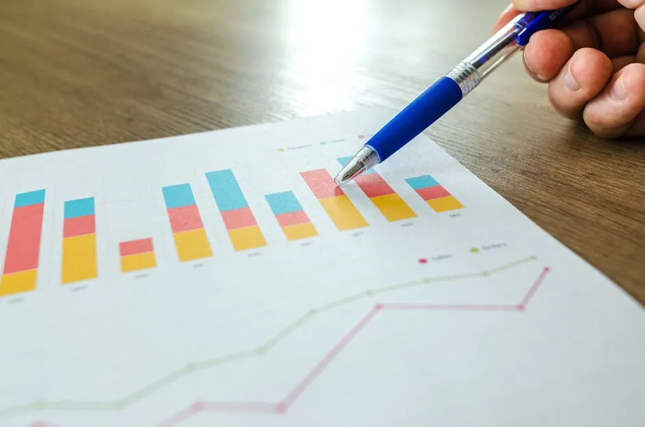
A bar chart is a visual representation of data using rectangular bars. These bars can be oriented vertically or horizontally. The length of each bar correlates with the value it represents. Bar charts excel at comparing different categories side by side.
Definition and Purpose
The primary purpose of a bar chart is to illustrate the differences in values across categories. Think of it as your go-to tool for making sense of numbers. Whether it’s sales data or survey results, bar charts make it easier to grasp trends quickly.
Types of Bar Charts
Bar charts come in several flavors. Let’s break down the most common types:
- Vertical Bar Charts: These are the classic bar charts. They display bars rising vertically, making them perfect for comparing categories. Imagine you’re comparing the sales of different products; vertical bars make those differences pop!
- Horizontal Bar Charts: If you have long category names, horizontal bar charts are your best friend. They display bars extending horizontally, making it easier to read those lengthy labels. Use them when comparing items with long names—like, say, “Extra Crunchy Peanut Butter.”
- Stacked Bar Charts: These show the total values of several groups on top of each other. They help visualize how sub-categories contribute to the total. For instance, if you’re analyzing sales by region and product type, stacked bar charts can show both aspects in one go.
Each type serves a unique purpose, so knowing which one to use is key to effective data visualization. With this understanding in your pocket, you’re ready to tackle the next section: creating bar charts like a pro!
Conclusion
In conclusion, bar charts serve as powerful tools for visualizing data and conveying information in an easily digestible format. Whether you’re a data analyst, marketer, or student, understanding how to create and effectively use bar charts can significantly enhance your ability to communicate insights. Remember to adhere to best practices and continually refine your skills for creating impactful visualizations.
Best Practices for Designing Bar Charts
Creating bar charts that shine is more than just slapping some bars on a graph. With a sprinkle of design know-how and a dash of creativity, you can craft visuals that speak volumes. Here are best practices for using data visualization to ensure your bar charts communicate your message clearly and effectively.
Choose the Right Chart Type
Selecting the right type of bar chart is crucial. Vertical or horizontal? Stacked or grouped? Each type has its strengths. Vertical bar charts work wonders for comparing categories, while horizontal ones shine with long labels. Stacked bar charts are perfect for showing part-to-whole relationships. Match the chart type to your data story for maximum impact.
If you’re interested in mastering the principles of data visualization, Data Visualization Made Simple: Insights into Becoming Visual is a fantastic resource that breaks down the essentials into digestible bites.

Labeling Axes and Adding Titles
Don’t skip labeling your axes. A well-labeled chart guides your audience effortlessly through the data. Use clear, concise titles that tell viewers what to expect. For example, “Sales by Product Category” is far more informative than “Chart 1.”
Selecting Color Schemes and Fonts
Color choices matter! Avoid clashing colors that distract from your data. Opt for complementary colors that enhance readability. Stick to a limited palette to maintain focus. As for fonts, choose something legible. Remember, your chart should be a feast for the eyes, not a puzzle.
Avoiding Common Pitfalls
Mislabeling axes is a common mistake. Ensure your scales accurately reflect the data. Avoid using 3D effects; they can distort perception. Keep your chart simple and to the point. Too much information can overwhelm viewers faster than you can say “data overload!”

Real-World Applications of Bar Charts
Bar charts aren’t just pretty pictures; they have real-world applications. Businesses use them to track sales performance, compare product popularity, and analyze marketing campaigns. In academia, researchers visualize study results, making conclusions more digestible. Marketers showcase campaign performance using bar charts to make decisions backed by data.
For more on the role of data visualization in business, check out The Big Book of Dashboards: Visualizing Your Data Using Real-World Business Scenarios. This book offers real-life examples that bring the concepts to life!

The Role of Bar Charts in Data Storytelling
Bar charts play a key role in data storytelling. They simplify complex information, making it accessible. When used effectively, they spark curiosity and drive engagement. Think of them as your data’s best friend, turning numbers into narratives. So, whether you’re presenting to stakeholders or crafting reports, harness the power of bar charts to tell compelling stories.
By following these best practices, you’ll create bar charts that not only look great but also communicate your message with clarity and style. Ready to make your data visualizations dazzle?

How to Create Bar Charts
Creating bar charts is a breeze, especially with the right tools. Let’s break down how to whip up stunning bar charts using Chart.js, Tableau 2021 For Dummies, and Excel Data Visualization: A Guide to Creating Stunning Charts and Graphs. Whether you’re a coding wizard or a newbie, this guide has got your back!

Using Chart.js
Chart.js is an open-source library that makes chart creation simple and fun. Here’s how to get started.
Installation and Setup
To kick things off, include the Chart.js library in your project. You can either download it or link to it via a CDN. Here’s how to use a CDN:
<script src="https://cdn.jsdelivr.net/npm/chart.js"></script>
Basic Bar Chart Example
Once you’ve got the library linked, you’re ready to create a basic bar chart. Here’s a straightforward example:
<canvas id="myChart" width="400" height="200"></canvas>
<script>
const ctx = document.getElementById('myChart').getContext('2d');
const myChart = new Chart(ctx, {
    type: 'bar',
    data: {
        labels: ['Red', 'Blue', 'Yellow'],
        datasets: [{
            label: '# of Votes',
            data: [12, 19, 3],
            backgroundColor: [
                'rgba(255, 99, 132, 0.2)',
                'rgba(54, 162, 235, 0.2)',
                'rgba(255, 206, 86, 0.2)',
            ],
            borderColor: [
                'rgba(255, 99, 132, 1)',
                'rgba(54, 162, 235, 1)',
                'rgba(255, 206, 86, 1)',
            ],
            borderWidth: 1
        }]
    },
    options: {
        scales: {
            y: {
                beginAtZero: true
            }
        }
    }
});
</script>
This code snippet will give you a basic bar chart displaying three categories with their corresponding values.

Customizing Bar Charts
Customization is where the fun begins! You can tweak colors, borders, and even add tooltips. For instance, to change the bar color, adjust the backgroundColor array to your liking. Want to make it pop? Increase the borderWidth!
To create stacked bar charts, simply add this to your options:
options: {
    scales: {
        x: {
            stacked: true
        },
        y: {
            stacked: true
        }
    }
}
Now, your bars will stack on top of one another, showcasing totals beautifully.

Using Plotly
Plotly is a powerhouse for interactive visualizations. Let’s see how to create bar charts with it.
Overview of Plotly Express
Plotly Express is a high-level interface for Plotly, allowing for quick and easy chart creation. It’s perfect for beginners and pros alike.
Creating Simple and Grouped Bar Charts
To create a simple bar chart, you can use the following code:
import plotly.express as px

df = px.data.tips()
fig = px.bar(df, x='day', y='total_bill')
fig.show()
This will produce a simple bar chart comparing total bills across different days.
For grouped bar charts, you can add a color argument:
fig = px.bar(df, x='day', y='total_bill', color='sex', barmode='group')
fig.show()
This will group bars by gender, giving you a clearer view of the data.

Advanced Features (Coloring, Text Labels)
Want to add some flair? Use the color argument to differentiate categories. You can also add text labels to your bars for clarity:
fig = px.bar(df, x='day', y='total_bill', color='sex', text='total_bill')
fig.show()
Now, each bar will display its value right on top. Fancy, right?

Using Matplotlib
Matplotlib is a classic choice for Python users. It’s powerful and versatile. Let’s dig into creating bar charts with it.
Setting Up Matplotlib
First, make sure you have Matplotlib installed. You can do this via pip:
pip install matplotlib
Creating Grouped and Stacked Bar Charts
To create a grouped bar chart, follow this example:
import matplotlib.pyplot as plt
import numpy as np

labels = ['A', 'B', 'C']
group1 = [3, 5, 2]
group2 = [4, 2, 5]
x = np.arange(len(labels))

width = 0.35
fig, ax = plt.subplots()
bars1 = ax.bar(x - width/2, group1, width, label='Group 1')
bars2 = ax.bar(x + width/2, group2, width, label='Group 2')

ax.set_ylabel('Scores')
ax.set_title('Scores by Group')
ax.set_xticks(x)
ax.set_xticklabels(labels)
ax.legend()
plt.show()
This code creates a grouped bar chart comparing two groups across three categories.
To transform this into a stacked bar chart, you can adjust it slightly:
bars1 = ax.bar(x, group1, width, label='Group 1')
bars2 = ax.bar(x, group2, width, bottom=group1, label='Group 2')
With this tweak, the bars for Group 2 will stack on top of Group 1, giving you a clear view of the total.

Adding Labels and Annotations
Labels and annotations make charts more informative. Use the ax.bar_label method to add data labels on top of the bars:
ax.bar_label(bars1)
ax.bar_label(bars2)
Now your audience won’t have to guess the values!
Real-World Applications of Bar Charts
Bar charts aren’t just for fancy presentations; they’re vital in various real-world settings. Let’s take a look at how they find their place in business analytics, academic research, and marketing.
Business Analytics and Reporting
In the corporate world, making decisions based on data is crucial. Bar charts simplify complex datasets, making trends and comparisons clear. Businesses often use them to track key performance indicators (KPIs) like sales, expenses, and customer satisfaction. For example, imagine a company analyzing quarterly sales across different products. A bar chart showcasing each product’s performance allows stakeholders to quickly identify top sellers and underperformers.
Moreover, bar charts are essential for financial reporting. When presenting earnings reports to investors, a clear visual representation can make all the difference. Decision-makers can spot trends over time, helping them make informed choices about resource allocation.
For a deeper dive into data visualization in business, check out Data Visualization: A Practical Introduction. This book offers insights that can help you leverage visuals in a business context.

Academic Research
In academia, bar charts serve as indispensable tools for presenting research findings. Researchers often rely on them to compare data across different groups or conditions. For instance, a study examining student performance across various teaching methods might use a bar chart to illustrate how each method impacts test scores.
Bar charts also enhance the clarity of research presentations. A well-structured bar chart can help simplify complex data, making it easier for audiences to grasp essential points. Whether presenting at a conference or publishing in a journal, researchers leverage bar charts to communicate their findings effectively.

Marketing and Sales Presentations
Marketers adore bar charts for their ability to showcase campaign performance. Picture a marketing team evaluating the success of multiple advertising channels. A bar chart could display metrics like click-through rates and conversions, allowing the team to see which channels are delivering results. This visual clarity aids in optimizing marketing strategies and reallocating budgets effectively.
Sales teams also benefit from bar charts. When analyzing customer demographics or regional sales data, a bar chart can highlight which segments are thriving. This information is crucial for crafting targeted sales strategies. By identifying high-potential markets, sales teams can direct their efforts where they’ll yield the best returns.
In summary, bar charts are versatile tools that play vital roles in business analytics, academic research, and marketing. Their ability to distill complex data into easily digestible visuals makes them indispensable in today’s data-driven landscape.
Case Studies
Now that we’ve covered how bar charts are applied in various fields, let’s look at some real-life examples that illustrate their effectiveness.
Analyzing a Dataset with a Bar Chart
Imagine a nonprofit organization focused on environmental conservation. They conduct a survey to understand community engagement in recycling programs. The survey results reveal participation rates across different neighborhoods, but the data is a jumble of numbers. To make sense of it, they create a bar chart.
The chart displays each neighborhood on the x-axis and participation rates on the y-axis. Instantly, the organization sees which areas are thriving and which are lagging. With this visual insight, they can tailor their outreach efforts to boost participation in underperforming neighborhoods.

Success Stories Using Bar Charts in Business
Let’s consider a tech company that launched a new software product. To gauge customer satisfaction, they conducted a survey and gathered feedback across various features. Using a bar chart to display the results, they showcased ratings for each feature on a single page.
The chart revealed a striking contrast: while users loved the ease of use, they were less thrilled about certain advanced features. Armed with this information, the product team focused on improving those features in their next update. As a result, customer satisfaction scores soared, and user retention improved significantly.
In both these cases, bar charts transformed raw data into actionable insights. By presenting information visually, these organizations could make informed decisions that directly impacted their success. Bar charts are more than just visuals; they are powerful allies in the quest for clarity and understanding in data analysis.
FAQs
Please let us know what you think about our content by leaving a comment down below!
Thank you for reading till here 🙂
All images from Pexels
