

Introduction
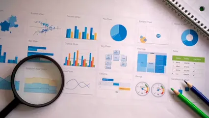
In the world of data visualization, pie charts are the classic go-to for showcasing proportions. They make information digestible and visually appealing. Picture this: you’re in a meeting, trying to explain a budget breakdown. A pie chart comes to the rescue, transforming those numbers into colorful slices that everyone can easily grasp.
But how do you whip up a pie chart that not only dazzles the eyes but also delivers your message effectively? Enter the pie chart maker—your online buddy for crafting stunning visuals in no time. These nifty tools take the hassle out of creating pie charts, allowing you to input titles, labels, and values with just a few clicks.
From customizing colors to choosing between 3D and donut styles, the options are nearly endless. Have a spreadsheet full of data? Not a problem! Many pie chart makers let you upload CSV files, making data input a breeze. Plus, the ability to save your creations in high-resolution formats means your charts will look sharp in presentations, reports, or even social media posts.

And speaking of presentations, why not elevate your game with a Presentation Remote Clicker? This handy device allows you to walk freely while presenting, ensuring you can engage with your audience without being tethered to your laptop.
In this guide, we’ll dive into the fascinating features of pie chart makers. We’ll break down how they can elevate your data presentation game. So, get ready to slice your data into visually appealing segments and impress your audience with your newfound skills!
Understanding Pie Charts
What is a Pie Chart?
A pie chart is a circular graph divided into slices. Each slice represents a proportion of the whole. The purpose? To illustrate percentages clearly and concisely. When you have data that represents parts of a whole, pie charts shine. They’re perfect for visualizing market shares, survey results, or budget distributions.
But when should you choose a pie chart over other types? Simple! Use pie charts when you’re dealing with a limited number of categories. If you’ve got more than five or six categories, it’s better to opt for a bar chart. Why? Because too many slices can confuse the viewer, turning your data into a jigsaw puzzle.

Advantages and Disadvantages
Pie charts come with their perks. First, they are visually appealing. Who doesn’t love a colorful chart? They simplify complex data, making it easier for audiences to grasp relationships at a glance. Plus, they can be a delightful addition to presentations, bringing your data to life.
However, it’s not all sunshine and rainbows. Pie charts have limitations. They can only represent a limited number of data points effectively. Too many slices, and your audience will squint trying to decipher it. Furthermore, pie charts can be misleading. If the differences between slices are subtle, they might not convey the right message. It’s essential to use them wisely and ensure that the data being represented is clear and accurate.
Features of Pie Chart Makers
User-Friendly Interfaces
Most pie chart makers prioritize user experience. They often feature clean, intuitive layouts. A typical tool will have input fields for titles, labels, and values, all laid out clearly. This design helps users navigate effortlessly. Imagine trying to create a pie chart and getting lost in a sea of buttons! A straightforward interface ensures you can focus on what matters—your data.

Customization Options
When it comes to customization, pie chart makers offer a smorgasbord of options. You can adjust colors, labels, and sizes to suit your preferences. Bright colors can make your chart pop, while muted tones might lend a more professional touch. Want to add labels to each slice? Easy! Tools like Daxlr allow you to customize how slice information is presented—whether by value, percentage, or label.
For instance, RapidTables provides options to choose the legend position and even offers different chart types—like 3D and donut charts. These features let you tailor your pie chart to fit your needs perfectly. Learn more about pie chart makers.

And while you’re at it, consider using Data Visualization for Dummies. This book is a treasure trove of tips and tricks to help you master the art of visualizing data effectively, ensuring your pie charts are not just pretty, but also powerful!
Understanding the various pie chart makers can significantly enhance your data visualization skills. Explore the features of pie chart makers here.
Data Input Methods
Data entry should be as smooth as butter. Most pie chart makers allow manual entry, where you can type in each category and its value. But what if you have a mountain of data? Fear not! Many tools support CSV file uploads. This means you can simply drag and drop your data and let the tool do the rest.
Different tools handle data entry in various ways. For example, Daxlr enables easy modification of values directly within the interface. This flexibility is crucial for users who need to make quick adjustments without hassle.

Don’t forget to back up your data! An External Hard Drive can save your data from unexpected disasters, ensuring your hard work is always safe and sound.
Exporting and Sharing Options
Once your masterpiece is ready, how do you share it? Pie chart makers typically offer various export formats, making it easy to download your charts as PNG, SVG, or even PDF files. This ensures your charts maintain high quality, whether for presentations or reports.
Social media sharing is another handy feature. Imagine creating a stunning pie chart on budget allocations and sharing it directly on your feed. Tools like Imgflip make this a breeze, allowing users to share their visuals without jumping through hoops.

In summary, pie chart makers are designed to make your life easier. With user-friendly interfaces, extensive customization options, flexible data input methods, and seamless exporting capabilities, you can create charts that not only inform but also engage and impress your audience.
Real-World Applications of Pie Charts
In Business
Pie charts play a vital role in business analytics. They simplify complex sales data and market share representations. Imagine a company needing to present its sales distribution across different regions. A pie chart can visually break down that information, allowing stakeholders to see which areas are thriving and which may need attention. This visual clarity can spark insightful discussions and informed decision-making.
For those presentations, consider using a high-quality High-Quality Printer Paper. It ensures your charts look professional and polished, making a lasting impression on your audience!
In Education
In educational settings, pie charts are invaluable for illustrating demographic distributions or survey results. For instance, educators might use pie charts to show the percentage of students from various backgrounds in a classroom. This kind of visual representation helps in understanding diversity and addressing potential inequalities.
Moreover, pie charts are great for displaying survey results. If a class conducts a survey on favorite subjects, a pie chart can effectively showcase how preferences are distributed, making the data accessible and engaging for students.

In Personal Projects
Pie charts are not just for business or education; they can also be handy in personal projects. For example, consider budgeting for a family vacation. A pie chart can visually represent how much of the budget goes to accommodations, food, and activities. This way, family members can see where their funds are allocated at a glance, making it easier to adjust plans if necessary.
Additionally, individuals can use pie charts to visualize personal data, like weekly exercise routines or daily screen time. By representing this information graphically, it becomes easier to identify patterns and areas for improvement.
And while you’re planning that vacation, don’t forget to pack your essentials in a stylish Laptop Backpack. It combines functionality and style, making travel a breeze!
In summary, pie charts are versatile tools that enhance data understanding across various fields. Whether in business, education, or personal projects, they make data relatable and engaging.

Comparison of the Best Pie Chart Makers
Tool A vs. Tool B
Let’s kick things off by comparing two popular pie chart makers: RapidTables and Daxlr. Both tools offer unique features that cater to different user needs.
RapidTables shines with its straightforward interface. Users can easily input titles, data labels, and values without feeling overwhelmed. The tool supports various chart types, including 3D pie charts and donut charts. Pricing? It’s completely free. So, if you’re on a budget and need quick results, it’s a solid choice.
On the other hand, Daxlr takes customization to the next level. This tool allows unlimited pie charts for free and offers more advanced features. Users can adjust slice colors, add prefixes, and even modify values in real-time. Plus, Daxlr supports CSV uploads, making it ideal for users with larger datasets. While both tools are user-friendly, Daxlr’s rich features might appeal more to those looking for deeper customization.

User Reviews and Testimonials
User feedback on these tools is largely positive. RapidTables users appreciate its simplicity and quick setup. One user noted, “I created a pie chart for my presentation in under five minutes. It’s refreshingly easy!” However, some users wish for more customization options, feeling limited by the basic features.
Conversely, Daxlr users rave about its customization capabilities. A user stated, “I love being able to personalize my pie charts. The hover feature that shows both value and percentage is a game-changer!” But a few users mentioned that the interface could feel slightly cluttered due to its many options.
Overall, both tools cater to different audiences—RapidTables for those who prioritize speed and simplicity, and Daxlr for users who enjoy customization.

Best Use Cases for Each Tool
Choosing the right pie chart maker depends on your needs. RapidTables is perfect for quick visualizations. If you’re a teacher needing to illustrate student demographics, or a business professional summarizing sales data, this tool gets the job done without fuss.
Daxlr, however, is ideal for those who want to make their charts sing! If you’re working on a detailed market analysis or a financial report, Daxlr’s customization options will help you create a compelling visual narrative.
And to make sure your presentations are memorable, consider using Digital Drawing Tablet. It allows you to sketch out ideas quickly and make your presentations even more visually appealing!
In summary, both RapidTables and Daxlr offer valuable services. Your choice should depend on whether you prioritize ease of use or a feature-rich experience.
Conclusion
Creating pie charts has never been more accessible, thanks to online pie chart makers. With just a few clicks, you can transform raw data into visually appealing and informative graphics. From choosing the right tool to customizing your chart, this guide has equipped you with the knowledge to effectively use pie chart makers for various applications. Whether you’re a business professional, educator, or simply a data enthusiast, mastering pie charts will enhance your ability to communicate complex information clearly and effectively.
Ultimately, pie charts are a fantastic way to visualize data. They simplify information and help convey messages quickly. Whether you opt for RapidTables or Daxlr, you’re on the right path to creating stunning visuals that engage your audience. So, roll up your sleeves, choose your tool, and start crafting those eye-catching pie charts today!
FAQs
What is the best pie chart maker?
When it comes to pie chart makers, several tools stand out. **Daxlr** is a favorite for its endless customization options. Users can tweak colors, add text, and even modify data directly. Plus, it allows CSV uploads for bulk data input. Another great option is **RapidTables**. This user-friendly tool offers various chart types, including 3D and donut charts. It’s perfect for quick and straightforward visualizations. If you’re looking for something fun and engaging, **Imgflip** is ideal for creating humorous charts. It offers simple customization and easy sharing on social media. Each tool has its unique strengths. Your choice depends on your specific needs!
Can I create a pie chart for free?
Absolutely! Many pie chart makers allow you to create charts without spending a dime. Tools like Daxlr and RapidTables offer free services, giving you the ability to generate high-quality pie charts easily. However, some free tools may come with limitations. For instance, you might find watermarks on your charts or restricted customization options. If you want to unlock advanced features, consider opting for paid plans, but for basic needs, free options work just fine!
What data format do I need to use?
Creating a pie chart is flexible when it comes to data formats. Most pie chart makers accept manual entry, allowing you to input categories and values directly. However, if you have a lot of data, using a CSV file is often the way to go. Tools like Daxlr make it easy to upload your CSV files, converting your data into stunning visuals with minimal effort. Just ensure your data is organized correctly—each category should have a corresponding value, and you’ll be good to go!
Are pie charts effective for large datasets?
While pie charts are visually appealing, they aren’t the best choice for large datasets. Their strength lies in simplicity, making them ideal for displaying a small number of categories—typically no more than five or six. When you have too many slices, the chart can become cluttered and confusing. In such cases, consider using bar charts or line graphs. These alternatives can effectively convey complex information without overwhelming your audience.
How can I enhance the readability of my pie chart?
Making your pie chart readable is crucial. Start by choosing contrasting colors for each slice. Bright, distinct colors help differentiate data points. Next, ensure each slice is labeled clearly. Displaying values or percentages directly on the slices can provide immediate context. Avoid overcrowding the chart with too much information. Keep it simple! Lastly, consider adjusting slice sizes proportionally to the data they represent. This approach not only enhances readability but also makes the chart visually engaging.
Please let us know what you think about our content by leaving a comment down below!
Thank you for reading till here 🙂
All images from Pexels


